Aug 15, 2016
Anyone who takes a peek at my portfolio will quickly figure out that I LOVE WALLPAPER. It is my favorite way to enhance a room – especially in a nursery. I like to break all the rooms when designing a nursery – whether the client wants something calm and soothing or bold and fun, wallpaper can work in many ways.
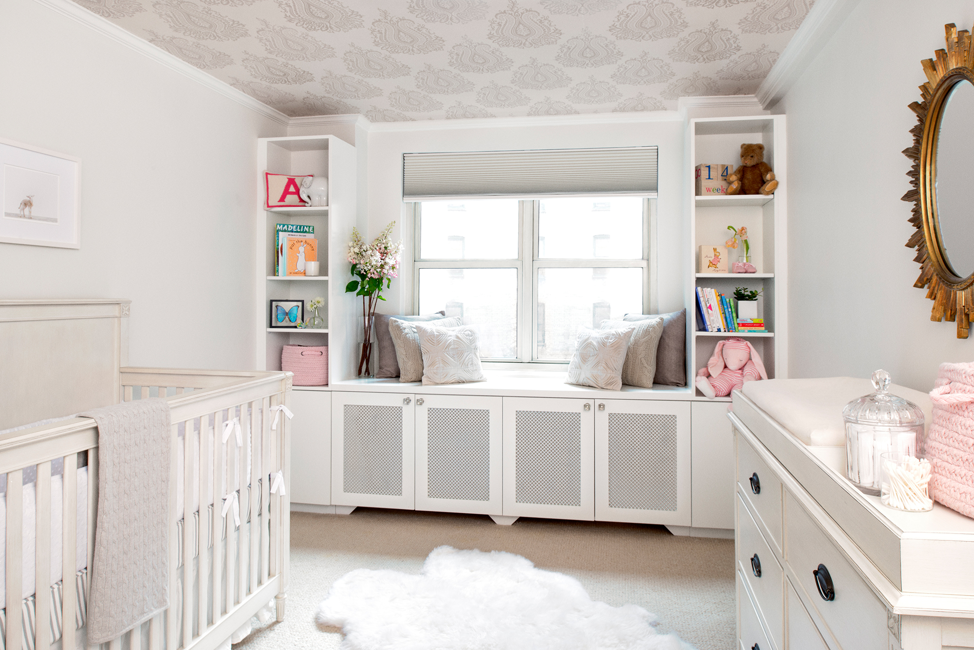
My very first client was a dear friend who was expecting her first baby girl. She wanted an all white room, but it’s scary to put the words “white” and “baby” in the same sentence. We came up with a clever solution by painting the walls white and using wallpaper on the ceiling to add some personality. That way the wallpaper stayed clear of any child related hazards, and if anything happened to the walls, they could be touched up with paint.
We found a beautiful tone on tone, neutral wallpaper by Villa Nova called Kamini Pearl. It also has a touch of iridescence to make it extra special:
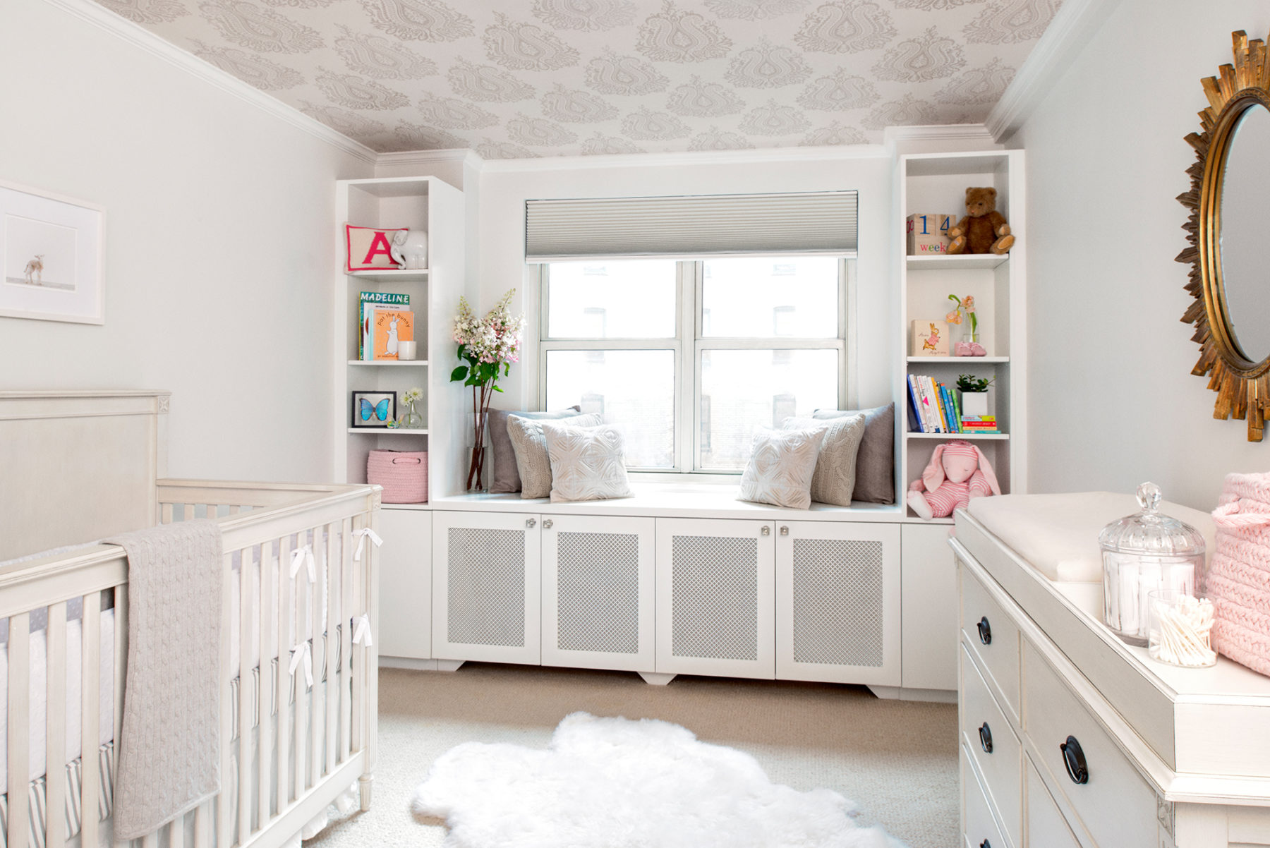
As you can see the remainder of the room is all white including the walls, furniture & built-ins.
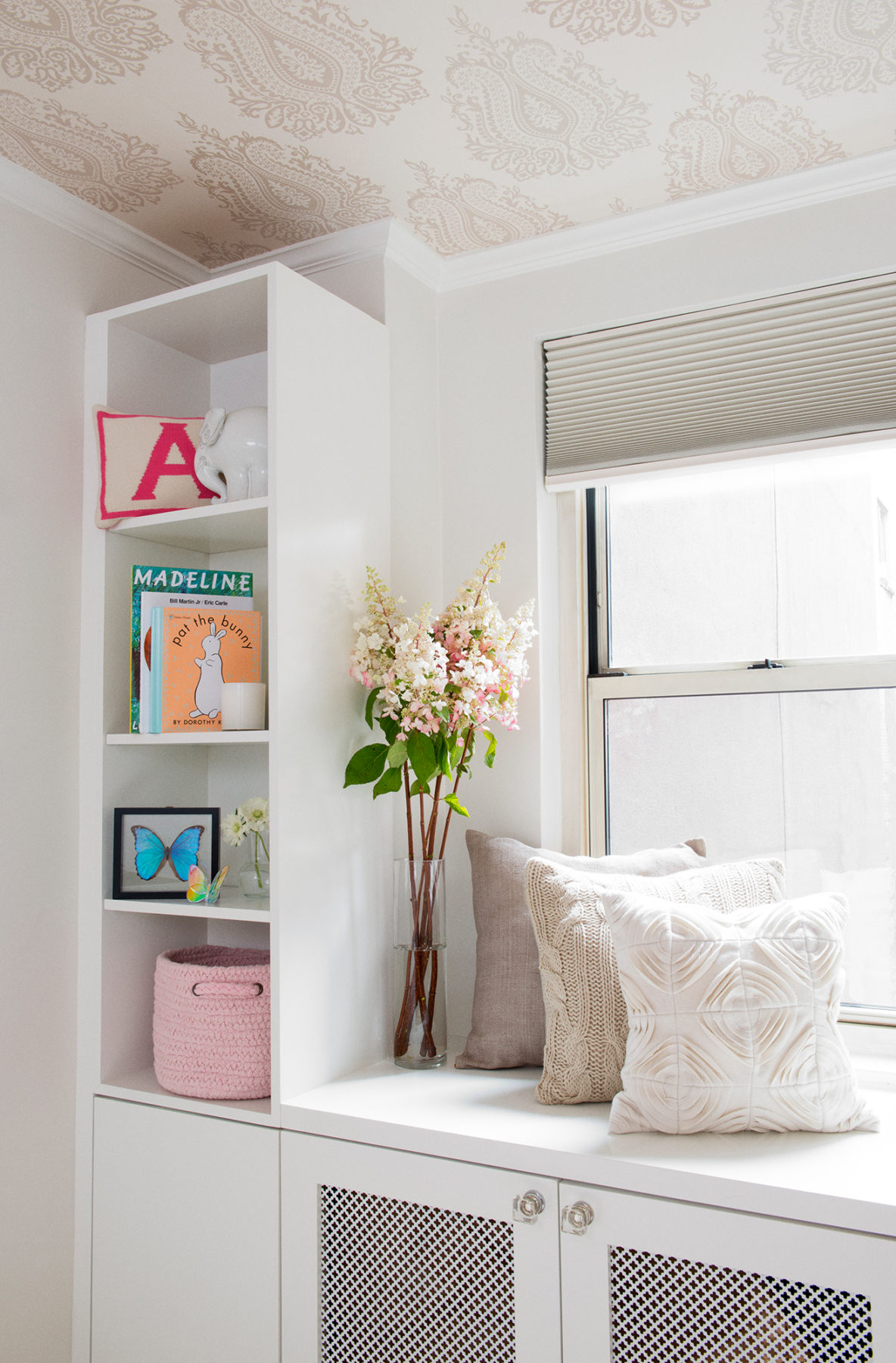
Here is a detail shot of the paper above the built-ins around the window. It really warmed up the space and made it feel cozy.
Here are some other spaces I love that also used neutral wallpapers on the ceiling:
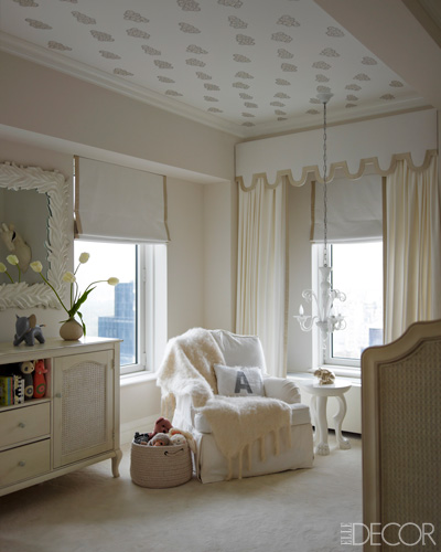
This nursery is in Ivanka Trump’s manhattan apartment, designed by Kelly Behun.
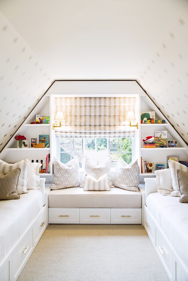
This is a converted attic turned kid’s room designed by LA based design firm Life.Style.
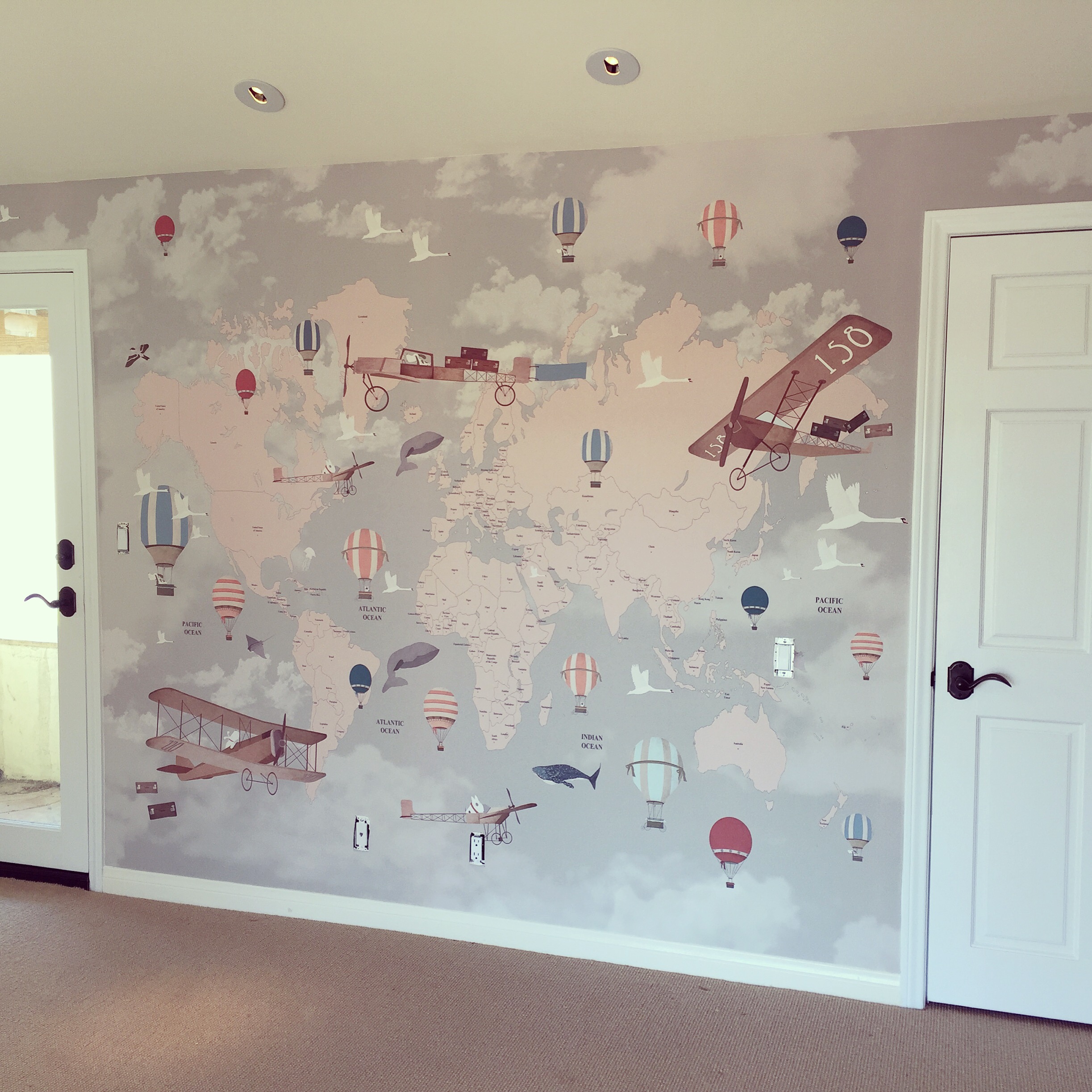
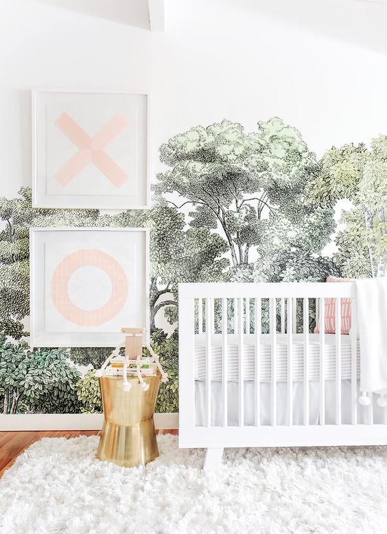
Another wallpaper trend that is on the rise is the use of mural-sized paper. These papers are usually custom made for each individual wall so the story of the paper does not get interrupted. For a current client I am working with, we used the Aviator World Map wallpaper by Little Hands Illustration for the wall behind the crib (which is currently on backorder!):

I just love how this mural wall turned out. It is something this boy will continually discover as he grows up here.
Here is another recently completed nursery that also uses mural wallpaper:
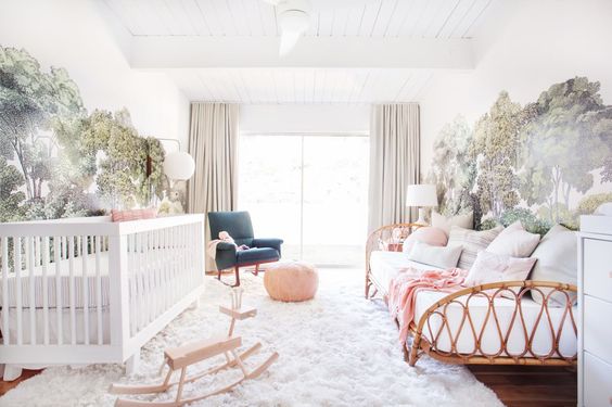
This nursery was designed by Emily Henderson for her daughter. It is so unique and feminine!
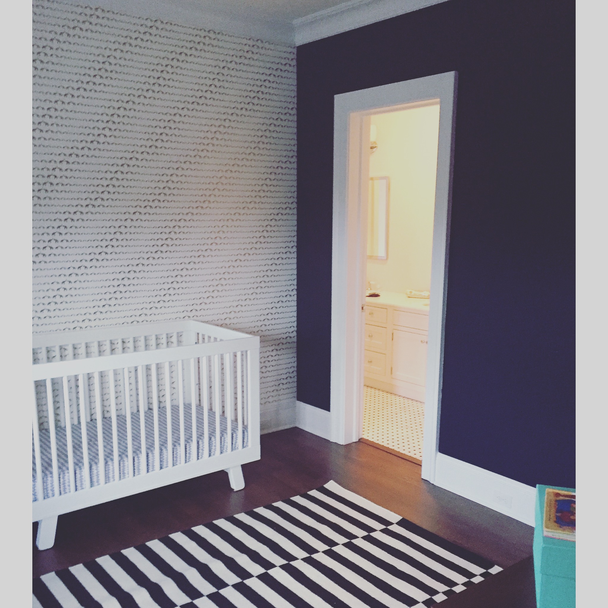
One of my absolute favorite wallpaper vendors is Sissy + Marley. They design really amazing kid’s wallpapers that feel appropriate for a child but are also super sophisticated and modern. I recently installed their Baby Elephant Walk in Gold in a nursery at our Southampton project:
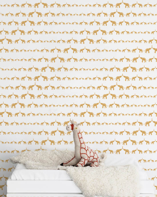
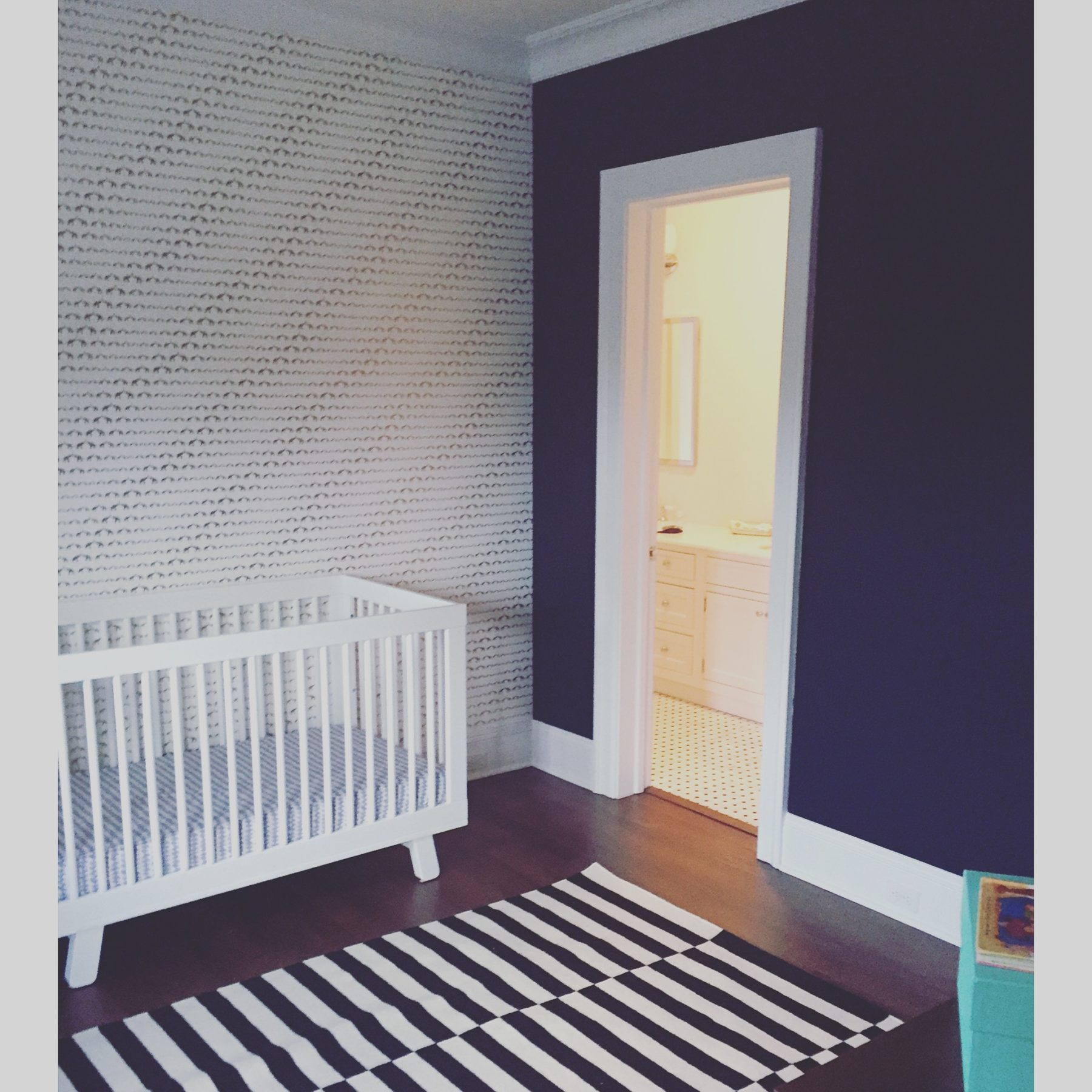
The gold & white paper against the navy walls adds such dynamic to this handsome space.
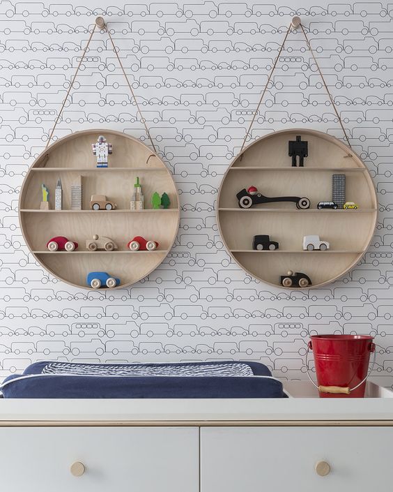
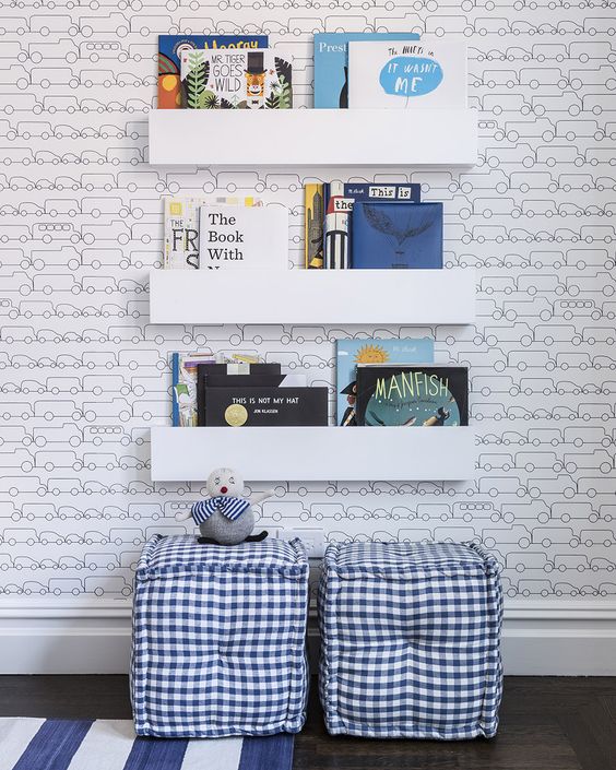
They have tons of other papers to choose from. One of my personal favorites is called JAM and features illustrations of little cars and trucks (maybe I’m biased because Brady runs around all day screaming CAR!):
Here are some other nurseries using wallpaper that provide me with inspiration for future projects: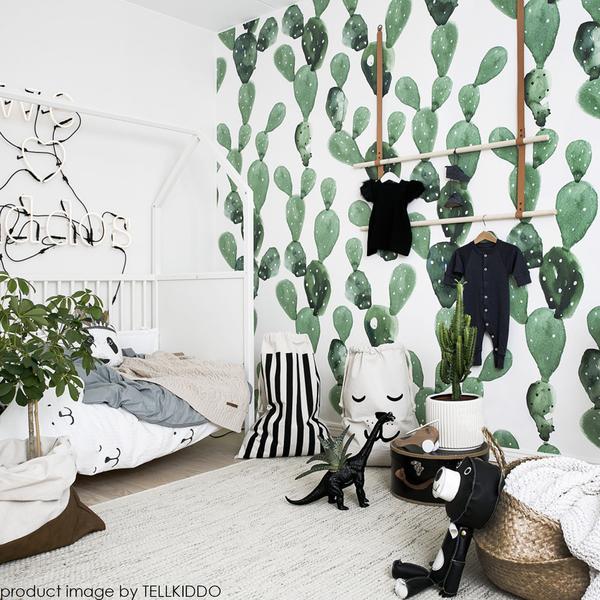
Cactuses (cacti?) are having a moment right now. This wallpaper is called Watercolor Cactus by Anewall.
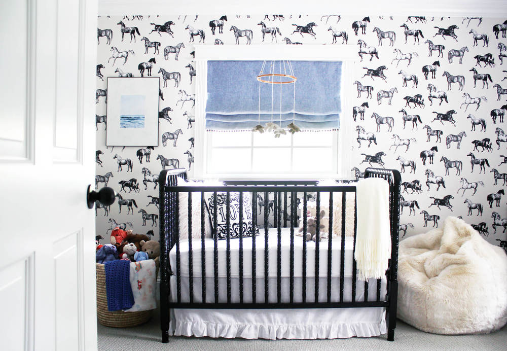
This room by Color me Carla feels like a total throwback. The horse wallpaper is by swedish wallpaper company Sandberg Wallpaper.
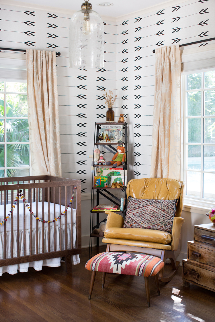
Arrows are another pattern that are hot right now. This nursery by Regan Baker Design has a cool southwest flair.
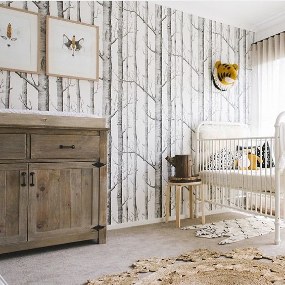
I have coveted this wallpaper by Cole & Son for ages. Love how Sophie Vine used it in her son’s rustic-chic nursery.
Hope I provided you with some inspiration or at least some pretty pictures to look at. That’s it for now! xo, AE
Aug 8, 2016
Welcome to the launch of the ae design blog! This has been on the to-do list for some time and I am hoping to update it often with posts about my current projects and inspiration. For those new to aedesign, my name is Amy Elbaum and I am an interior designer in Los Angeles. I am also a momma to my son Brady and fur-daughter Franny and wife of 5 years to my husband Jeremy. We currently live in Santa Monica but are on the hunt for a bigger home in the area – but that’s another story all of its own…
To kick things off, I thought I would share some photos and details of a recent master bathroom renovation project I completed. Let’s start with the before shots….
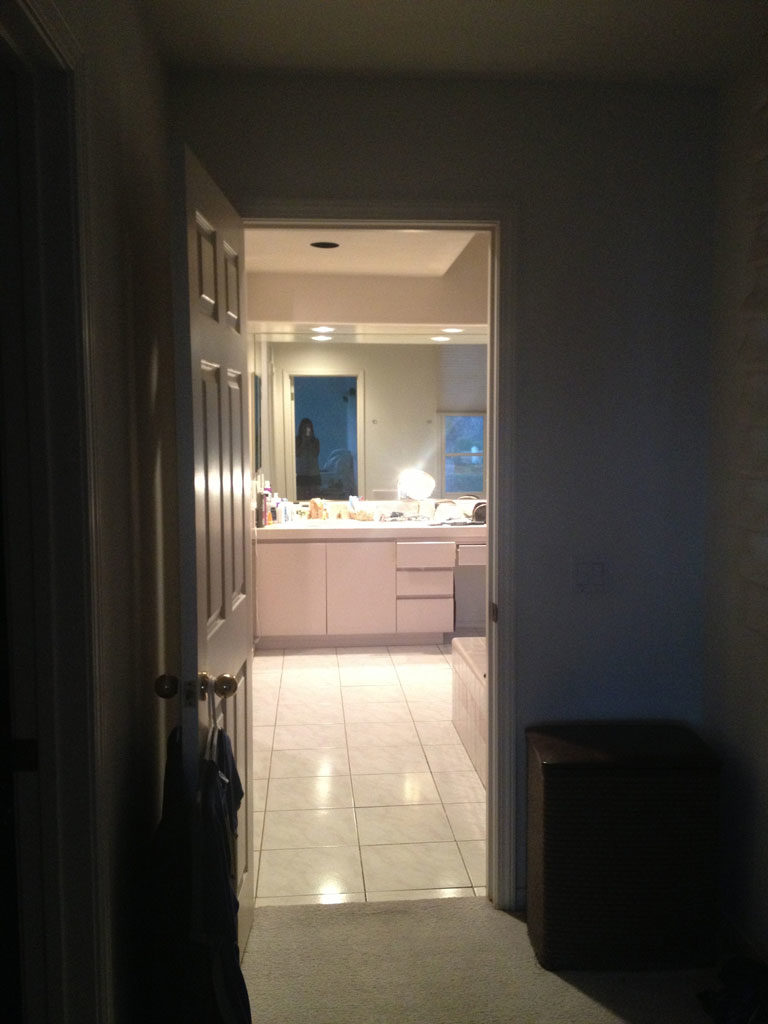
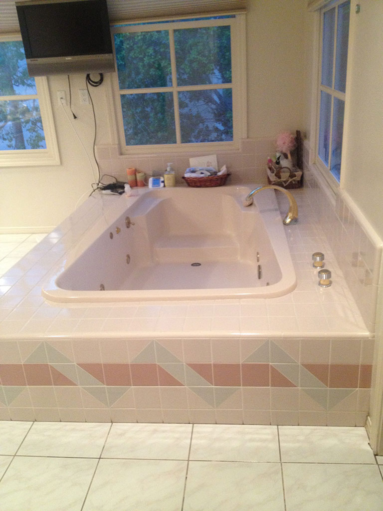
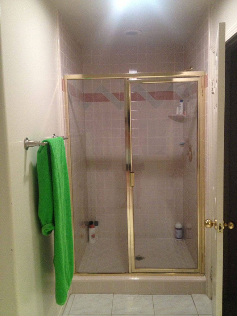
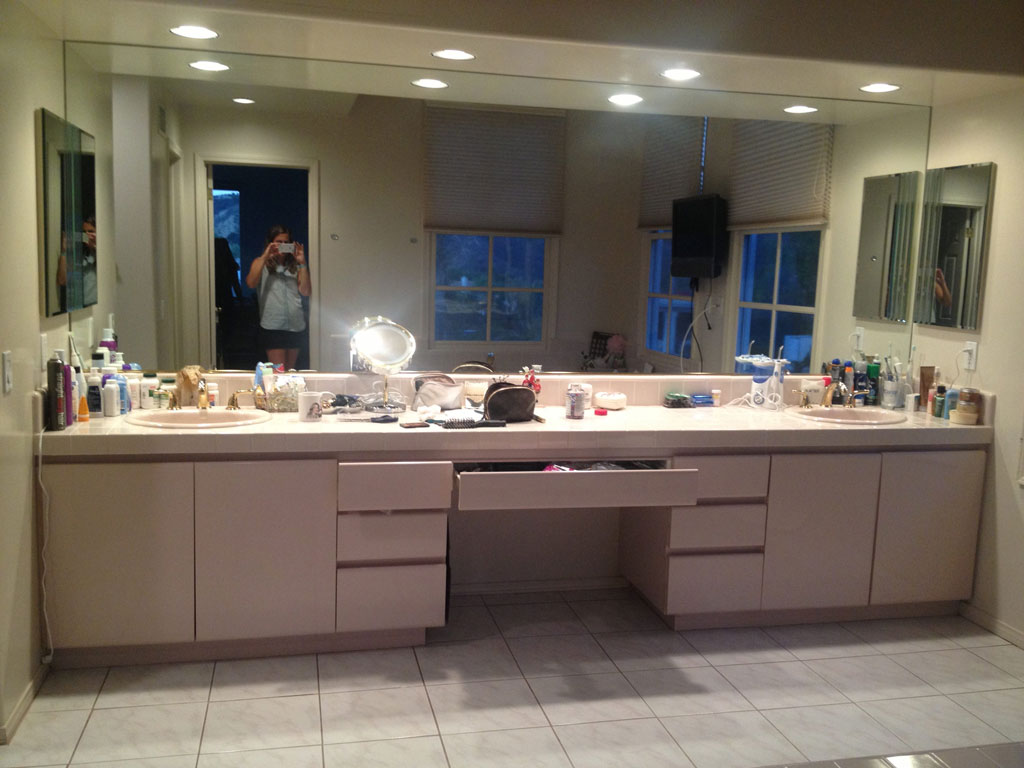
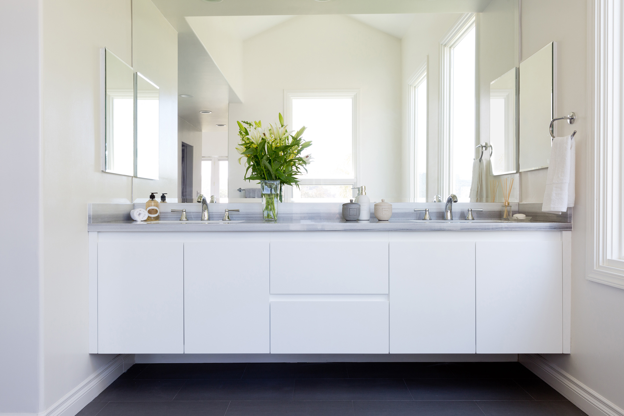
One word…yikes, right?? This house was built in the 80’s and the bathroom had not been touched since mauve was the color of the moment. Everything had to go…every last tile and fixture. We also opened up the entry to the bathroom to brighten up the space and add a wall of shoe storage. This client wanted something very modern, clean, with lots of gray tones. When we began the design process, we were really inspired by this certain type of marble, called Marmara, which has a really unique horizontal stripe:
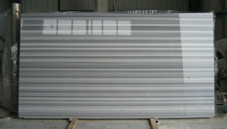
This is what a beautiful slab of Marmara marble looks like.

Here is how it looked installed as the top for our floating white lacquer vanity.
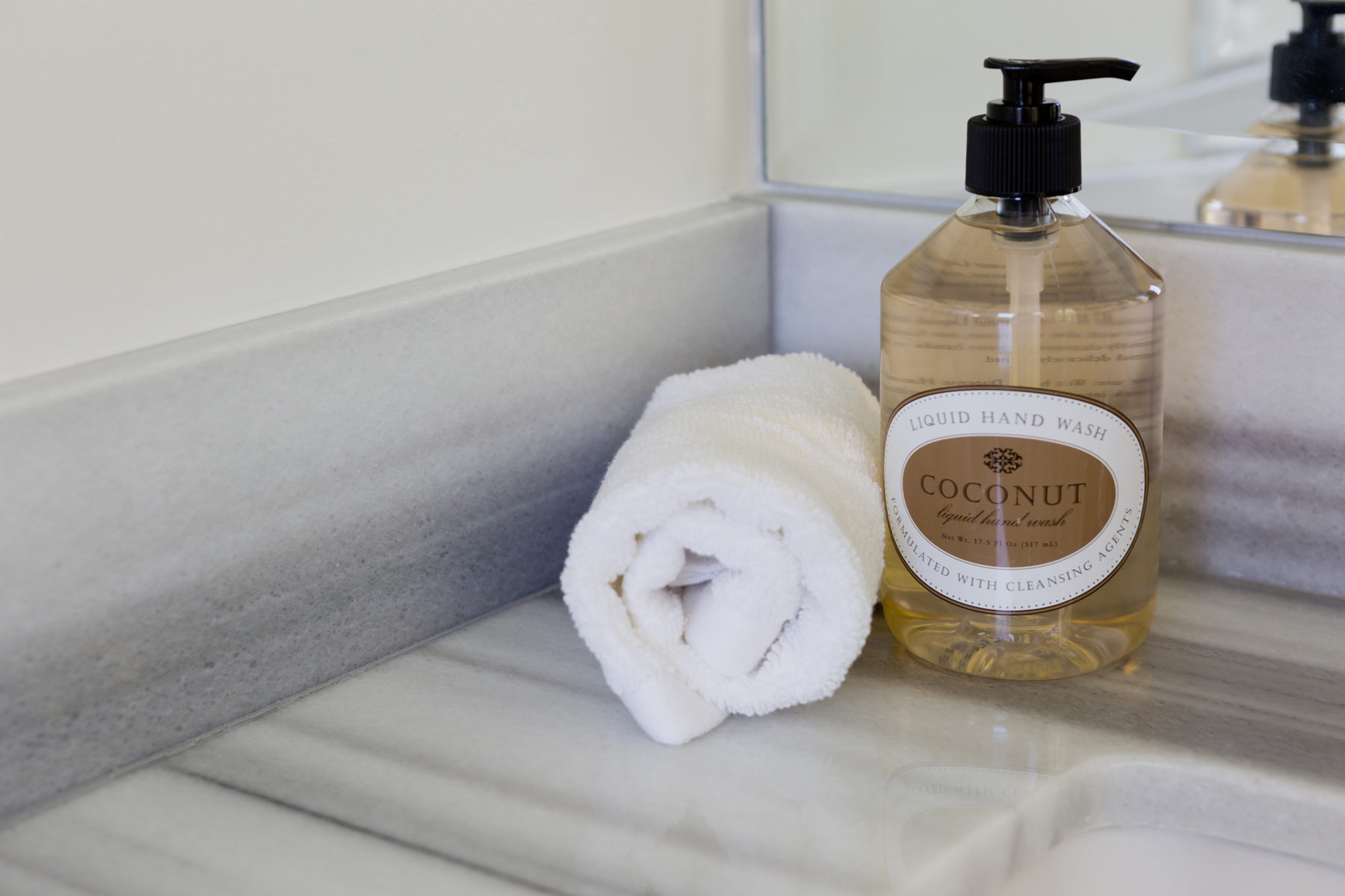
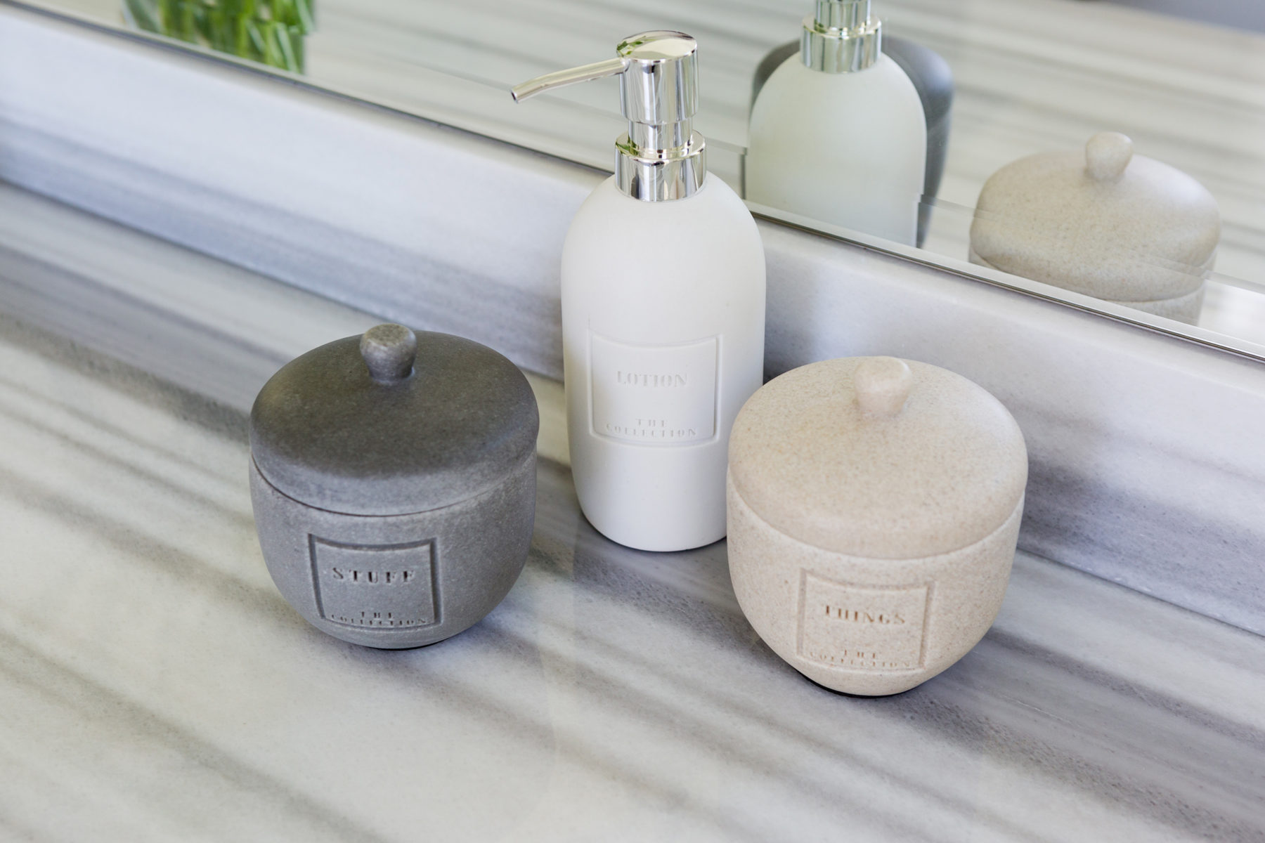
And some detail shots of the vanity top and backsplash.
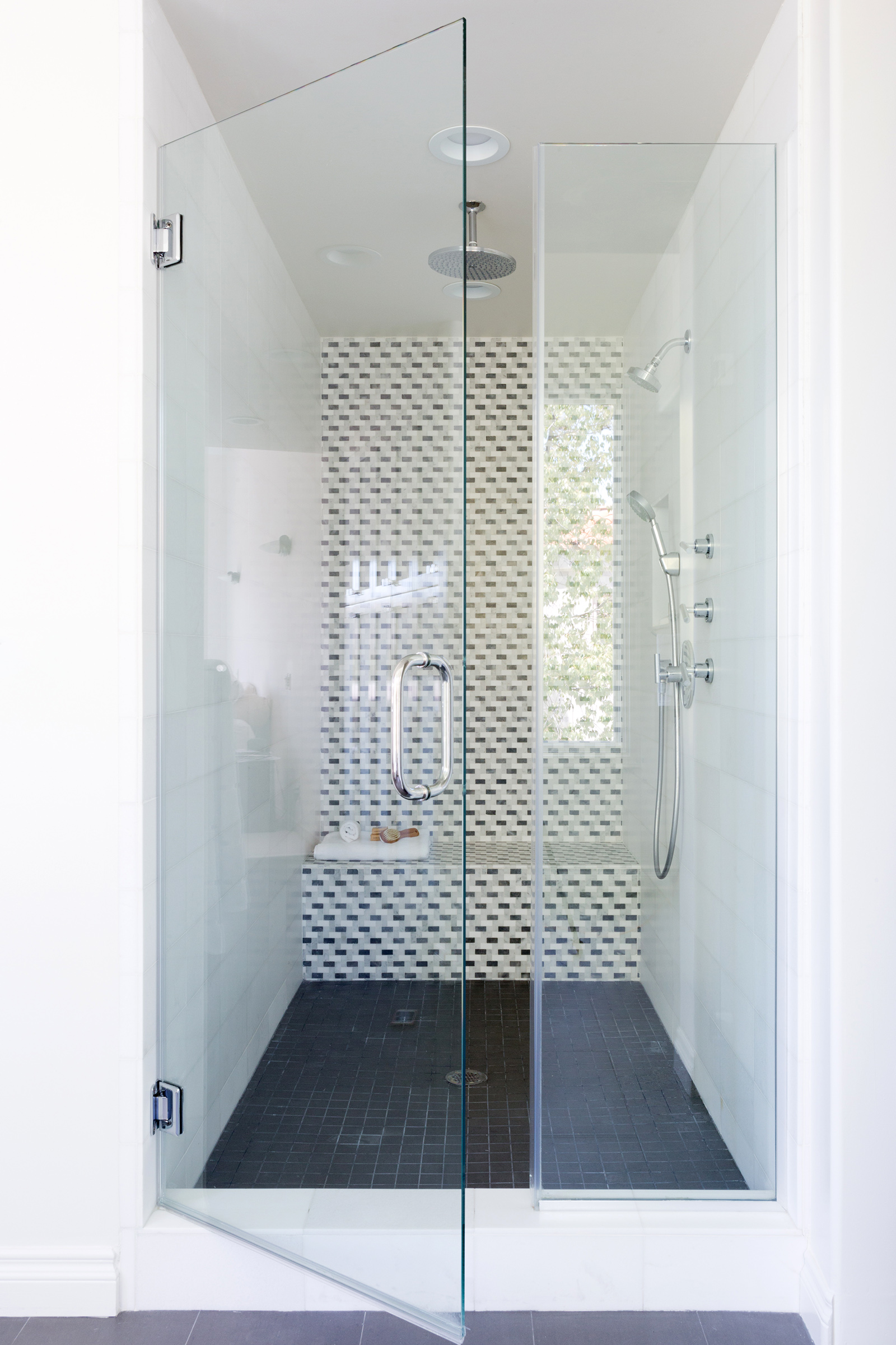
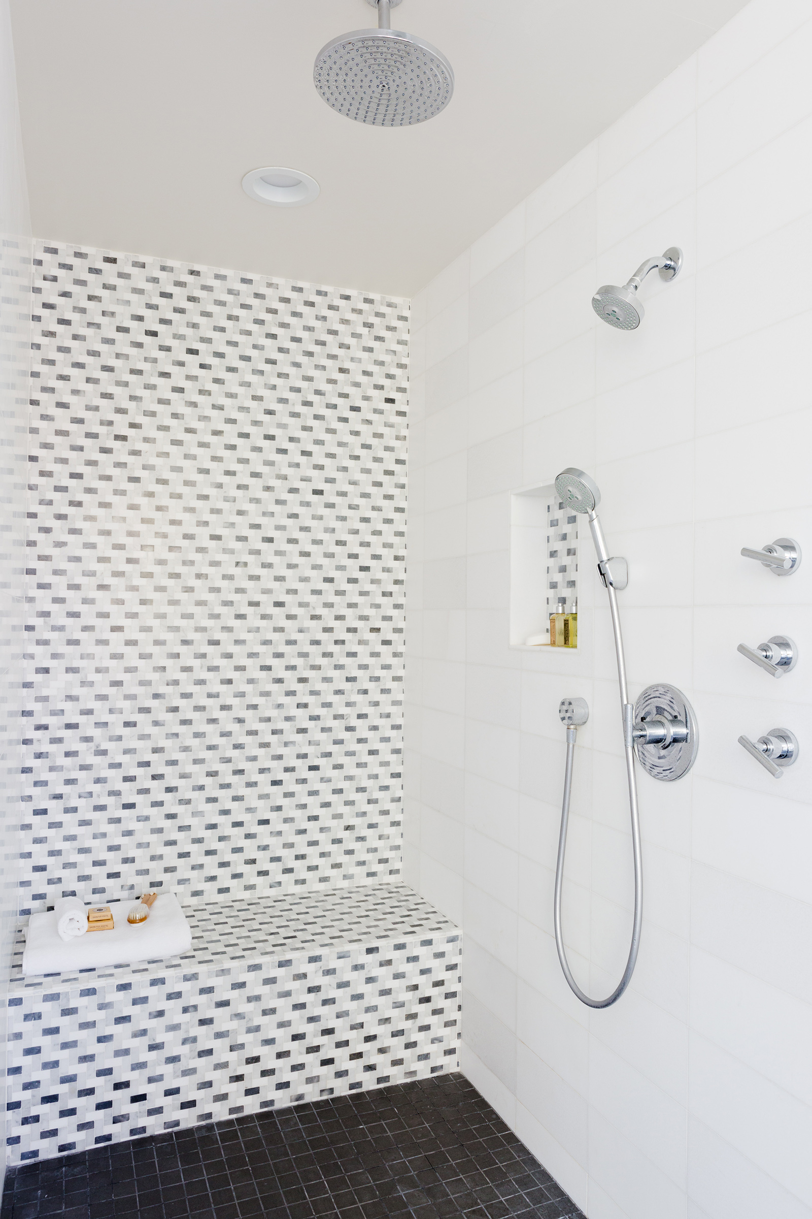
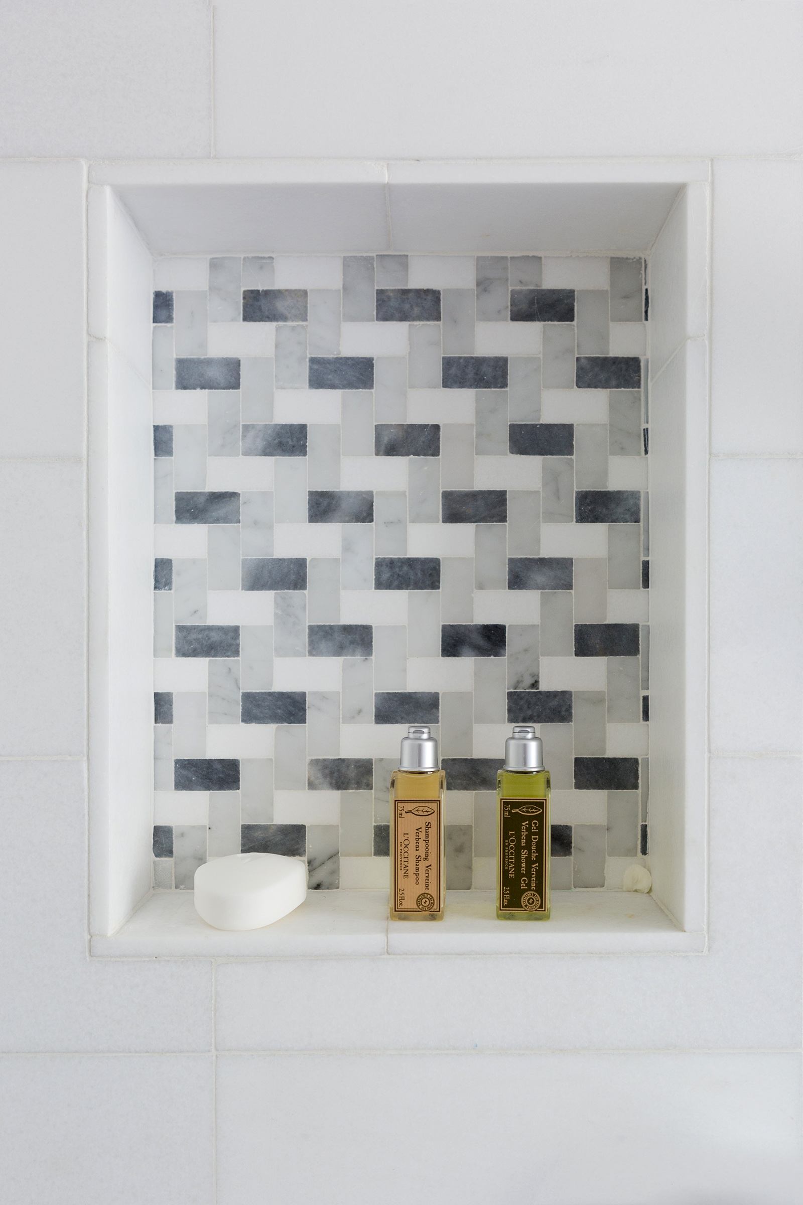
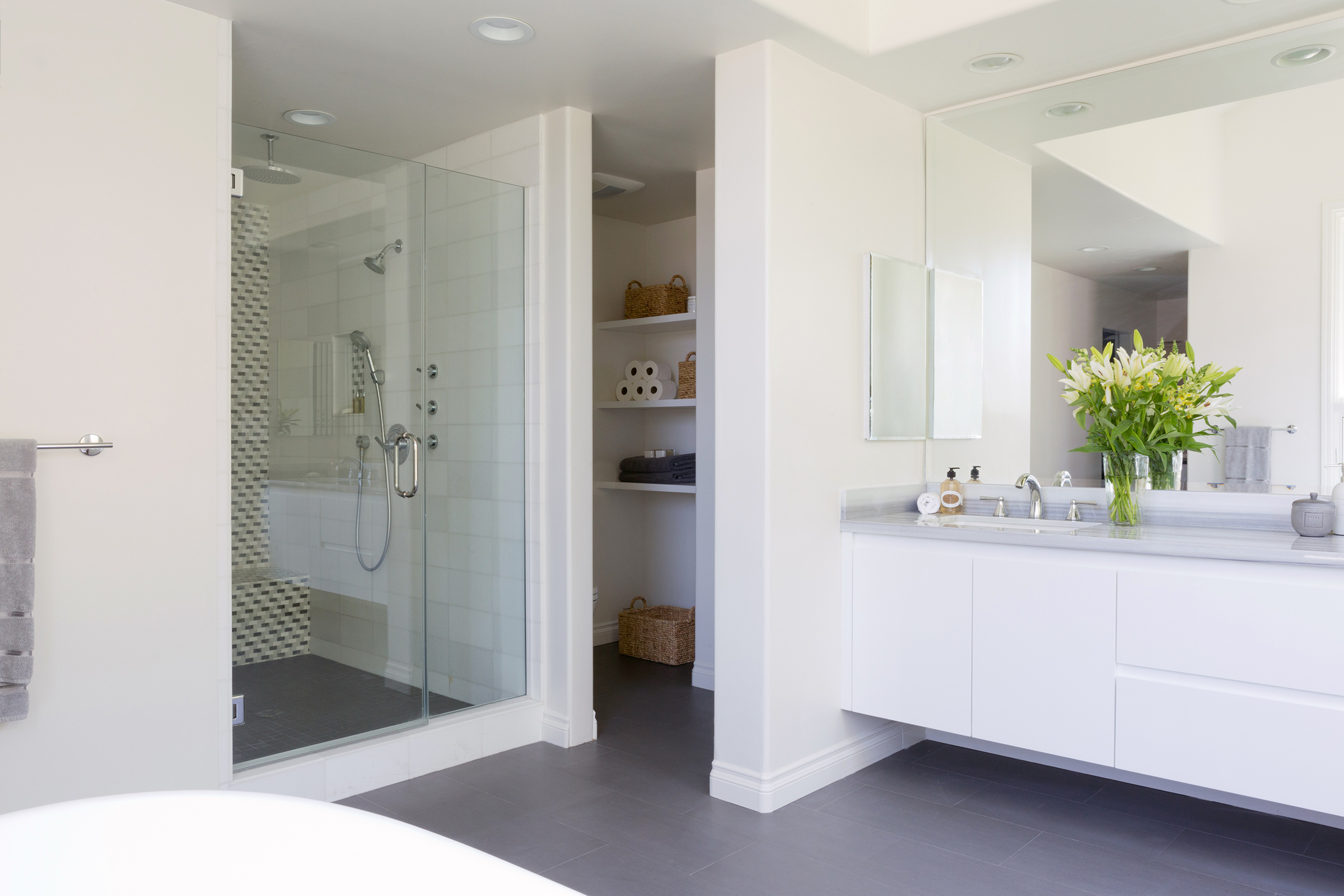
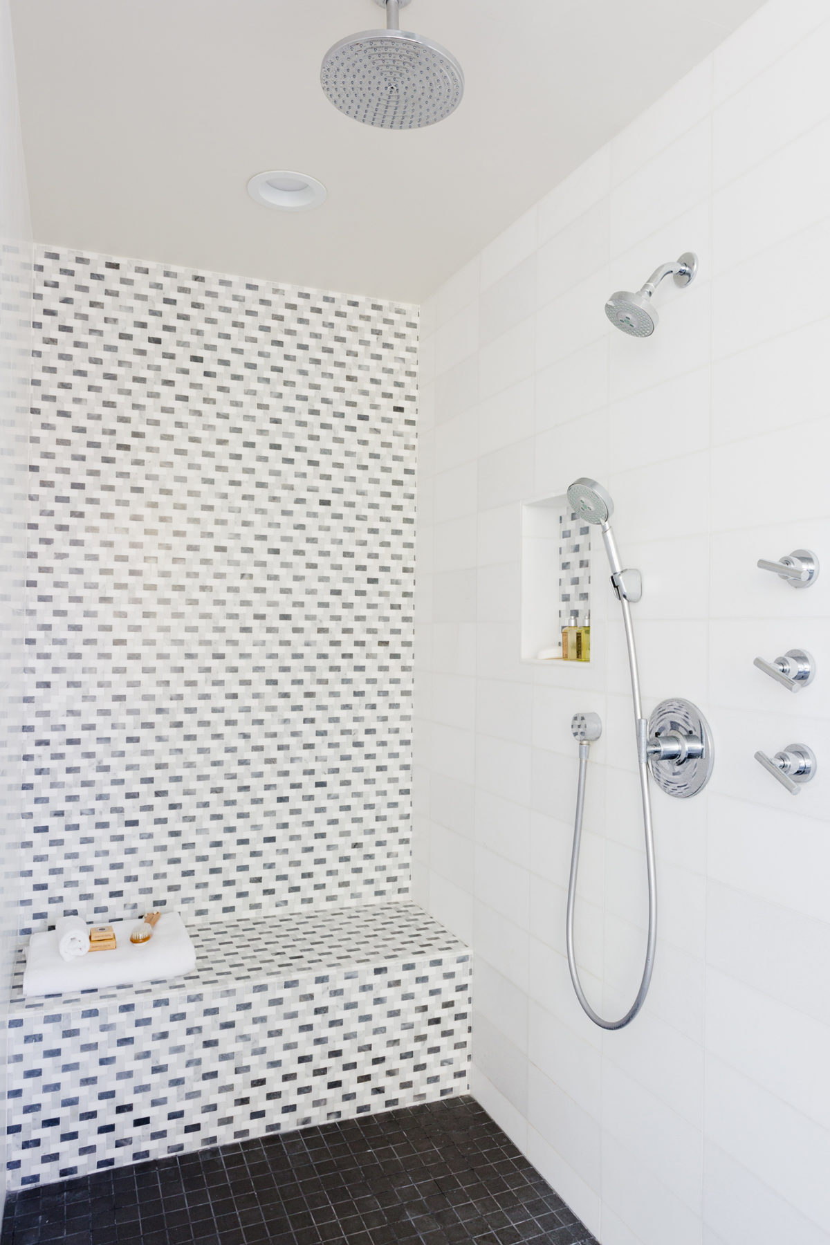
It is a striking stone so once we selected it for the vanity countertop, we chose everything else to compliment it. We used a dark slate tile for the floors to offset the bright white walls and ground the space overall. In the shower, we livened things up with a dynamic feature wall composed of a stone mosaic, which we also used in the shelf nook. We used white thassos marble tiles on the adjoining walls, and a smaller scale of the same slate tile for the floors:

The oversized step-in shower has all the bells & whistles – swinging glass door, overhead recessed lighting, and multiple shower heads.
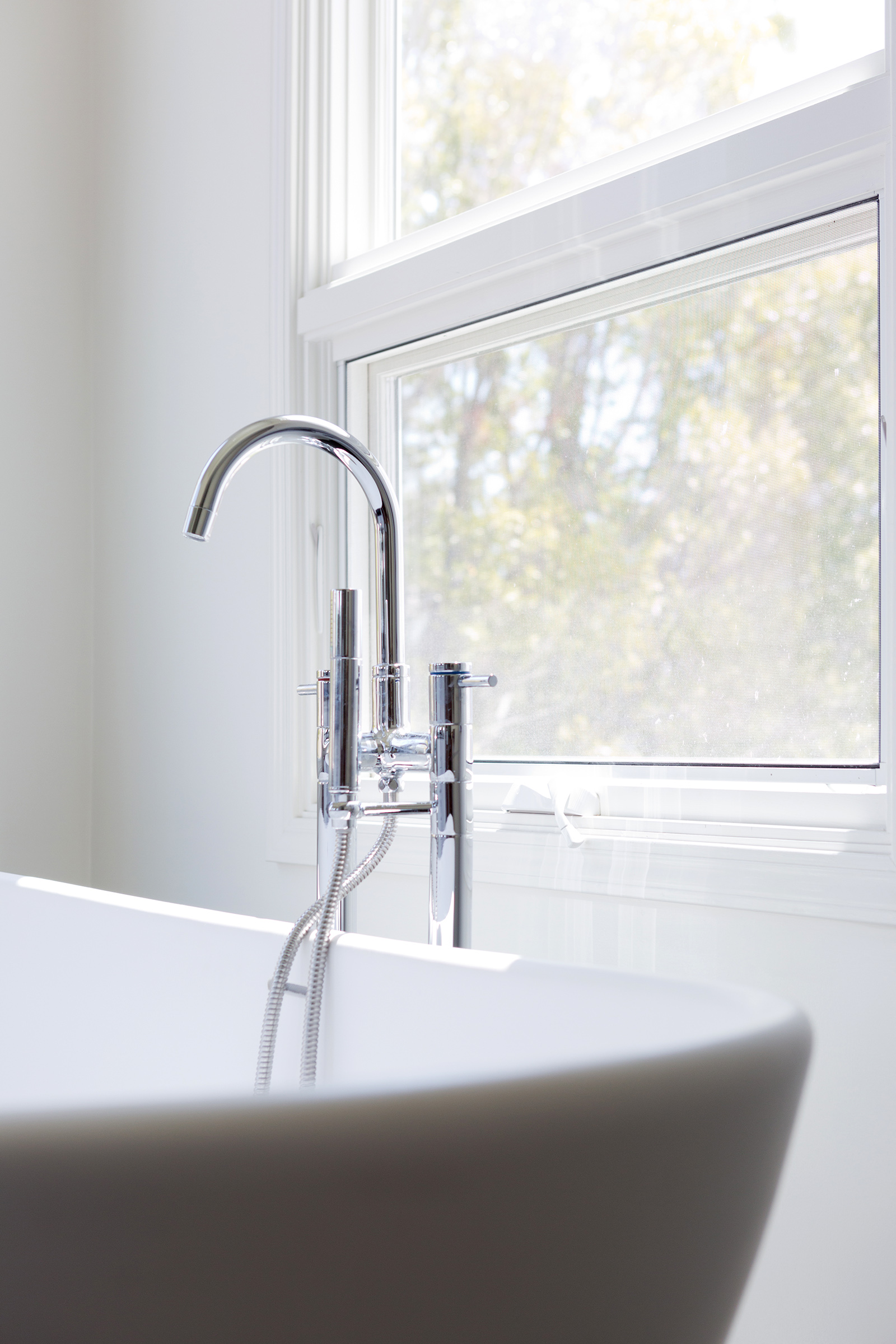
All the fixtures are a polished chrome finish to stick with the modern aesthetic.
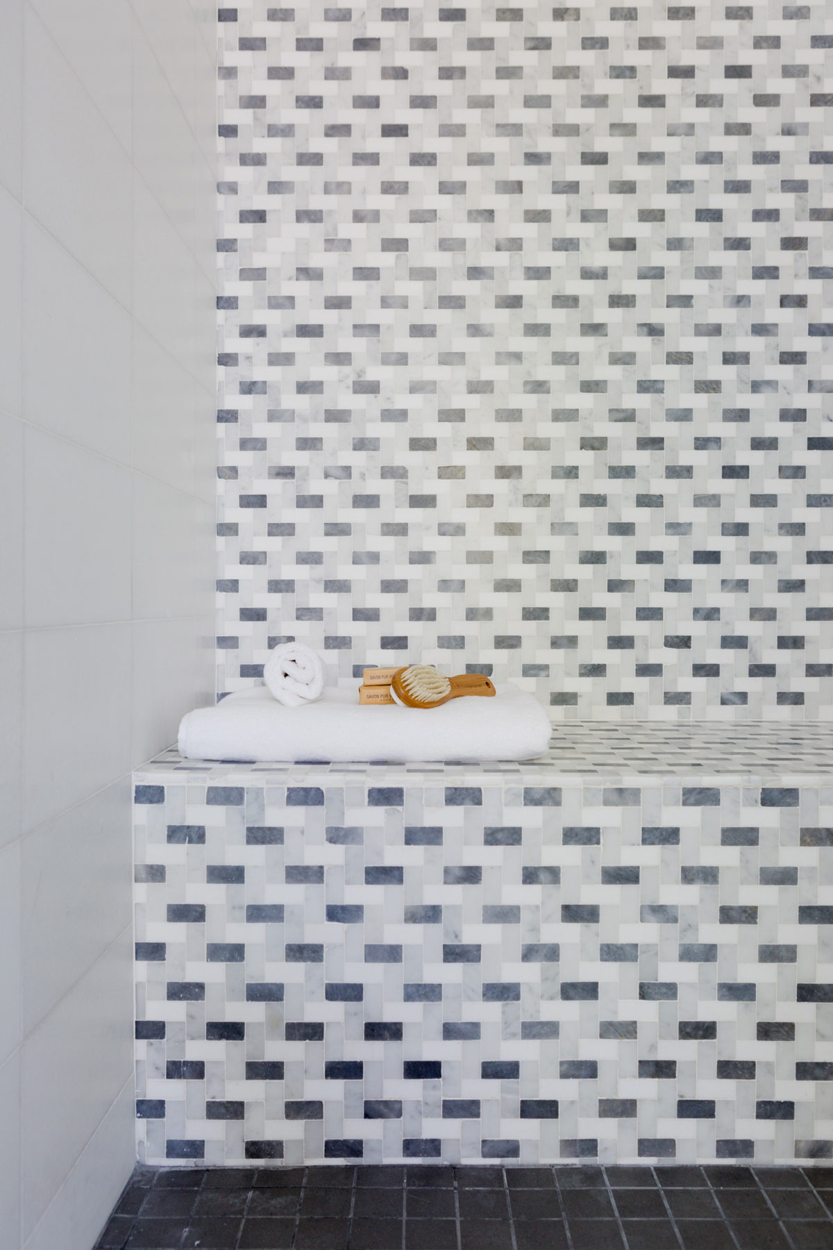
The stone mosaic included a combination of slate, marble & thassos.

Details are everything! We used the same stone mosaic in the shower nook, framed in white thassos.
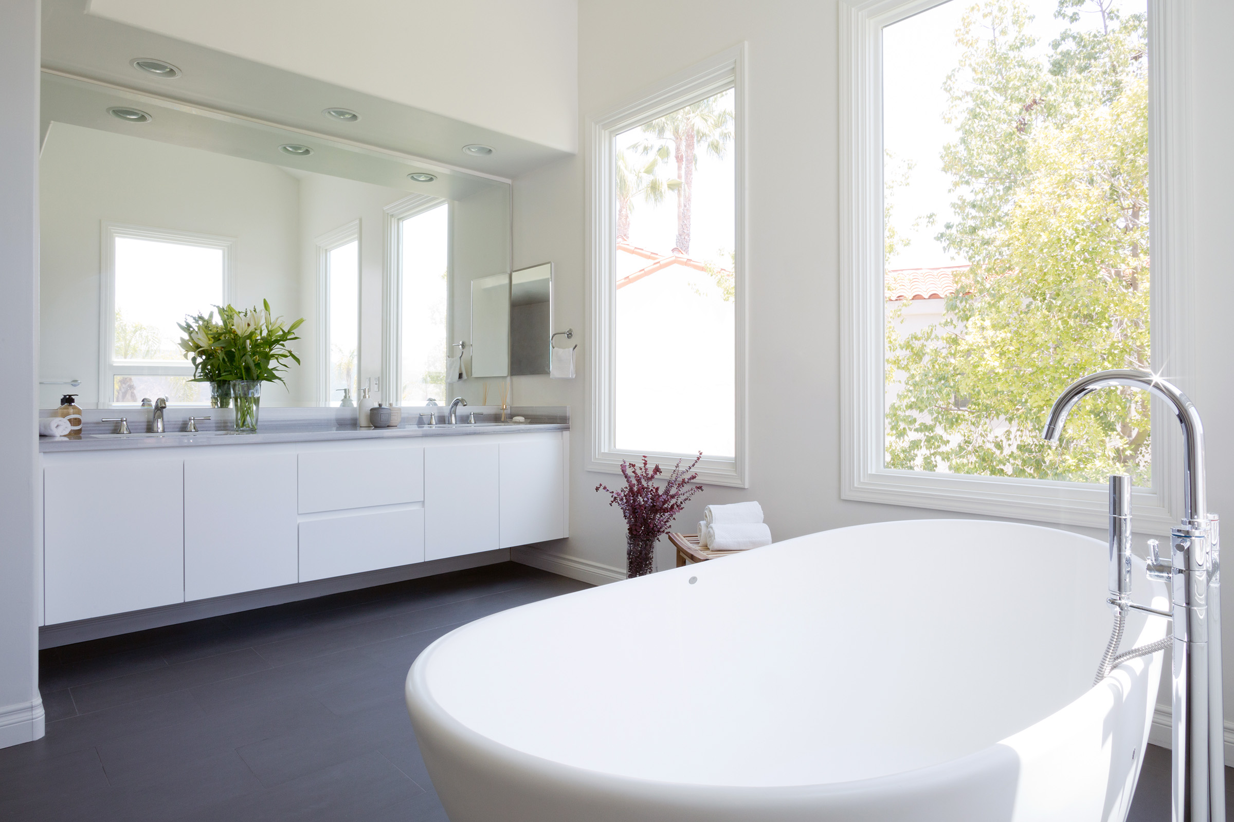
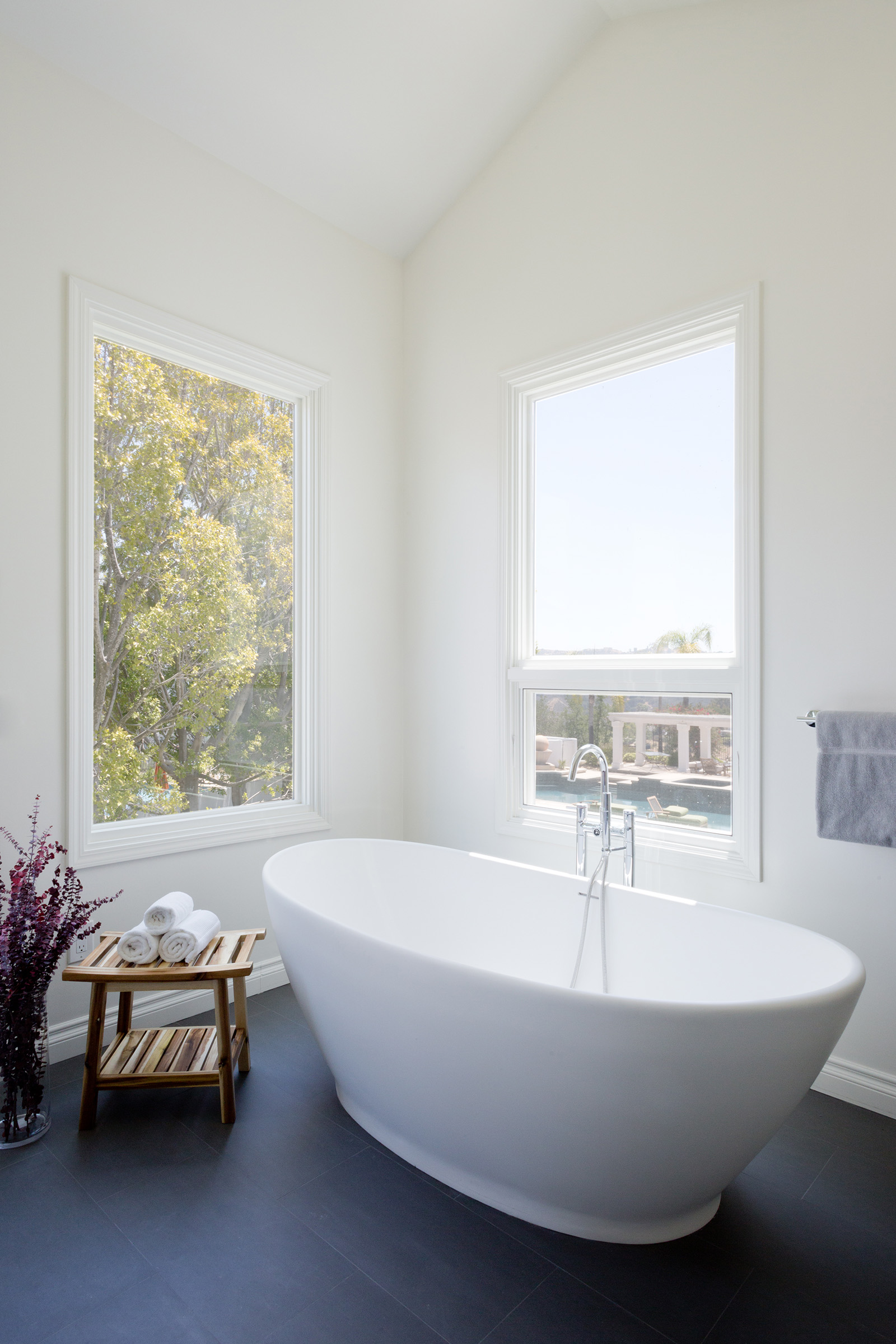
One of my favorite features of this bathroom is the TUB!!! How beautiful are free-standing bathtubs? It is more like a sculpture than anything (although fully functional) and it is the epitome of modern design. This bathroom has incredible views on a very private property so the client wanted to embrace it and leave the windows uncovered:

This shot really shows off how large this space is and how the tub is the star of the show.
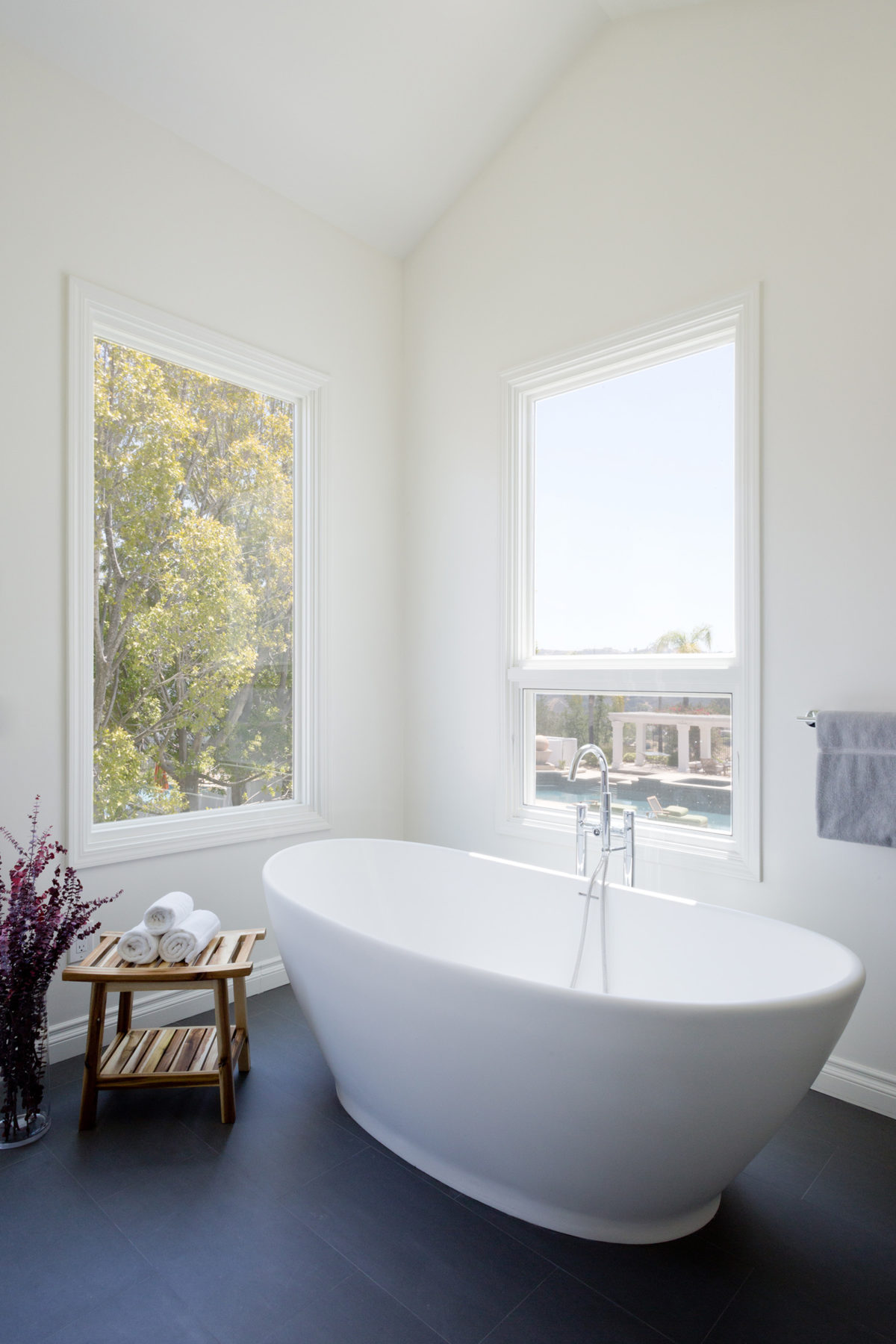
Seriously the views from this tub. Killer!
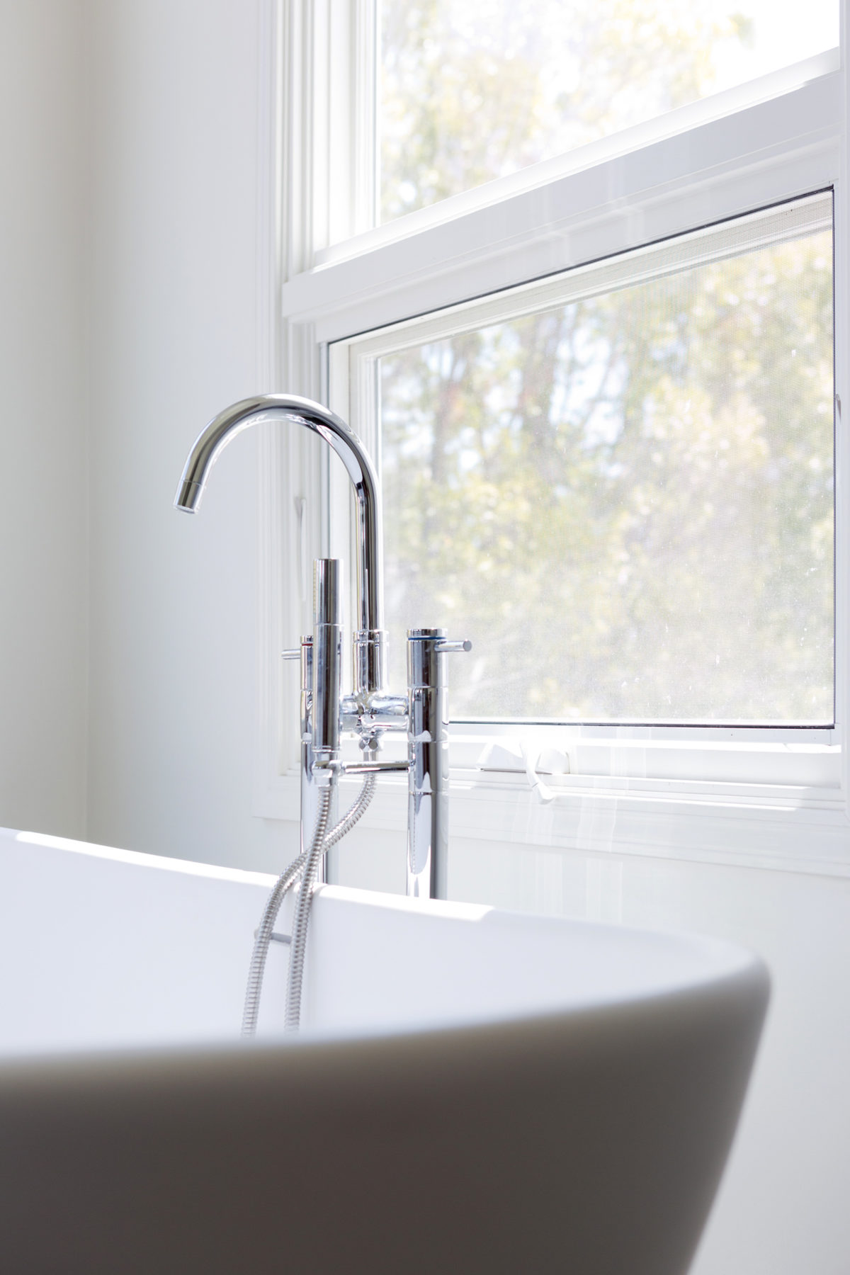
Close up of the polished chrome tub filler.
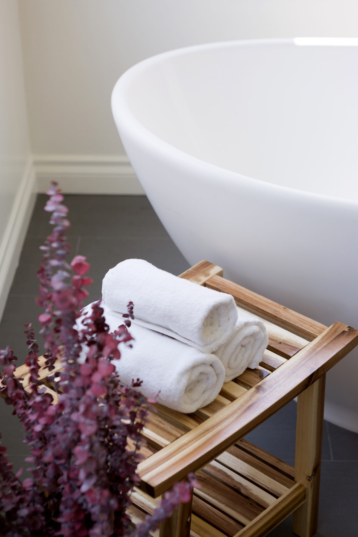
Every free-standing tub needs a side table to hold towels, soap and other necessities. I love this teak stool we used here.
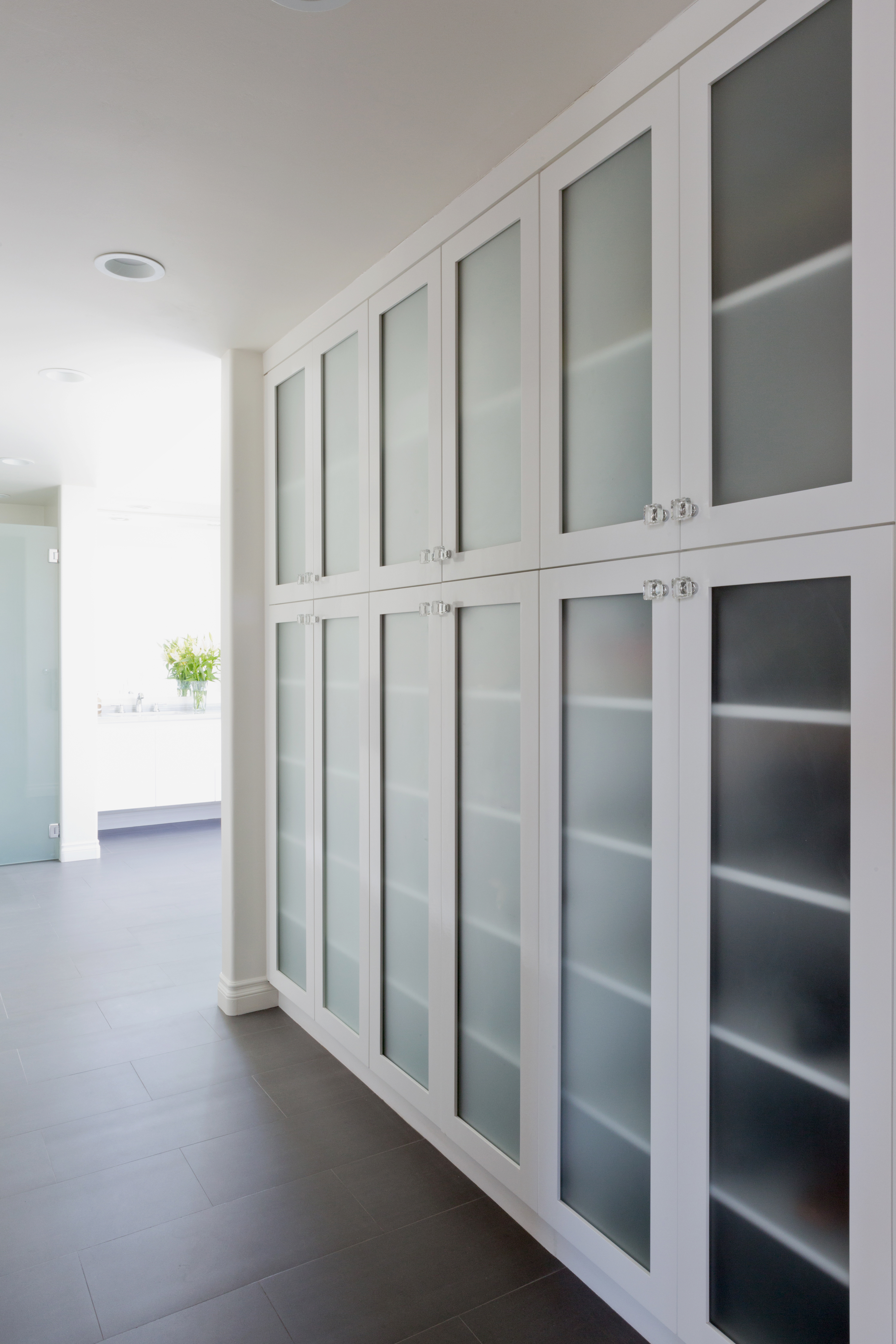
Lastly, this room needed some storage space – for shoes, purses and other bathroom basics. We covered up an existing window in the hallway leading to the bathroom and added a closet with frosted glass doors and feminine lucite knobs. We also created a private room for the toilet that hid some extra storage shelves as well:
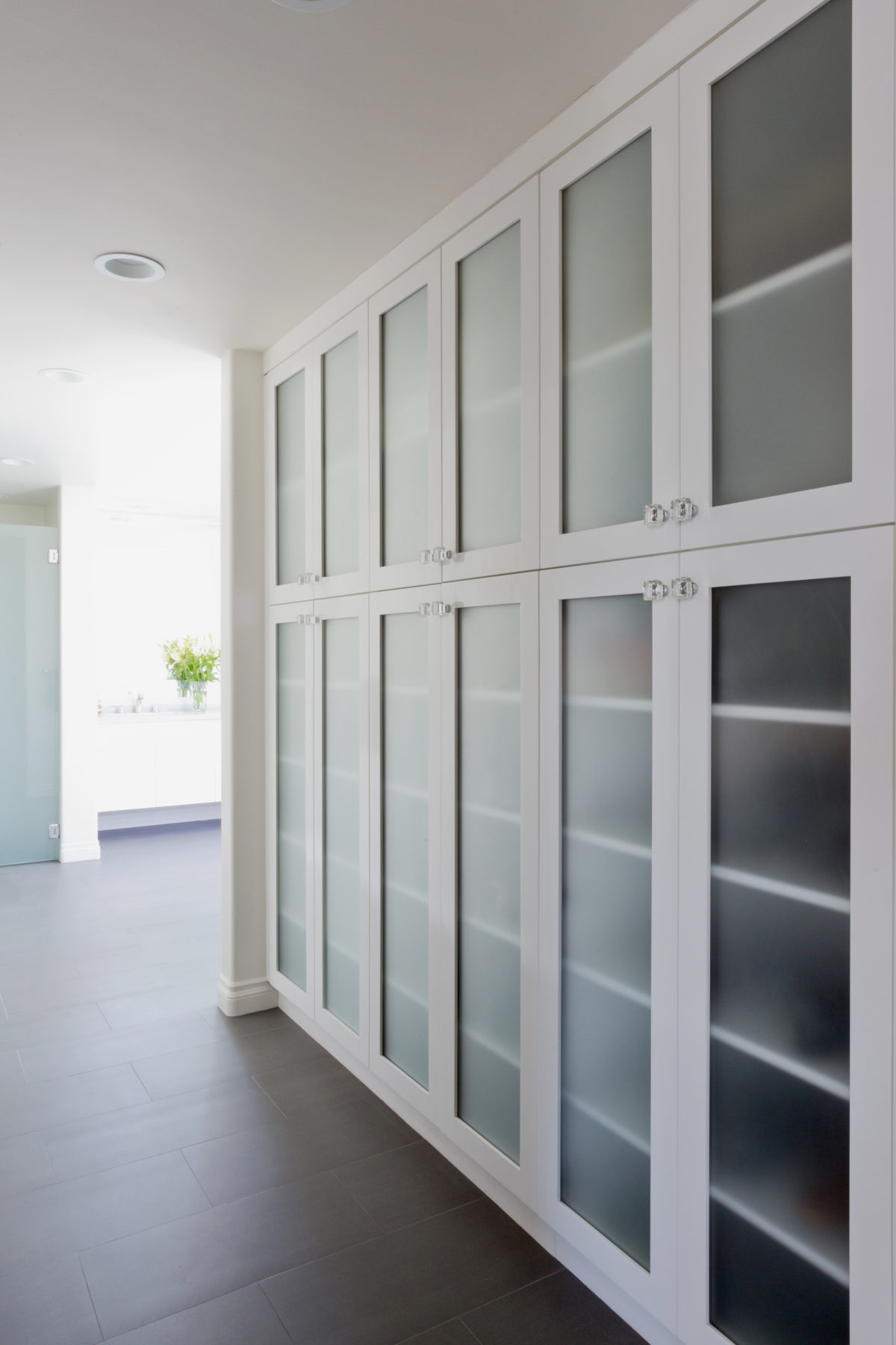
The frosted glass closet doors continue to make the space feel light while providing some privacy as to what is being stored inside.
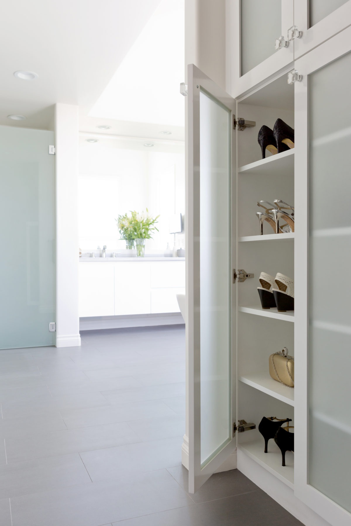
Every girl’s dream. Shoes for days!
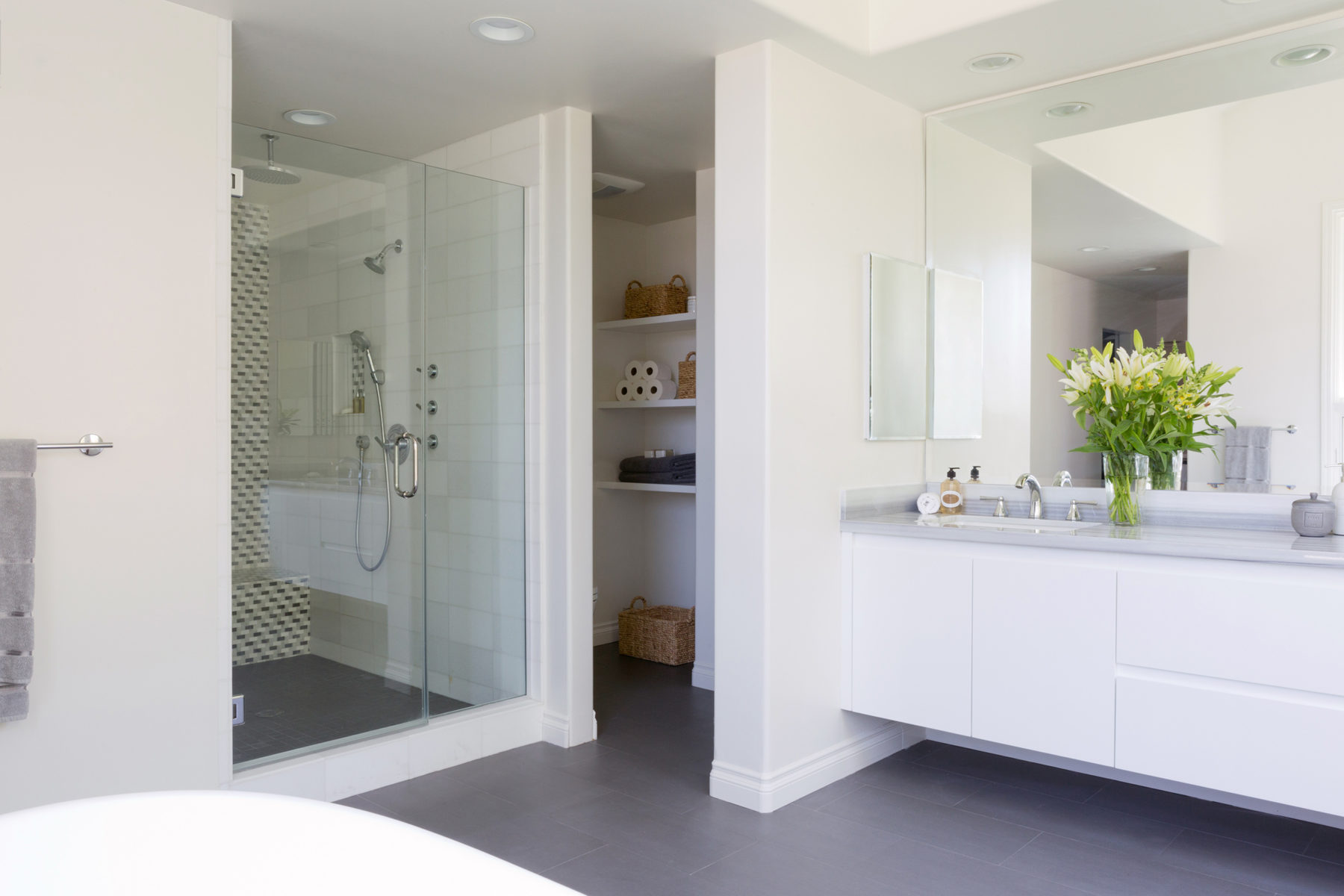
Between the shower & the vanity, we created a small room with another frosted glass door for the toilet and additional storage.
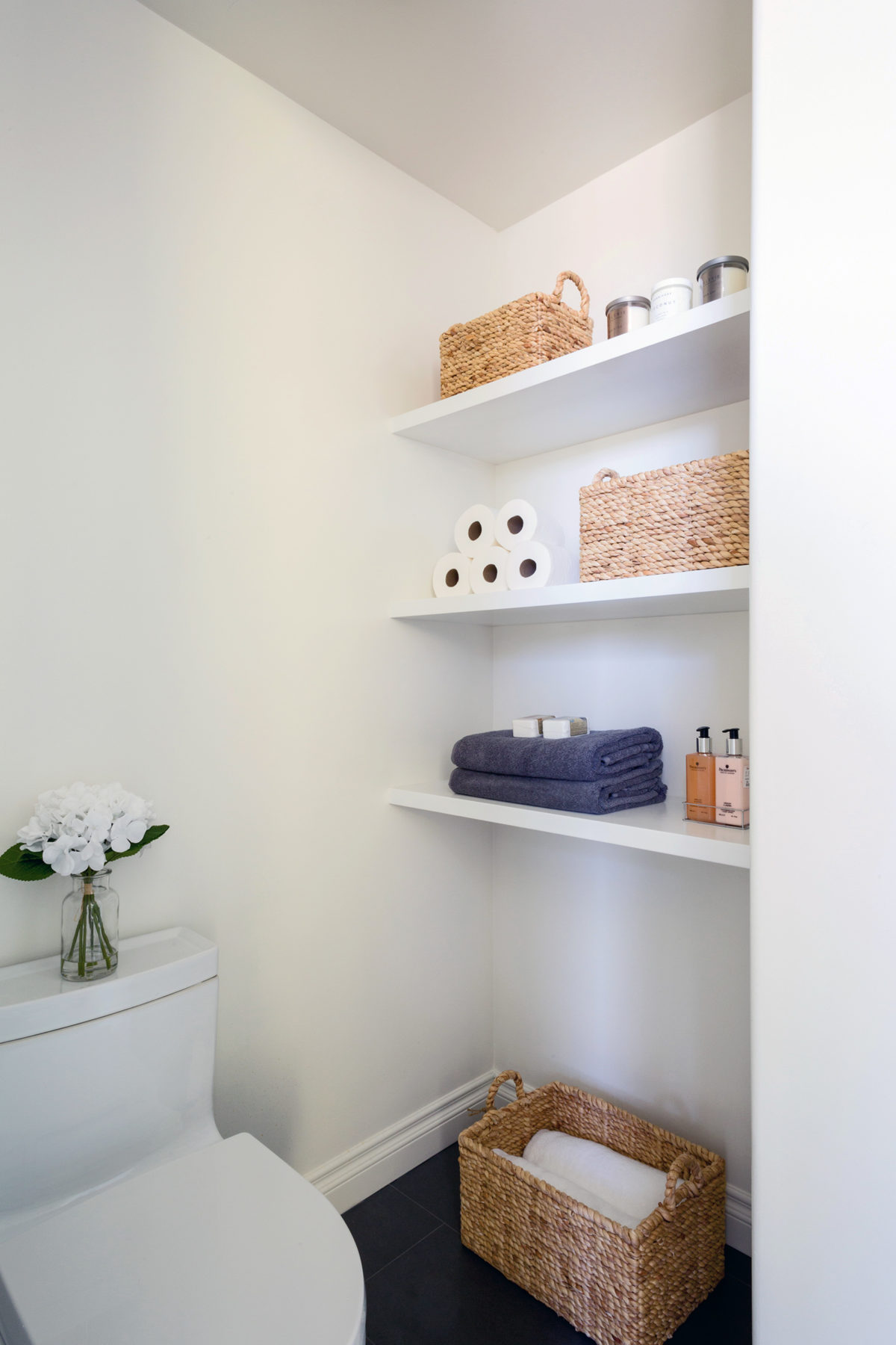
These shelves provide great space for extra toilet paper, towels, soap, etc.
Everyone involved was really pleased on how this room turned out, which is the best case scenario when re-designing someone’s home. We really transformed an extremely outdated space to reflect the client’s more modern taste and were able to keep function in mind.
To check out the rest of my current portfolio, click here.
See you soon! xo, AE (more…)