Nov 23, 2016
As a tribute to the upcoming Thanksgiving feast, today’s post will focus on the dining room. I usually travel to the east coast to be with my family on this holiday, but things were too crazy here this year, what with the house in shambles and moving out of our townhouse any day (I also would be dreading taking my 22 month old on a 5 hour flight, so am lucky I was able to get out of it). It feels less “thanksgiving-y” in LA than on the east coast, and without all the stress of travelling, I keep forgetting that its coming up tomorrow! But when I went to see the progress on the house today, I was reminded of what will someday be our formal dining room and I got excited all over again.
This house has a formal dining room – a REAL dining room – not just a nook off somewhere near the kitchen (although we have one of those too). This means I am officially a grown up and will have to figure out how to cook meals and host guests in the near future. Here are some progress pics of the house as it is today:

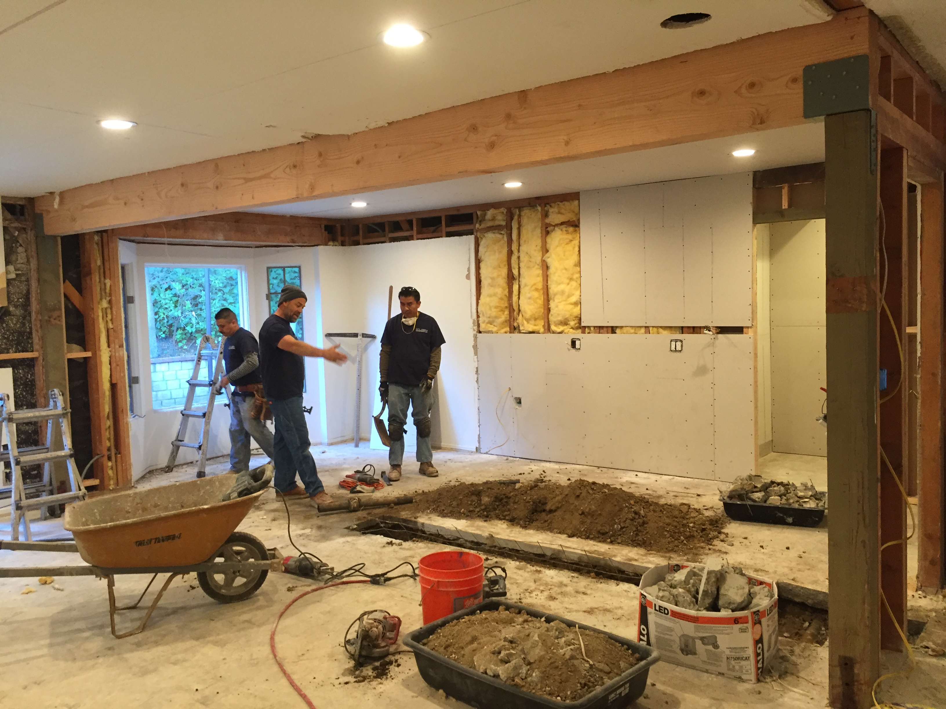
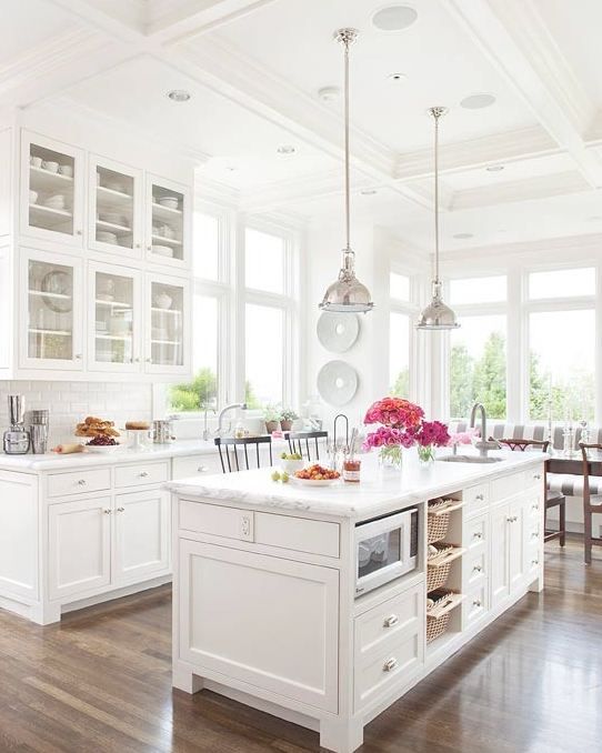
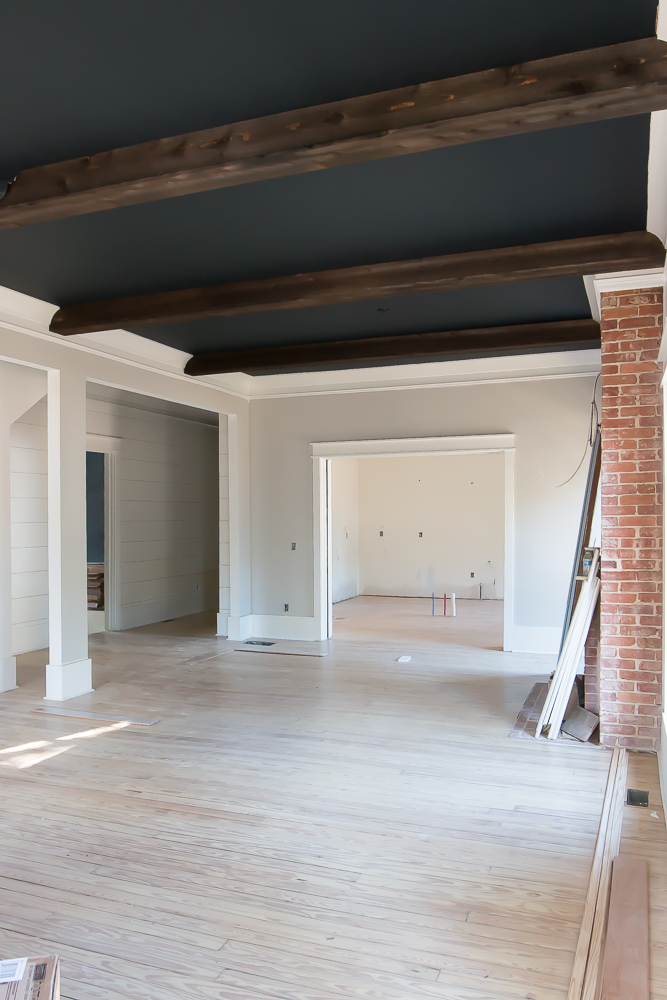
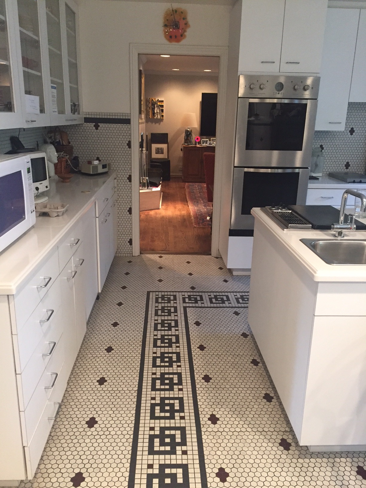
This is the kitchen. Say Hi to our new beam!
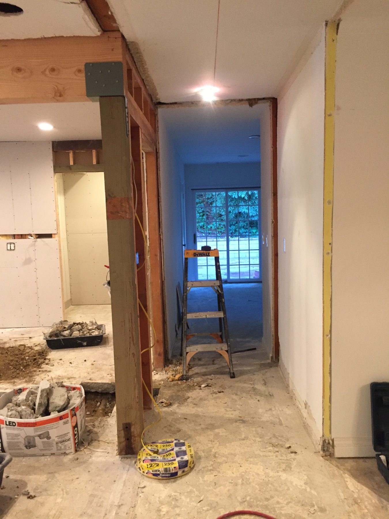
This is the walkway to the office and mudroom past the kitchen.
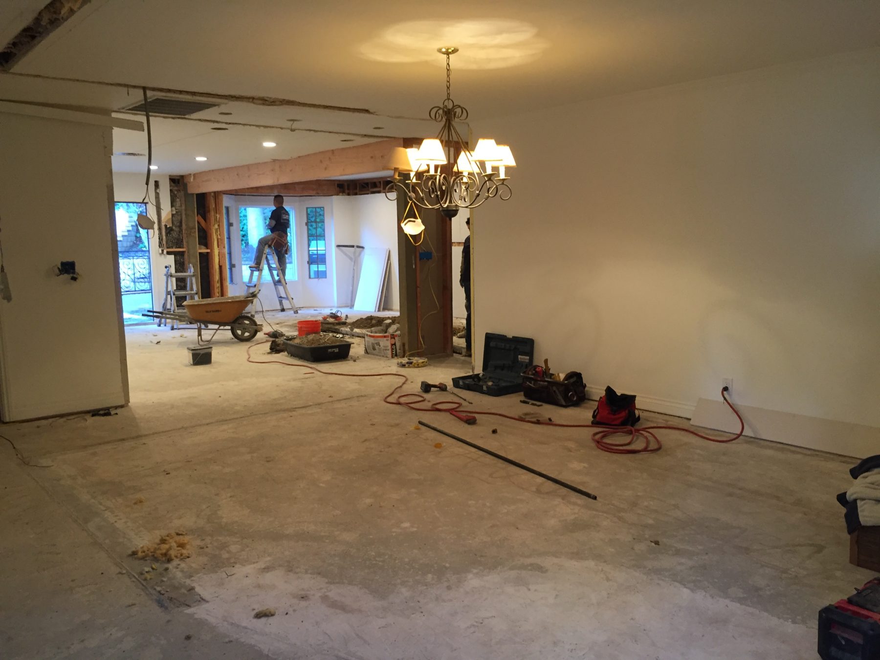
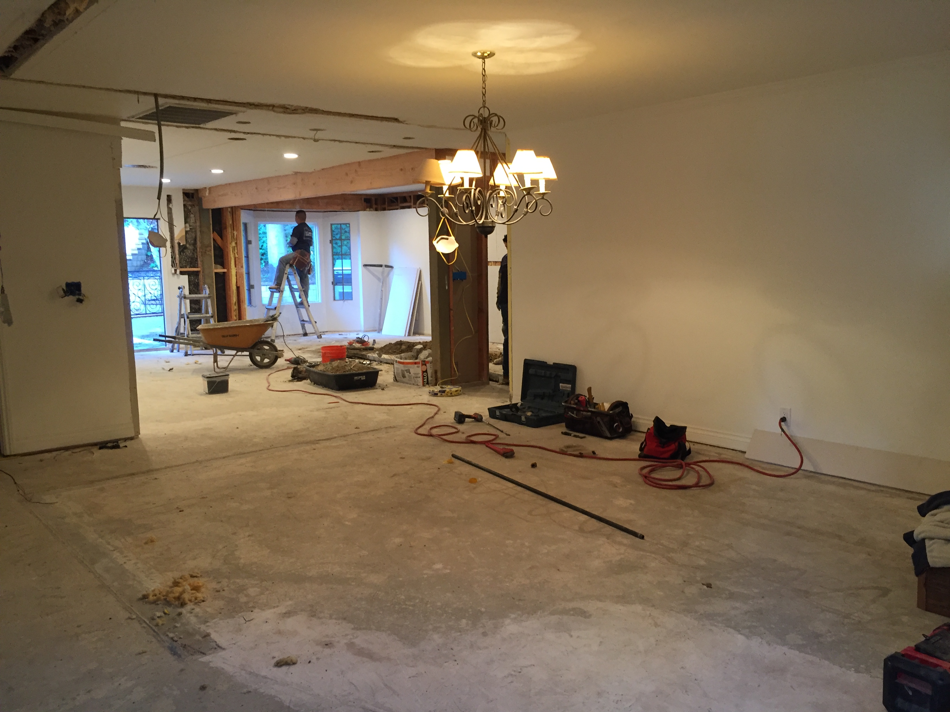
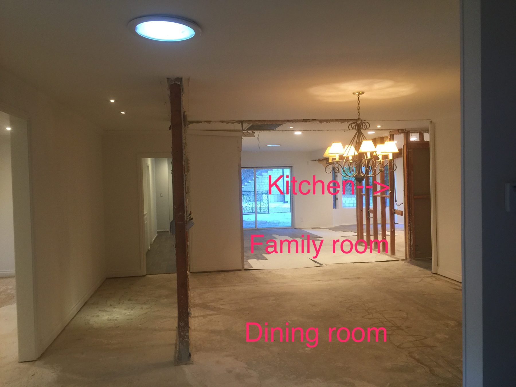
This is the dining room looking into the kitchen/family room.
Things are moving so fast! The house feels unbelievably open and I can’t wait to start seeing things built.
So the dining room is the first room that you see when you walk into the house. It is very open and you walk right through it to get to the kitchen/family room. At first I thought that was odd, but then I thought it would be a great opportunity to make a welcoming yet exciting space. I have had a few flashes of visions for this space, but figured I might as well start honing in on them and getting this space sorted out because otherwise people will walk into my house and be immediately greeted by an empty room.
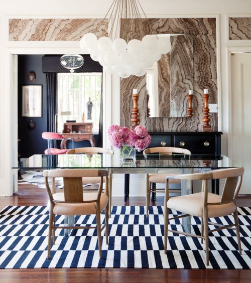
I am planning to keep this room somewhat light, as in no dark or black walls (will be dong that in Brady’s room – stay tuned). I do think it would be nice to add some soft wallpaper to this room to define it as its own, like in this Southampton dining room by Tamara Magel:
I love that this room is supposed to be “kid-friendly” according to the article in My Domaine I read. My kid would DESTROY those chairs. However I do like the grasscloth walls, it gives the room some glam and warmth.
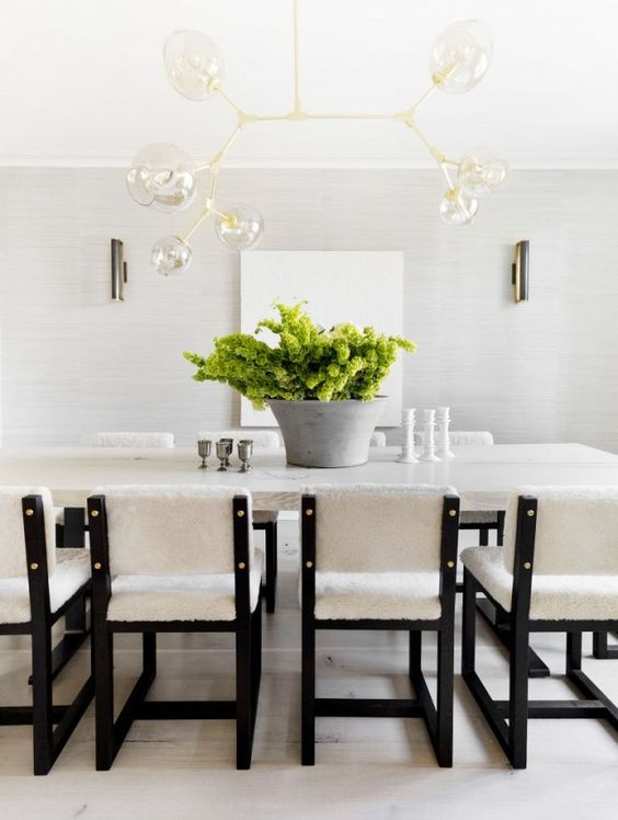
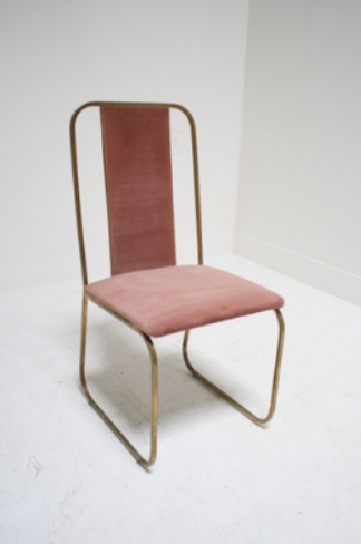
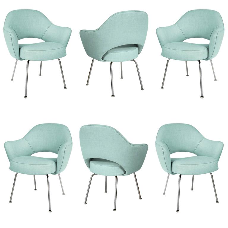
I also have been really into the idea of using vintage chairs for this room:
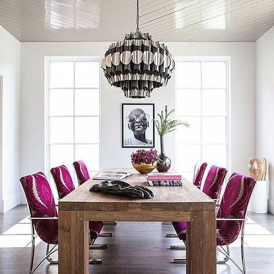
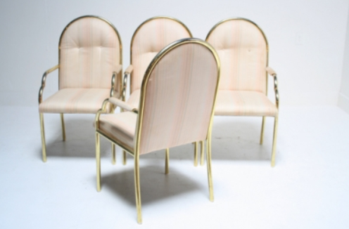
I LOVE both these dining rooms. They really bring the wow factor – mostly by lighting and awesome chairs. I am thinking definitely vintage in this room and a to-die-for fabric to reupholster. Sometimes I look around on Scout Design (based in Dallas) because they have awesome vintage finds at unbelievably low prices. Check out these 80’s brass chairs that would look so amazing in new upholstery:
When I am off in a fantasy land, pretending I am one of my clients, I take a peek on 1st dibs to see what I can lust after:
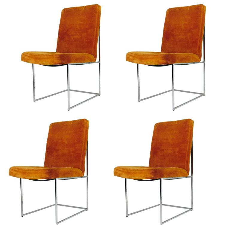
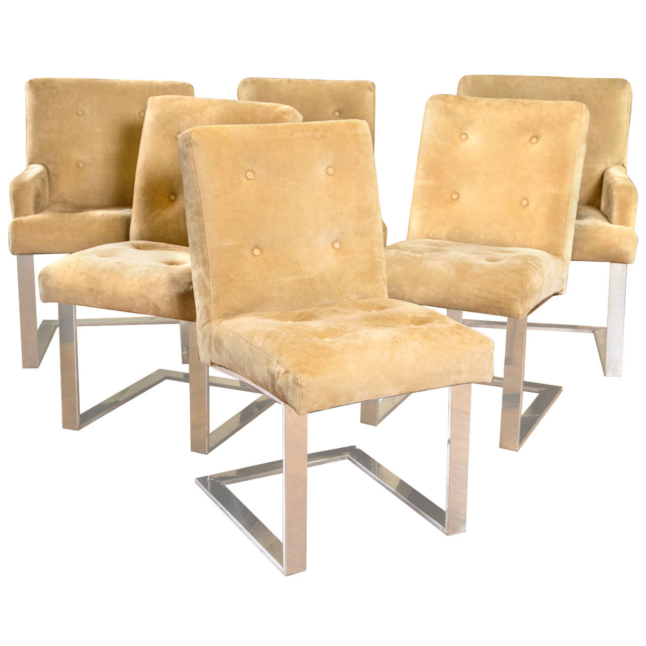
Milo Baughman, Paul Evans, Saarinen…can’t go wrong. I will probably end up scouring some flea markets with the pennies I have left after this renovation.
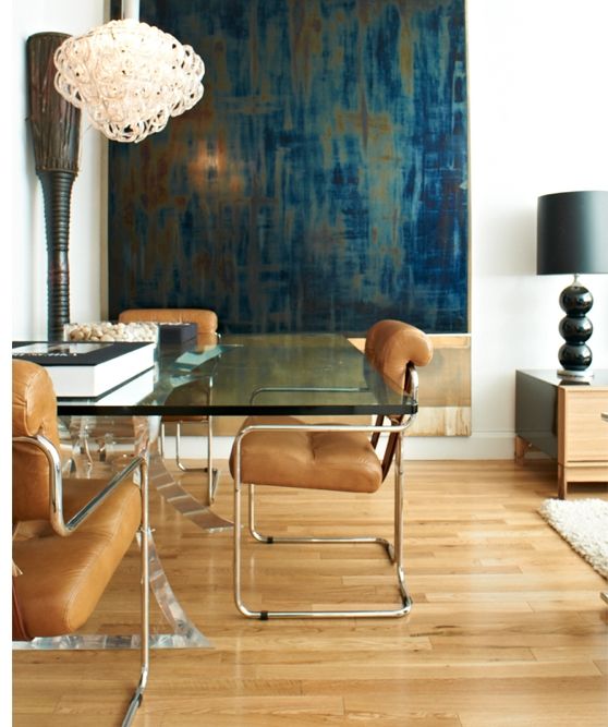
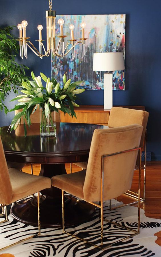
Something else I have been into lately is camel leather upholstered dining chairs. Leather is so easy to clean (my family is so messy) and the camel color is really warm – and goes well with bold colors like navy or emerald green:
Lots of vintage-y looking chairs here too. These spaces are so warm and depart from all these cool, gray tones we are seeing so much of these days. And even though I said NO WHITE furniture in my house, these white leather chairs seem easy enough to maintain and give the rooms a crisp, clean feeling:
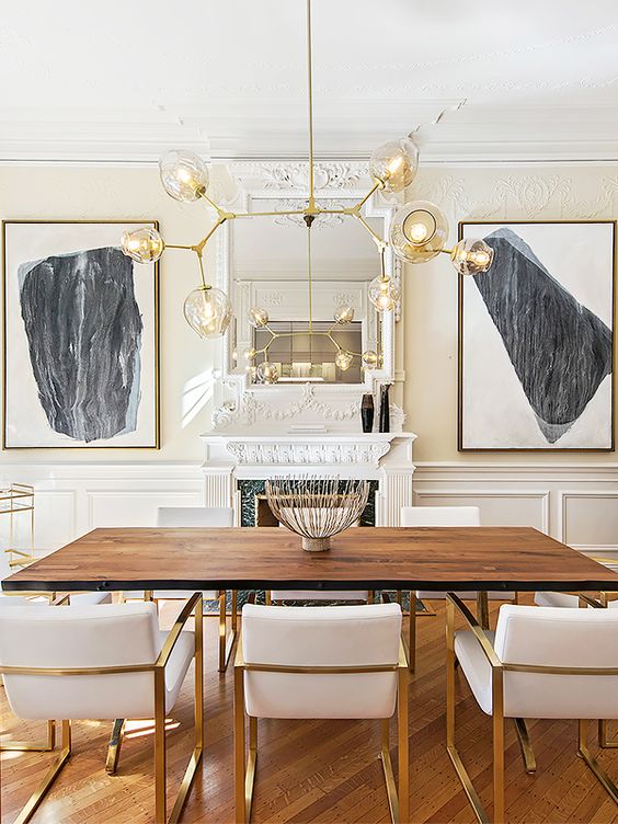
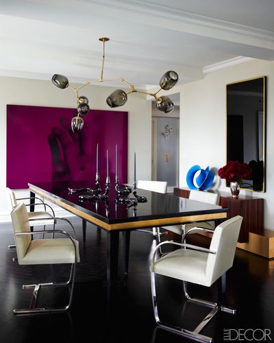
I am anti-Donald Trump but I am pro Ivanka Trump’s NYC penthouse – I have loved her dining room (above) for years. These spaces also benefit from the beautiful Lindsay Adelman light fixtures. Ugh dreamy!!
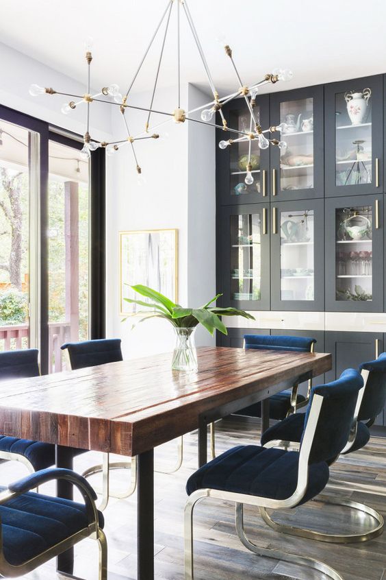
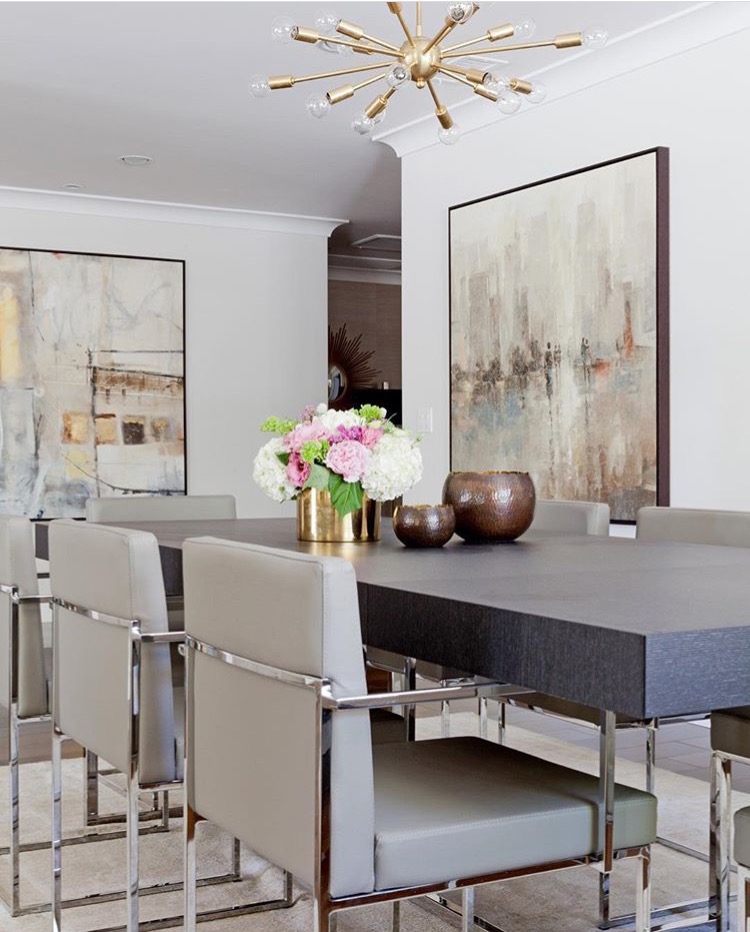
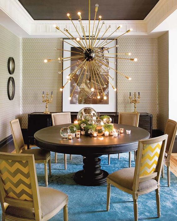
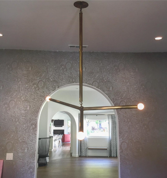
Nothing quite brings a space together like a big brass sputnik-type fixture. I will definitely be on the hunt for something jaw dropping over our table:
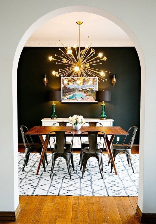
I have been lusting after this piece by Lambert et Fils (sold by twentieth design in LA). Its got the height and width to really fill a space but also feels light and airy. It also feels half vintage half modern, which is amazing:
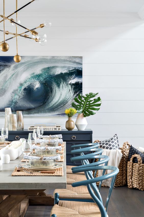
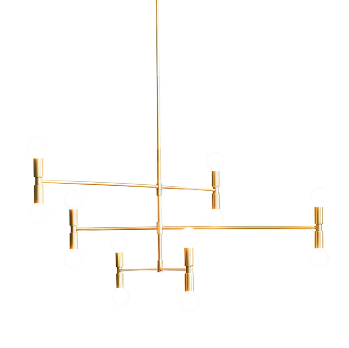 This reminds me a lot of the Apparatus arrow pendant that we just used in our Westlake dining room. Their pieces are on fire right now, so amazing!
I hope everyone enjoys their day and their feast. See you all next week! xo, AE
Nov 15, 2016
Never have I been so excited to receive pictures of partially broken down walls and a house (my house) looking like a total disaster zone. But when I got a text from my contractor with photos of what happened during day 1 of demo, I was over the moon. This house has an amazing layout but there were so many walls, it was almost hard to figure out where you were. During the open house the brokers were giving out floor plans so you understood where you were in relation to the rest of the house. It took me about 2 minutes to figure out that taking down a few of those existing walls would change everything. I prayed to the gods that there would be no load bearing walls or annoying beams in my way (will get to that later) and we laid out our game plan.
Here are some photos what the dining/kitchen area looked like before:
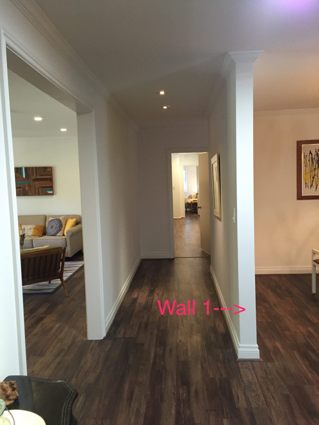
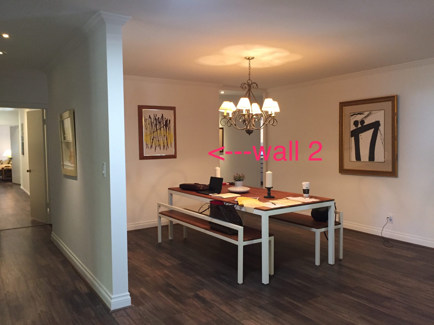
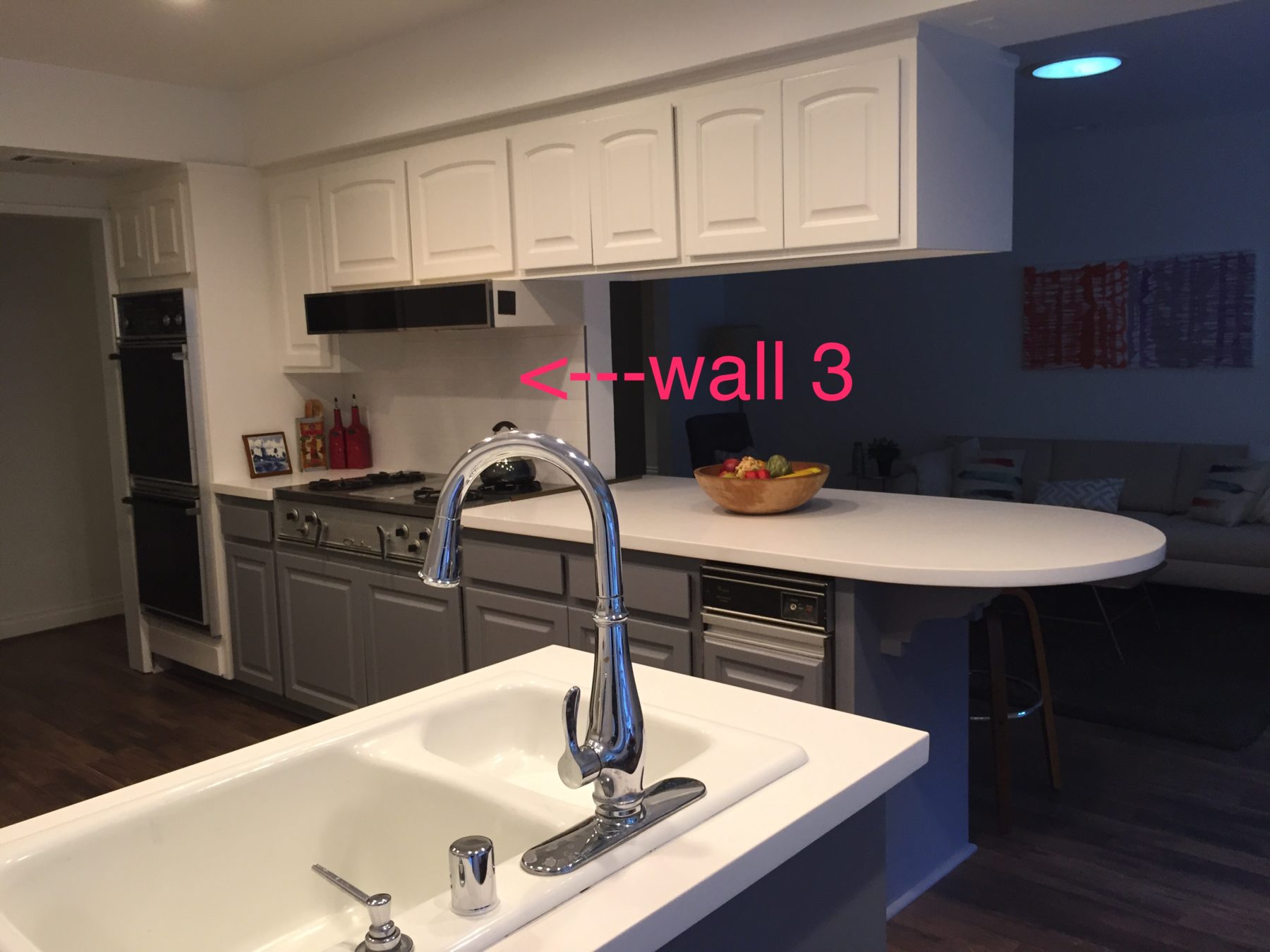
So those are the 3 walls that are coming down. Here is what it looked like after day 1 of demo:
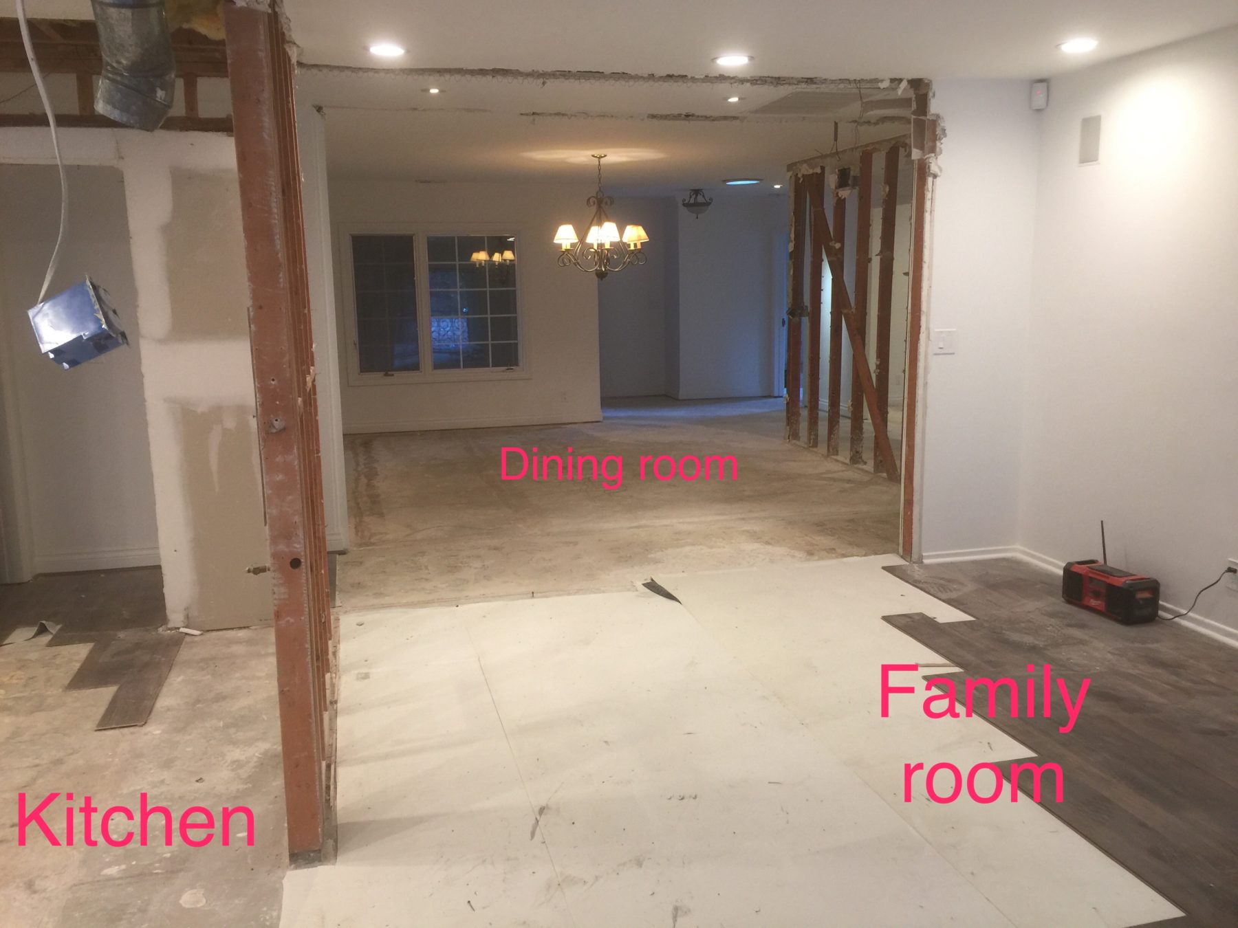
When you first walked into the house, you couldn’t see the kitchen because there were these 2 (non-load bearing) walls that created a dining room. It was so odd and ridiculous and I was jumping up and down when my contractor told me those walls served no purpose and could come down asap. Now when you walk into the house, you can see right to those big bay windows where the kitchen banquette will go in the not so distant future.
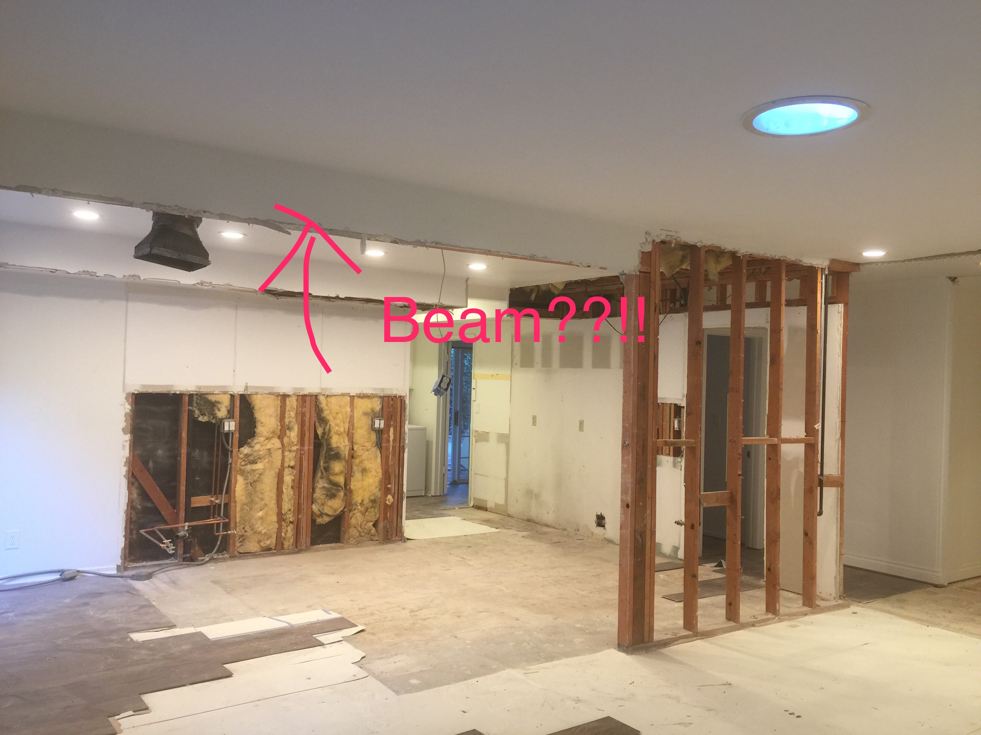
Of course, nothing ever goes smoothly in this world, and we knew we were going to encounter a problem with wall 3 (the partial wall in the kitchen). That wall is unfortunately supporting a very important beam….cue the tears. I was literally devastated about this and refused to design any sort of post or wall or structure to support this alleged “beam” until we learned more about it. Here is what we found today:

So, there it is, this hypothetical beam my contractor has been telling me during his trips into the attic (which I refused to join him in). BUTTT I did get some good news – yes we have to keep the beam but if we make the beam bigger – right now its just a 3.5″x11.5″ box covered in plywood – then we wont have to add any structural support aka an obnoxious post in the middle of my glorious kitchen! I told my contractor I was crying tears of joy and I think I freaked him out a little bit because he hasn’t been responding to my texts since then…
So having an exposed beam in the kitchen is really not a bad thing. Beams can be cool! Now I have to decide how I want the beam to look and how I want it to relate to the rest of the room. Do I want to make it a cool rustic beam? Do I want to turn it into a coffered ceiling? Do I want to paint it white and try to make it go away? To be honest, I have no idea. Let’s look at some options:
Cool, rustic, exposed beam (make it look like we uncovered something cool but really we are going to be adding it in):
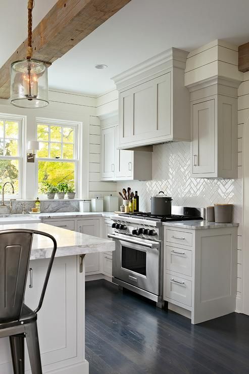
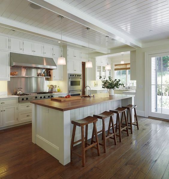
Here is a kitchen which is actually somewhat similar to what mine will look like – soft gray shaker style cabinets – but mine will be more modern with less ornate moldings and without the shiplap detail. These rustic beams are perfect in this space, they are soft and they work well with the “farmhouse” style of the room. I like how they contrast with the dark floors too.
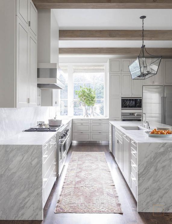
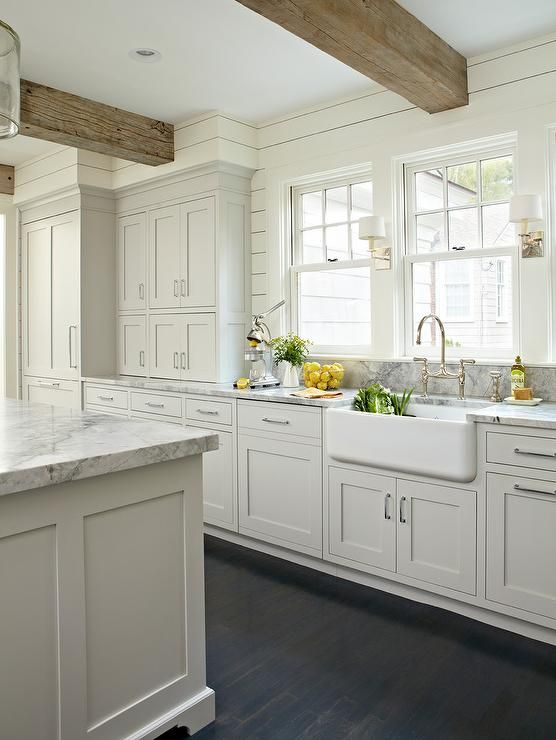
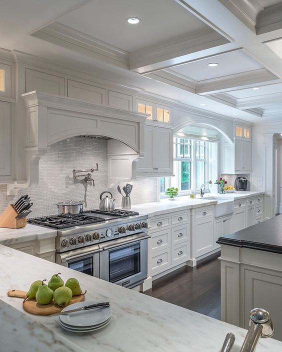
This kitchen is WOW. I mean, the marble waterfall edges are to die for. But lets focus on the beams here – this is a fairly modern kitchen, and although the beams are a somewhat washed out wood, the lines are super clean and they only enhance the feeling of the space. They appear to be slightly lighter than the floors which I think works nicely. This may be a good inspiration image for our kitchen.
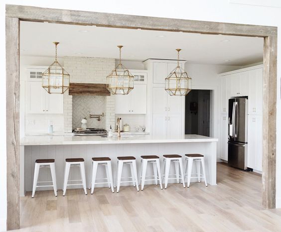
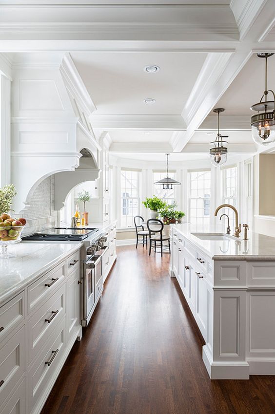
 This makes me want to do an all white kitchen ASAP. How amazing is that framed opening with the rustic wood?? Its stunning with the all white and brass kitchen. I love the idea of bringing the beam down and wrapping it around like a frame, but I’m not sure I have the room to cut away at the open space I have (plus we just opened it all up so why would I close it back up?). It does make me think about how to incorporate the beam into something bigger though.
Make it disappear (paint it white):
Painting it white and adding some pretty architectural details is a great option. That way it isn’t stealing the show but its also adding some character to the space. Here is an example of a white beam with very nice details that gives the space a really sophisticated feeling:
That is really some beautiful work. The paneled ceiling doesn’t hurt the overall look, but I like how the beams have an interesting yet subtle design to them.
A lot of the time beams are incorporated into an overall ceiling design, such as a coffered ceiling. I love a coffered ceiling, especially in a room with high ceilings and lots of light:
 These ceilings often lend themselves to a more traditional space, with elaborate moldings and details. Considering we have 8’2″ ceilings and most of the house has NO crown molding, this doesn’t seem like an option for me. Not to mention, there is a lot of cost involved with doing all this detailing which likely wont fit in our already exploding budget.
The opposite: make it dark
To be honest, I’m not sure I would have the guts to make my beams and ceiling dark like Brittany, of the blog Addison’s Wonderland (please check it out – she is restoring/renovating a 1905 house and it is unbelievable), is doing in her home. I will say that it is stunning and magical and every other complimentary word I can think of.
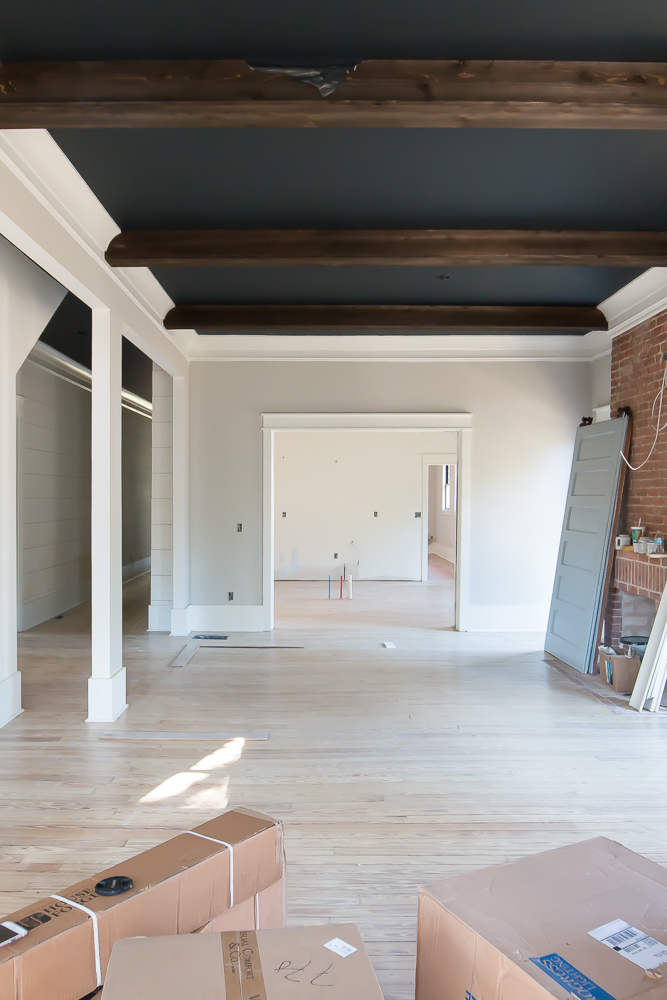
Her floors are really light, like a white-washed wood, which maybe helps balance it all out, not to mention her 12′ ceilings! I have to say since I started reading her blog it has definitely opened my eyes to the endless options of finishes that can go into a house. I am yet to make a final decision on flooring, and hers is certainly on my mind…
More conversations will have to be had about the parameters of the beam, what size it needs to be etc, before we can make a final decision, but I think we will figure really nice out and my hopes is it will only add to the beautiful open space we are creating. More to come soon! xo, AE
Nov 8, 2016
Things are moving along over here at project #aedesignsherown and we are slated to start demo on MONDAY YAY!!!! I cannot wait to see this place get torn apart 🙂 The transformation is going to be really something. I have been plugging away at finalizing my designs, picking finishes etc and trying really really hard not to change my mind a million times. The problem is I am endlessly finding new images of spaces that inspire me to come up with a new design, so I am trying my best to go with my gut and stick with what I like the first time around, because that usually works out best for me.
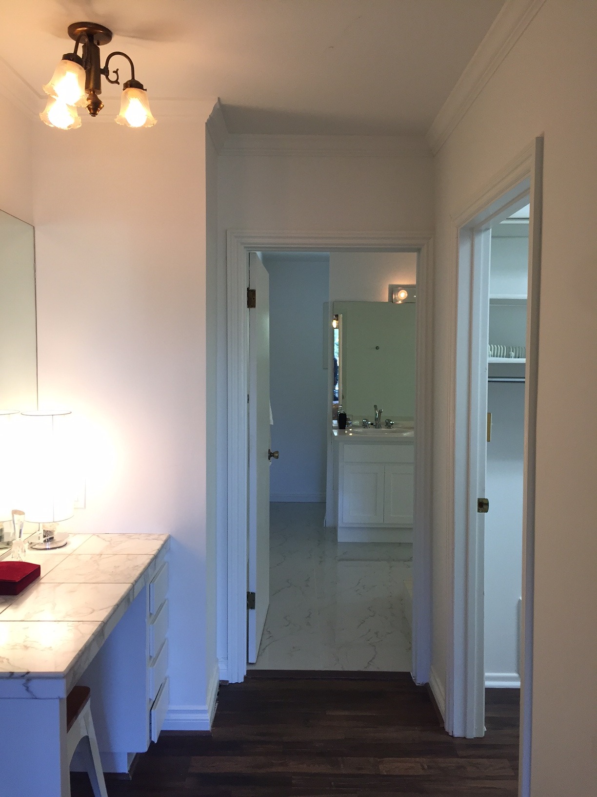
I have been focusing a lot of time on master bath because that is a) a seriously important room b) the second biggest renovation after the kitchen. Here are some before shots – brace yourself:
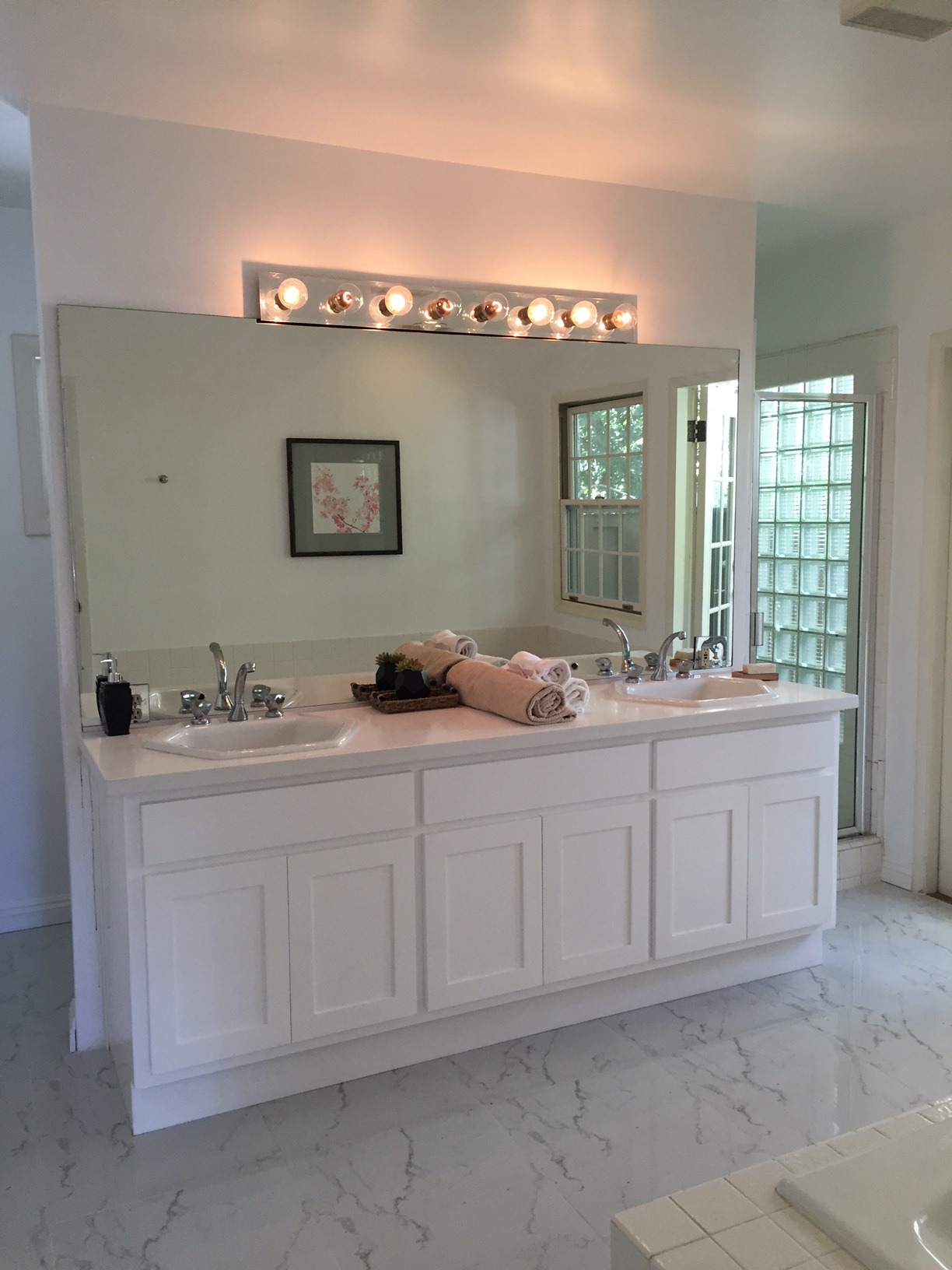
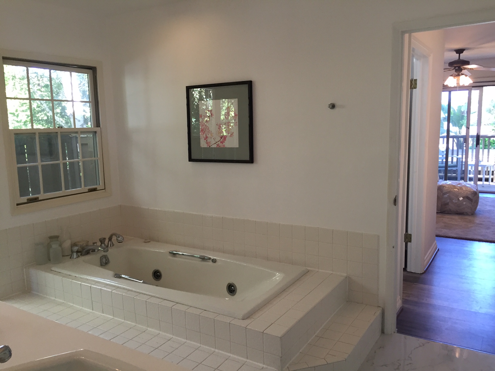
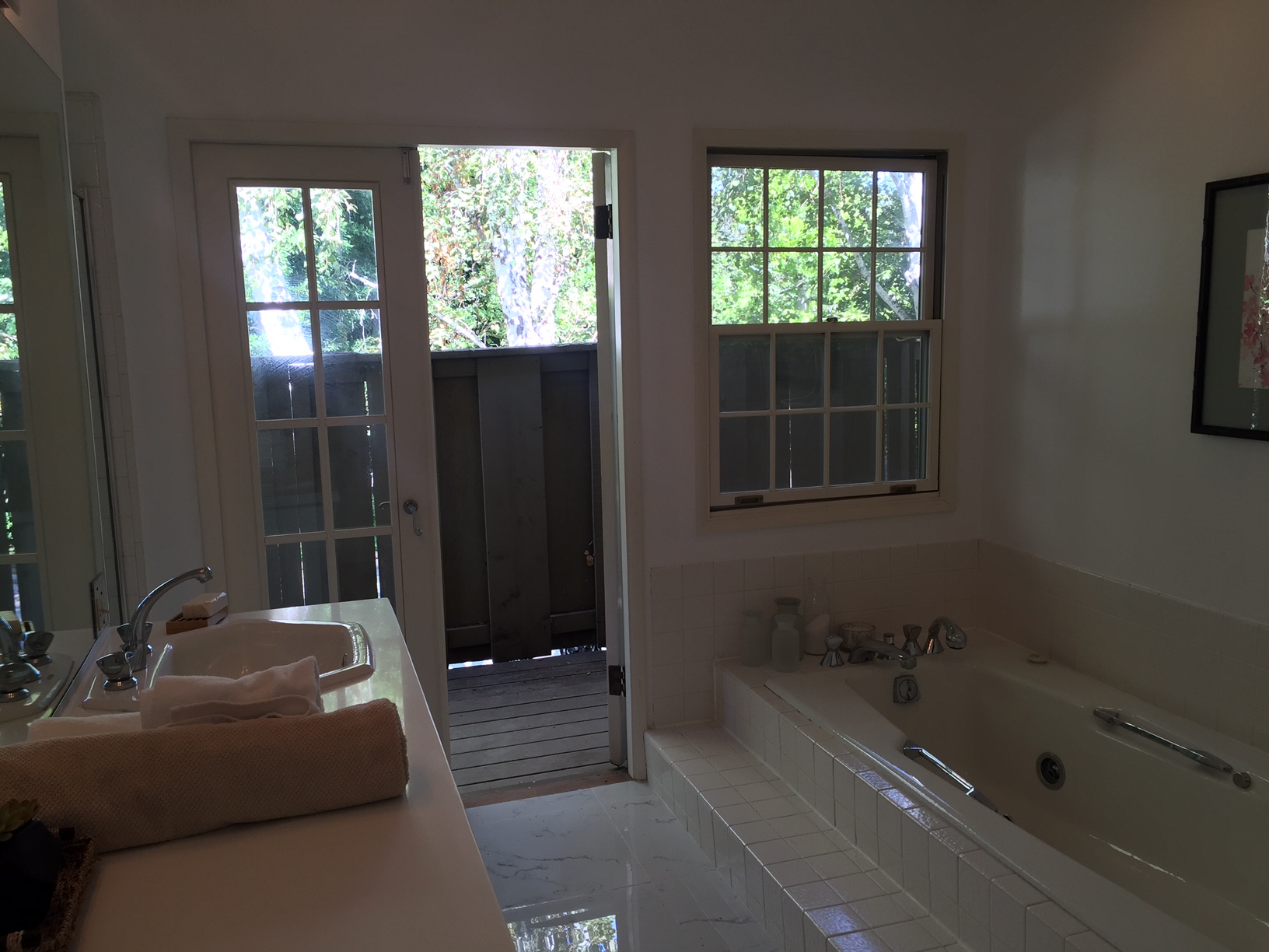
Obviously, we are keeping nothing. We are changing around the layout because the giant tub and vanity in the middle of the room are ridiculous. We are even losing the french doors (and the balcony it leads to) as well as the transom windows (so 80s).
I wasn’t sure which direction I was going to go in at all for this room, I didn’t have a vision for it like I did the kitchen. So I decided to start tile shopping for some inspiration and I came across this magnificent beauty:
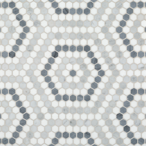
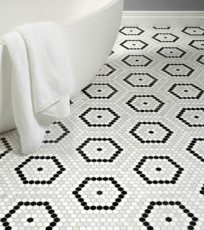
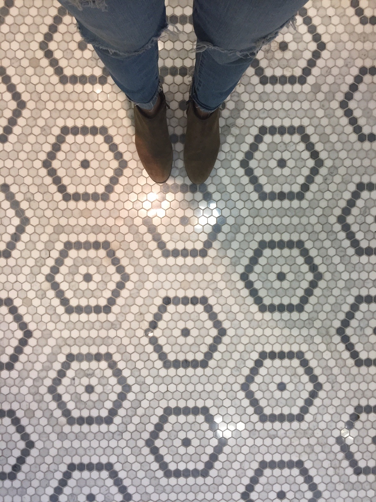
This is a marble mosaic from Artistic Tile and I saw it installed in a tile showroom near my current house. I fell in love with it immediately (the grey stones, not the black and white, although I love that too!). Its different and unique but also feels classic and like I wont get sick of it anytime soon. It also reminds me a lot of my grandmother, who loved her penny tile and had it all over her kitchen and laundry room:
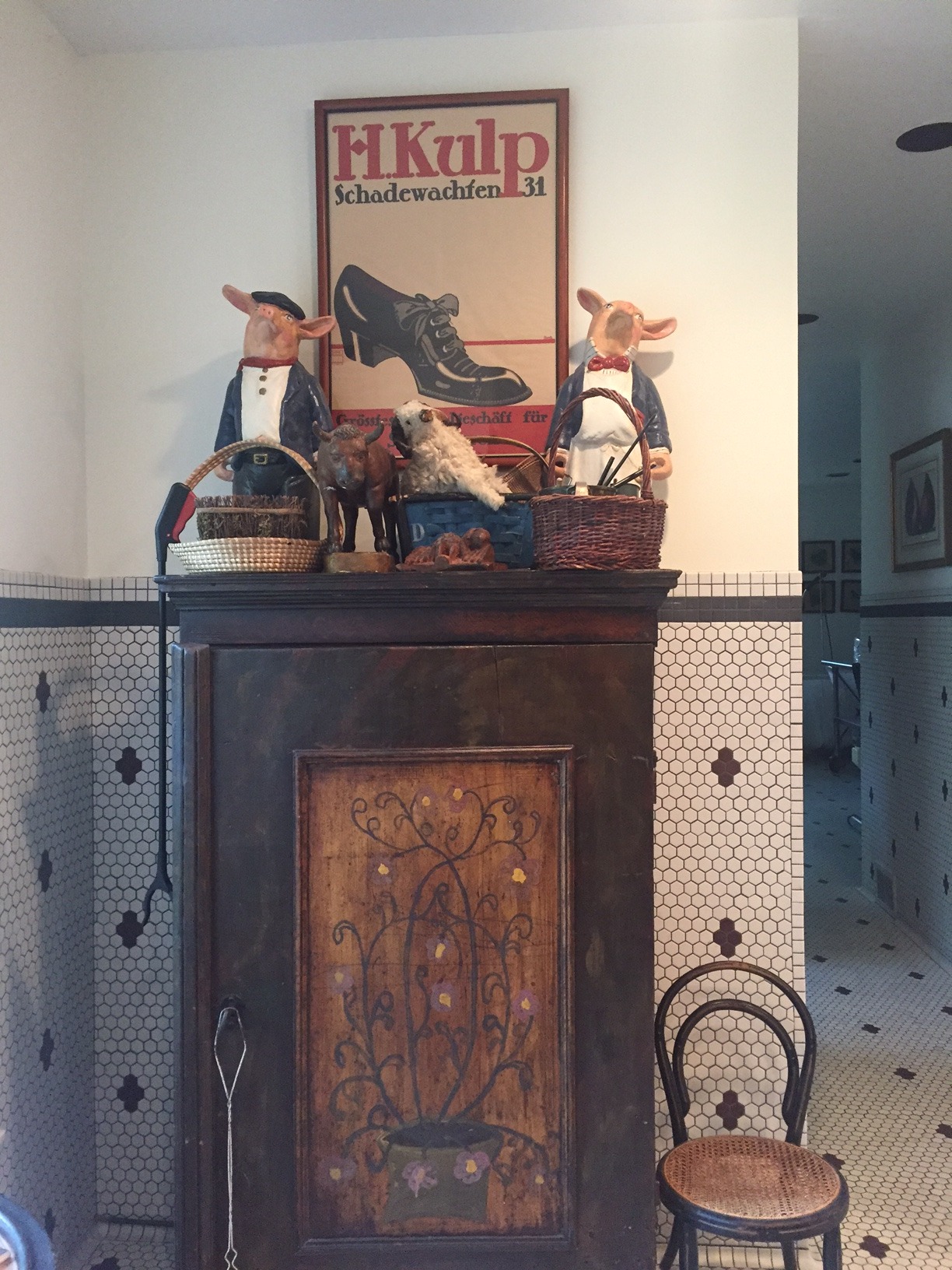
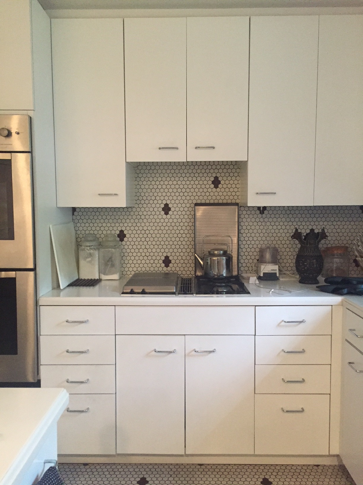
Wasn’t her kitchen fab? I love the all white everything with those crazy tiles.
Once I decided on that tile for the floors, it made everything pretty easy. When you have such a bold pattern somewhere in the room, its best to balance it out with complimentary, subdued pieces. I found a lot of inspirational bathroom designs that have the serene yet interesting vibe I am looking to accomplish:
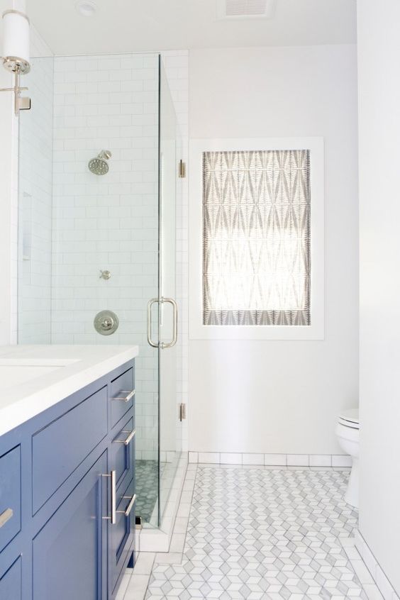
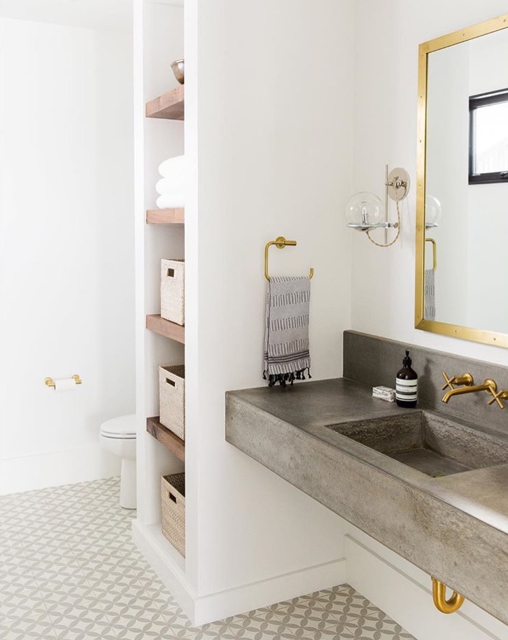
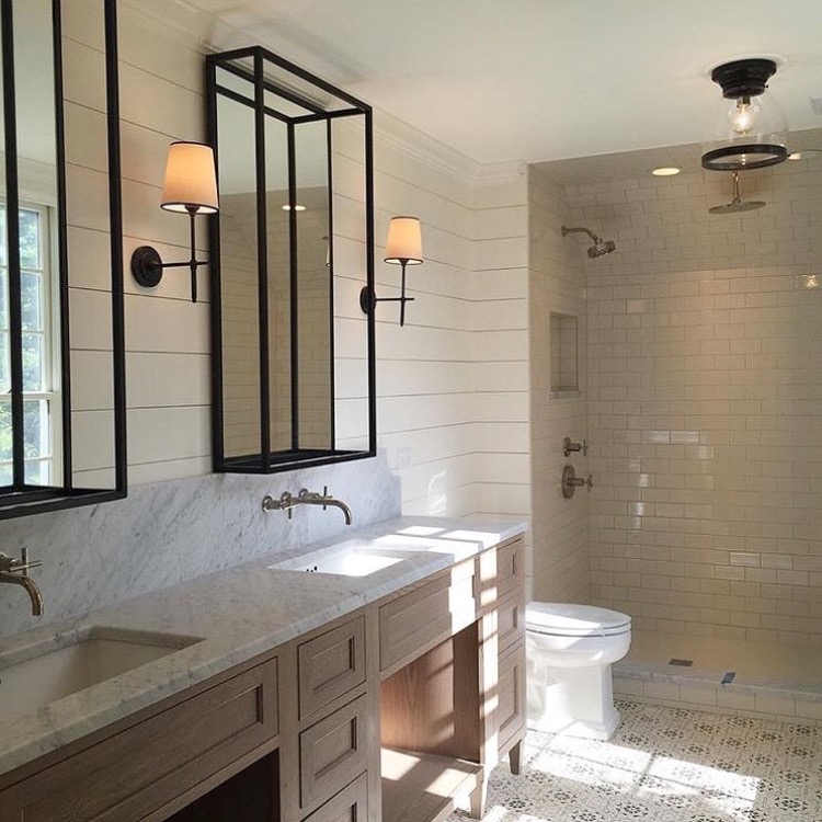
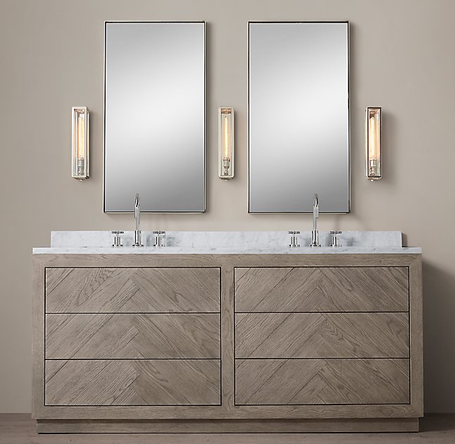
I love how these bathrooms feel contemporary and unique yet also so soft and classic. I particularly love the bottom image by Kate Marker Interiors with the natural oak vanity which I also think we will be doing. The wood feels softer than lacquer going against the patterned floors. I love this vanity from Restoration Hardware and will probably use it as inspiration when designing my own:
I haven’t gotten to picking out fixtures, hardware, mirrors, & sconces yet, although that is really the best part because it is like jewelry for the room. I will likely stick with polished chrome fixtures (like in above image) and mix up the metals for the hardware.
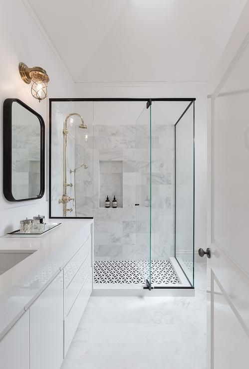
I’ve also been focusing a lot on shower doors – we are doing a BIG walk-in shower (no tub) and a built-in bench. At first, I was all set on doing something like this:
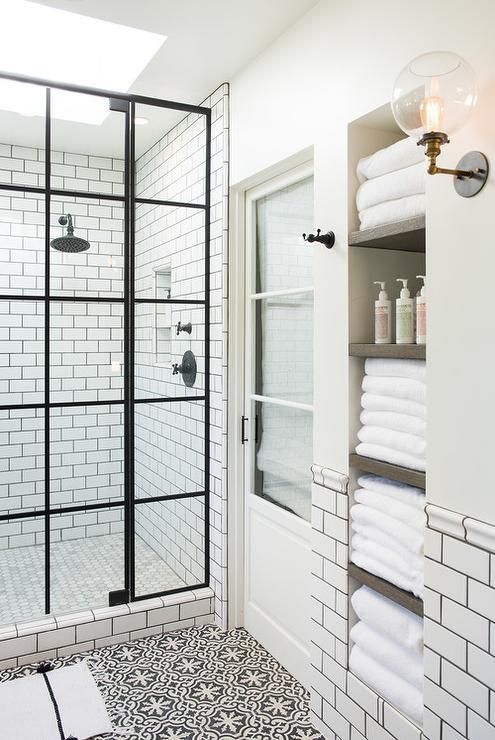
I love the windowpane design and how the black steel works with the patterned floor. Alas, my contractor told me doing something like that would basically bankrupt me, so I am thinking of compromising and doing a more simple black metal frame:
The other big ticket item in the bathroom is storage! Luckily we have the space to add a linen closet and shelving in the room to store things like extra towels & toiletries, and we are going to include a pull-out hamper which is a lifelong dream of mine! Hampers can be such eye sores, so I am excited to have ours hidden. Our storage will be between the shower and the toilet area and be vertical like these images:
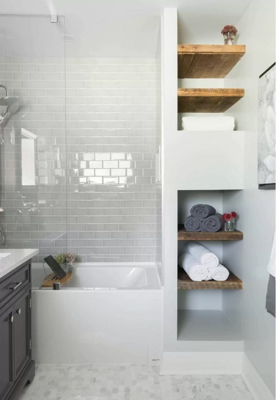
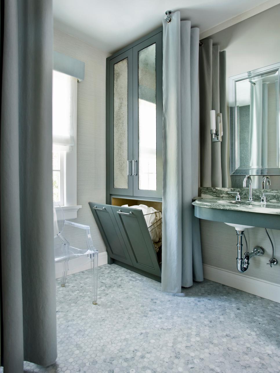
Super cool laundry contraption there. Next week I will be scouring the stone & tile stores in the Valley hoping to score a sweet deal and basically beg on my hands and knees for good pricing so I can afford that master bath mosaic!! Will keep posting updates, especially of me with my hammer next week (just kidding, I will be supervising, I’m not allowed near tools). xo, AE