Sep 13, 2016
For those who don’t know my backstory, I lived in New York City for 10 years before I moved out to Cali in 2015. I went to school for design there at Parsons, worked at a few design firms, and started my own business there. The last job I completed in New York before I moved was a west village apartment that we had so much fun doing. After I moved west, my client bought a house in Southampton and we have been working on it together long-distance for the last 15 months. Its not easy to have a client on the other side of the country, so I spend a lot of time creating design concept boards that we share via email so that she can understand my visions without having to actually be in the same place.
Today I am going to share with you the concept designs I put together for her son and daughter’s rooms. They are both young – 2 and 4, so we wanted them to feel fun & youthful, but still keeping to the sophisticated aesthetic of the rest of the house.
Here is the design concept board for the little boy’s room:
This room revolved around the accent wall, using one of my favorite Sissy + Marley wallpapers. The little elephants on the paper are sweet but not too “baby” where it will feel too young for him over the next several years. In contrast to the wallpaper, we painted the remaining walls Benjamin Moore’s Old Navy – its one of my go to colors for a boy’s room – I even used it in Brady’s nursery 🙂 I wanted to ground the room with a bold rug, and nothing is more sophisticated for a young boy’s room than the Stockholm rug from IKEA:

That’s right, $200 for this beauty! It’s constructed of flatwoven wool and is extremely durable for the price.
The dresser is the Malone Campaign dresser from West Elm, and is another bargain! The brass accents make it look expensive and it has plenty of storage:

I also sourced this grey rocking chair from West Elm, but unfortunately it was discontinued shortly after and we are still searching for the perfect replacement:

The final touch is the Nolan pendant from Arteriors. We needed something to bring the space together but with ceilings only 8′ high (and this boy’s father is over 6′ tall!), we needed something without a lot of height. Arteriors is definitely one of my go-to lighting sources, they have endless options at reasonable prices:
Next up is the girl’s room:

She is 4 and not a typical girly-girl. We wanted to make it feel feminine but without a lot of pink or frills. We decided to paint all the walls halfway up using Benjamin Moore’s Flamingo’s Dream, which is a pink-ish coral, and it gave the space a contemporary, cool vibe. Everything else in the room is bright and neutral to off-set the bold walls.
The Perch bunk beds from Oeuf are so chic for a kid’s room- they are made of solid wood and can easily transition from little girl’s room to teen room:

Bookshelves are tricky in a kid’s room – you really want something that can be mounted to the wall so there is no fear of it being pulled down. These stairway bookshelves from CB2 were the perfect solution for a narrow part of the room. They only take up 12″ of depth and leave the space feeling really open:

This little girl personally requested a teepee tent for her room. There are so many fun options out there for kid’s teepees, but when I found this silver metallic one from Land of Nod, I knew it was perfect for the space:

Finding a neutral but not boring rug for this space wasn’t easy. But I dug into my archives and found some photos of a rug I had taken at Las Vegas Market in August of 2016 and couldn’t believe I found something so perfect. This rug is by Jaipur and is 100% flatweave cotton AND is reversible, perfect for a kid’s space:

These modern, gray-washed nightstands from Room & Board flank the bunk beds, and I added one more pop of color with these awesome mint-green task lamps from Y Lighting:


No girl’s room is complete without a pretty chandelier. Again, we had to pay attention to height and we wanted it to feel feminine without an overload of crystals. This silverleaf Hampton Pendant (what a fitting name) by Aerin fits the bill:

Of course, things inevitable change when you go from a concept to an actual installed space. Modifications will be made along the way, but this serves as a really good starting point when creating a vision for a space that the client can understand. I am starting to do these boards more and more as it gives my clients comfort in having an understanding of how things will look all together. Can’t wait to get finished pictures of these rooms soon to compare to the original designs. Will share them soon! xo, AE
Aug 29, 2016
This post is an update of a current project I am working on here in Santa Monica – a total gut & re-design of an existing kitchen. Nothing is better than starting with a clean slate. I have spent the last few weeks (lets be serious, months, years…) looking into tile ideas for kitchen backsplashes. There are a lot of interesting trends out there and here is my take on what’s currently hot:
Geometric Shapes:
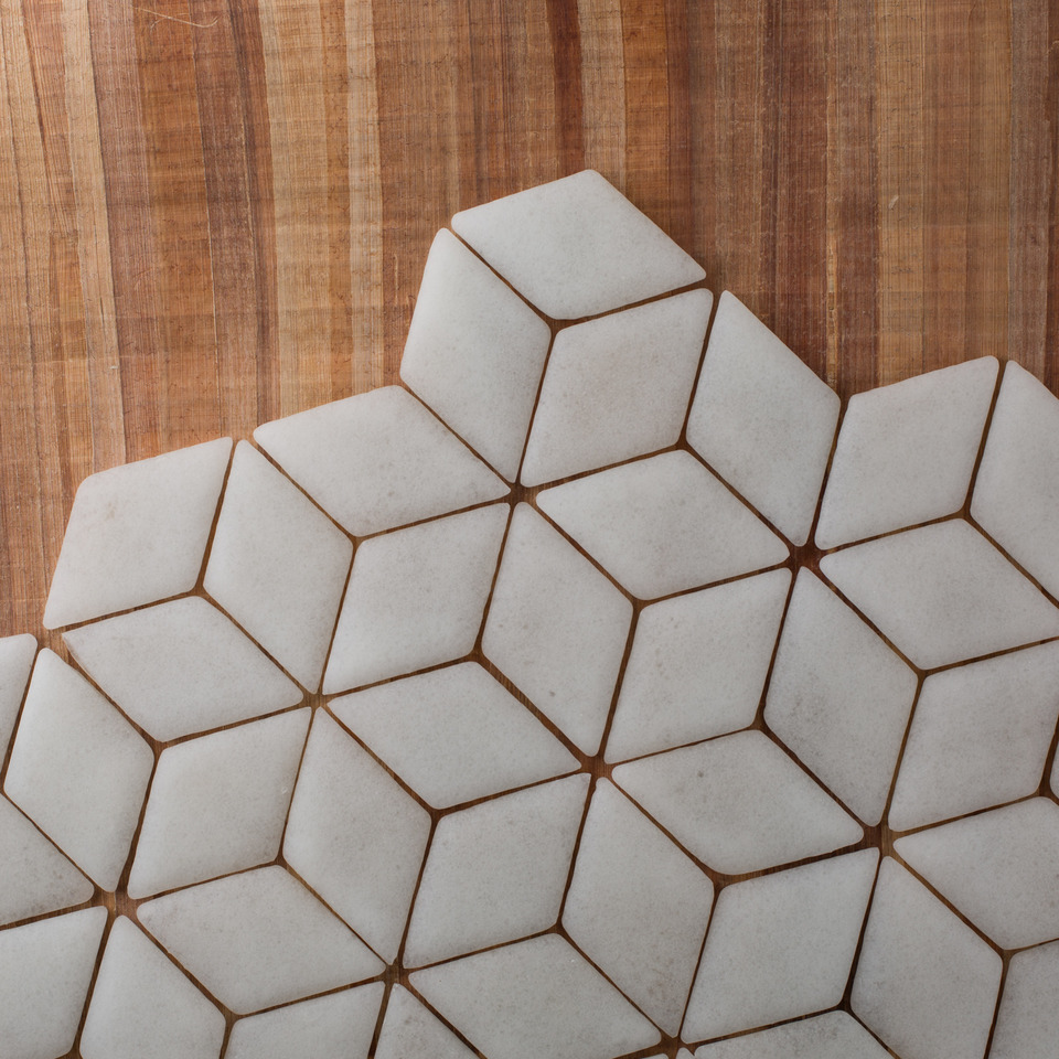
All sorts of simple geometric shapes are popping up in modern kitchen backsplashes. Something I have been discussing with my current client, is the diamond. Sounds simple, but the results can be really impactful.
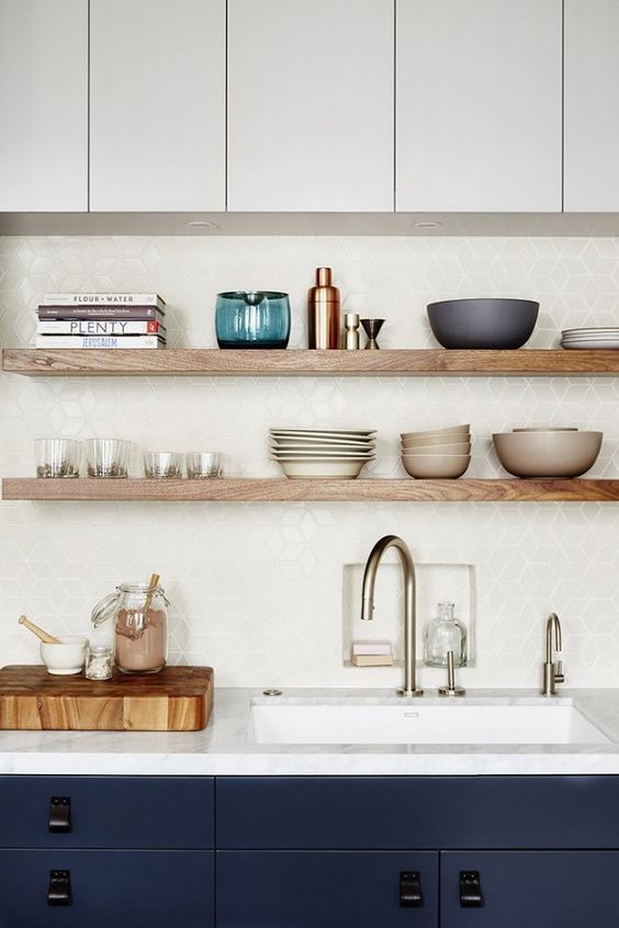
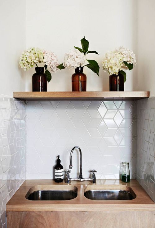
In all white, this look is minimal but chic.
Diamonds provide a lot of different options for configuration. Here are some examples from our friends at Fireclay Tile who I am currently working with:


Other various geometrics shapes showing up include the pentagon, hexagon, elongated diamond, and other shapes I don’t even really know how to name, but look pretty awesome. 


I love the use of white tile with black grout in some of these spaces, making them even more modern and dynamic.
Moroccan Inspired:
Now for something completely different! I love love love the trend of Moroccan inspired tiles. Used in tandem with white, clean lines they can make a contemporary space feel special and unique. I am yet to pull the trigger on something as eclectic as this (I am more of a classic, timeless kind of girl) but I still appreciate their beauty. Again, Fireclay Tile has a good selection of options as well as Cement Tile Shop.
If you are on the fence about this trend and want to use it while still keeping things streamlined, try using it as a feature wall behind an oven as seen here:


Next step would be to use it as an entire backsplash, as shown here:

Or go big and do the whole damn wall, like Studio Surface did in this showstopper kitchen:


Tiny Tiles:
I am a lifetime fan of the penny tile and I love to see it, and other tiny tiles, used in a non-traditional way like a kitchen backsplash. There are endless options of shape, color, and grout that create many different design outcomes:

White pennies, black grout. Timeless, bold, and all around cool.

50 shades of gray penny tiles.


Look closely, these are tiny hexagons.

Did you know subway tiles come this small? (Will get to the rest of subway tiles later).

Mini metallic subway tiles. Not sure I could live with it, but this picture is to die for!
Subway tiles:
The trend that never ends. Around since the early 1900’s, used literally on the subway walls in NYC in a 3×6 size, these babies are here to stay. They are a classic, some say safe, choice, but considering using them in a non-traditional way to shake things up.


Herringbone pattern can be done several ways, here shown in traditional and diagonal configuration.

For a more twist on herringbone, have the subway tiles cut in half lengthwise.

Run the tiles vertically (so obvious yet so genius).


Again, subway tiles come in many shapes and sizes. Square is making a big comeback, giving a nod to Scandinavian design.
Muted colors:
The kitchen backsplash isn’t generally a place where one uses a lot of color, but consider a muted blue or green color in a simple shape. I love blue in the kitchen, it always makes me feel calm and peaceful and that can come in handy considering the kitchen is one of the most high-traffic rooms in a home:


Did you notice how many of the above images included subway tiles again?
Pretty clear I gravitate to white kitchens based on this post. Will keep you guys posted on what we decide for this project! xo, AE
Aug 22, 2016
One of the toughest parts of designing a home are the finishing touches – accessories, styling, and most importantly ART. I am by no means an art snob – and while I do appreciate fine art and of the moment artists, I also strongly believe that the value of a piece of art is determined by how well you connect with it and how it makes you feel. So for today’s post, I am sharing some of my affordable art sources and young artists that I am currently crazy about.
Artstar
This site has been around for a while now and was one of the first websites to curate affordable art for the masses. They create print editions of contemporary fine art to give them a lower price point and make them available in many sizes.

They have a huge selection of paintings, photography and prints, all very contemporary and cool. They also have a selection called Little Collector, which has some not so typical kid’s art. Although they do have the obligatory baby animal prints, they also have interesting and modern pieces like these:

Artfully Walls
Now this is a genius idea…Artfully Walls not only provides a great selection of affordable prints, but also curates pre-arranged gallery walls, which by the way, can be quite challenging and overwhelming to do on your own. You can browse by style (eclectic, bohemian chic, etc.) and see what selections they recommend:


This is the current selection for “mid-century modern” style gallery wall. You can even see what it would look like in a real environment.
They also recently started carrying the work of Anna Ullman, who I am a huge fan of. She does larger pieces as well that can be purchased from her directly (click on her name to see her full portfolio), but she is selling prints of her work on Artfully Walls:

Zoe Bios Creative
I first came across Zoe Bios at Las Vegas Market last summer. They have their own in-house artwork and also carry other up and coming artists. Their most popular work are bright, colorful abstracts. These are not prints but are still extremely reasonably priced. I recently used their “Wabi Sabi” series in our Westlake project kitchen:

 We had them framed in natural wood frames to offset the color & metallic within the art. Here are some pieces from their new collection I also really like:

Kerri Rosenthal Art
Kerri Rosenthal has some really interesting art, that are different from a lot of the abstract art I am seeing right now. Her signature “drippy heart” would fit in almost any space – nursery, master bedroom, kitchen. I also have a thing for her “painted palms” series:


From her “Drippy Hearts” collection.

From her “Painted Palms” collection.
If you are feeling crafty (and cash poor), I do have a DIY trick for you. I am generally NOT a DIY person, but this is so simple even I could do it. Head to Papyrus or Paper Source or any other fancy paper goods store and purchase a large sheet of decorative paper and pop it into a matted frame. You can also use large pieces of wallpaper – sometimes vendors will give you a fairly big sample. I used this gold textured paper for our Calabasas guest bathroom when we couldn’t find anything else that felt right:

Here are some other examples of papers you can find at Paper Source that would look nice (and expensive!) in a frame:

Hope this solves some art dillemas out there. xo, AE
Aug 15, 2016
Anyone who takes a peek at my portfolio will quickly figure out that I LOVE WALLPAPER. It is my favorite way to enhance a room – especially in a nursery. I like to break all the rooms when designing a nursery – whether the client wants something calm and soothing or bold and fun, wallpaper can work in many ways.
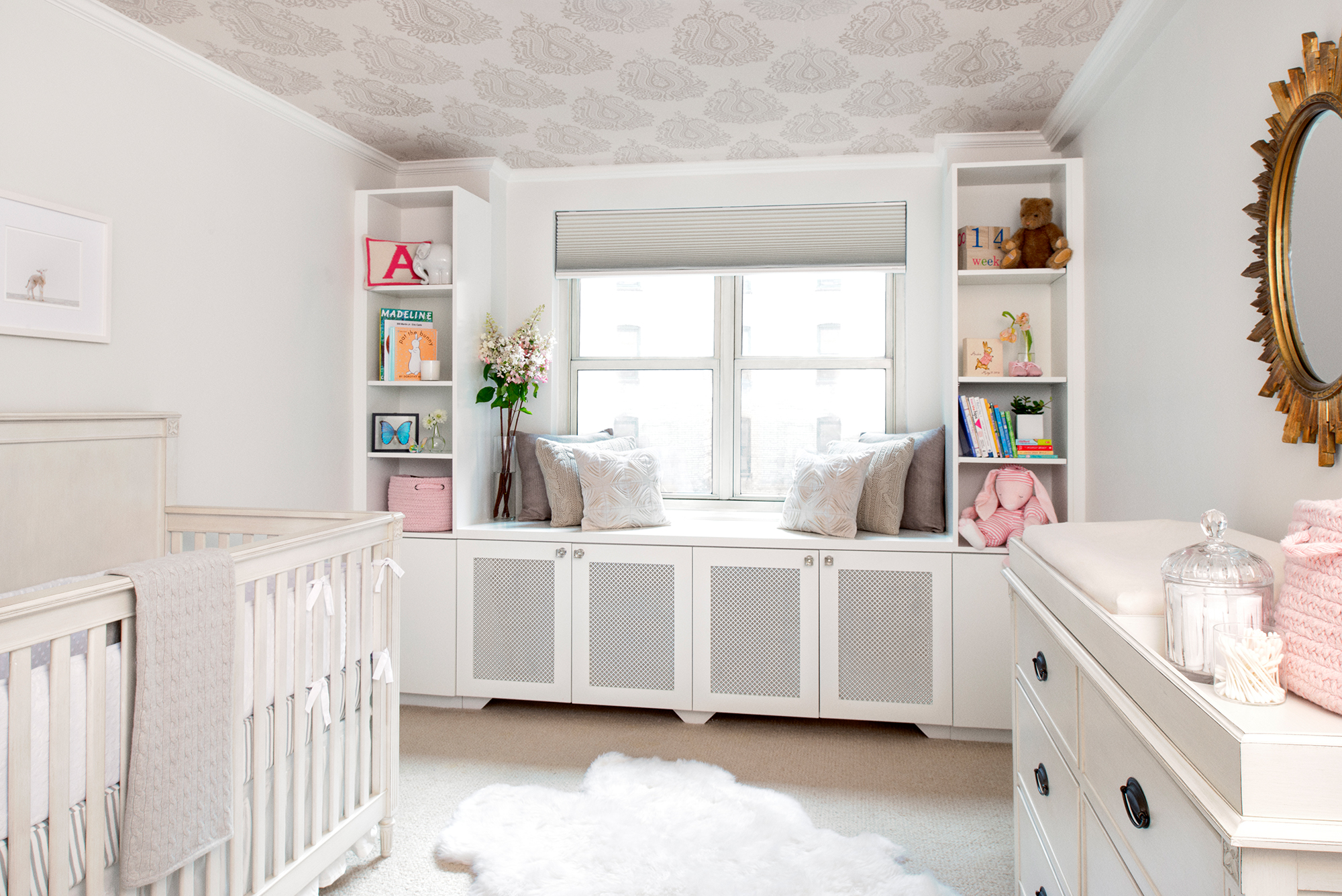
My very first client was a dear friend who was expecting her first baby girl. She wanted an all white room, but it’s scary to put the words “white” and “baby” in the same sentence. We came up with a clever solution by painting the walls white and using wallpaper on the ceiling to add some personality. That way the wallpaper stayed clear of any child related hazards, and if anything happened to the walls, they could be touched up with paint.
We found a beautiful tone on tone, neutral wallpaper by Villa Nova called Kamini Pearl. It also has a touch of iridescence to make it extra special:
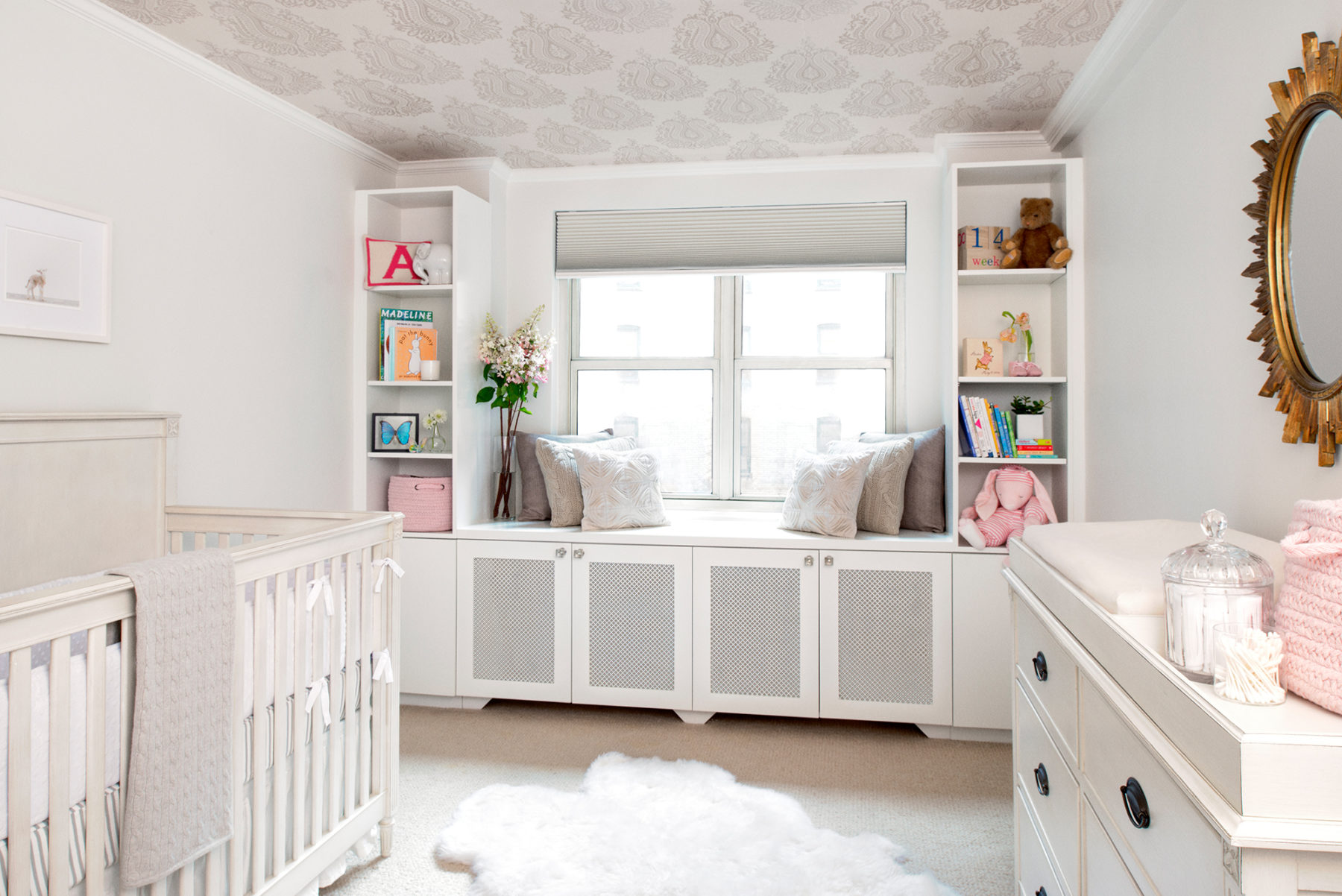
As you can see the remainder of the room is all white including the walls, furniture & built-ins.
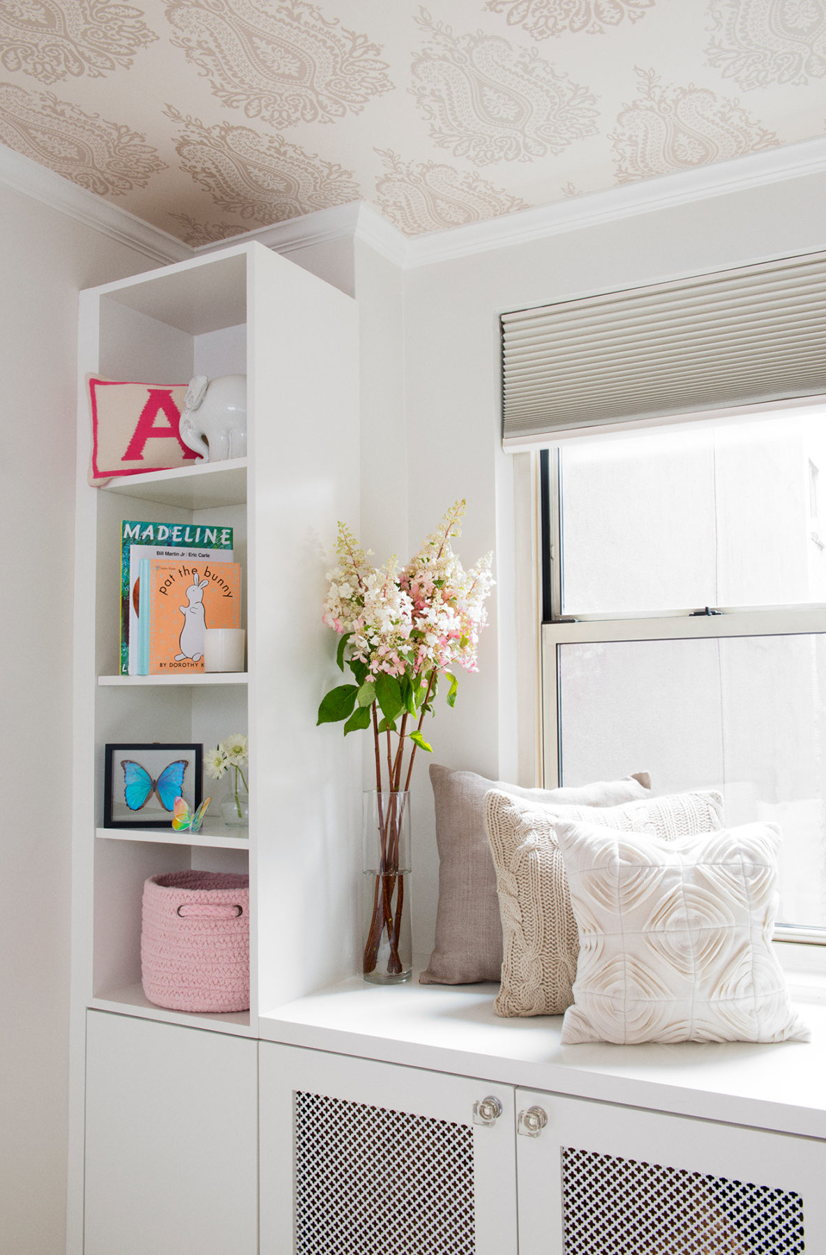
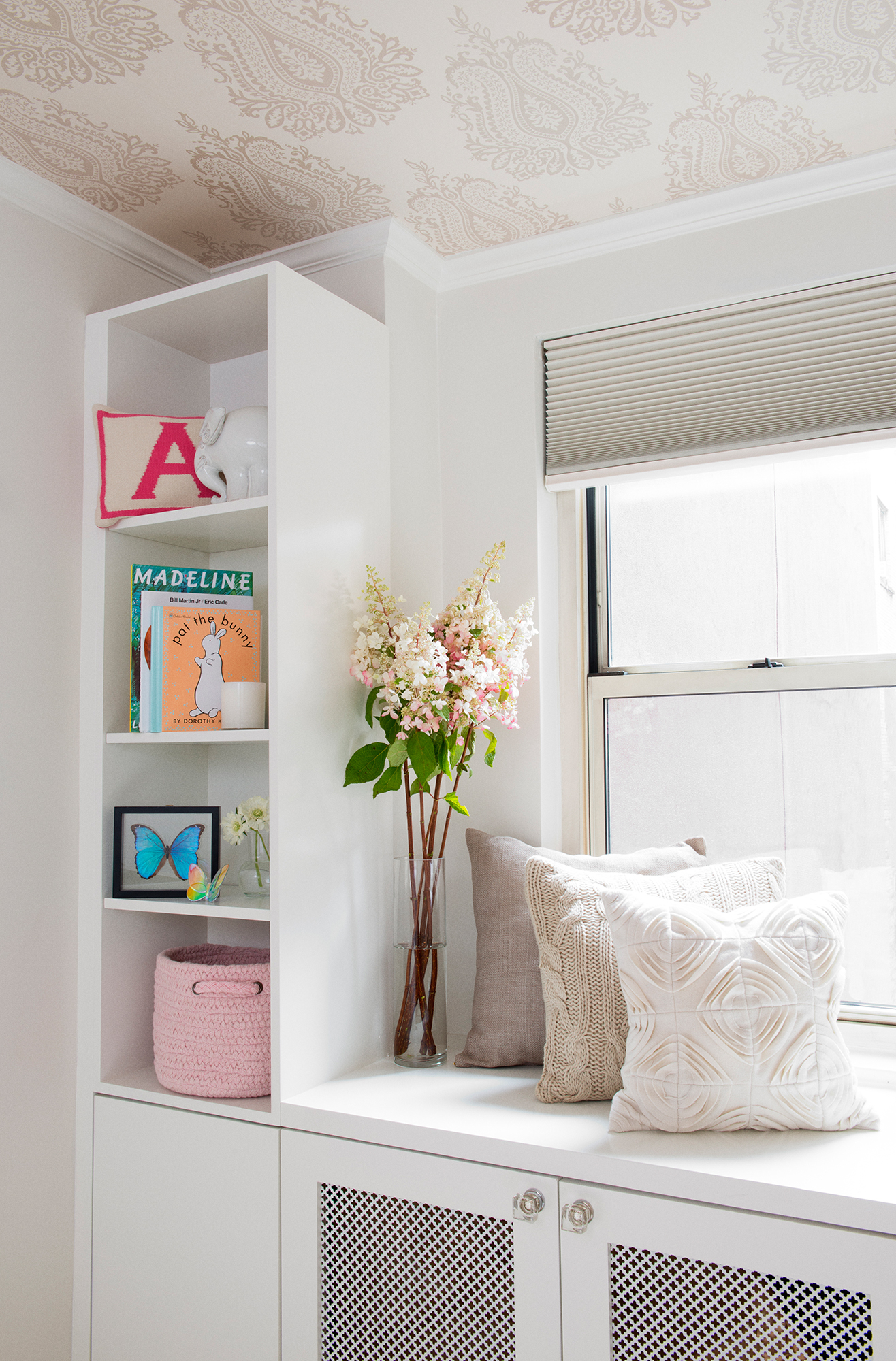
Here is a detail shot of the paper above the built-ins around the window. It really warmed up the space and made it feel cozy.
Here are some other spaces I love that also used neutral wallpapers on the ceiling:
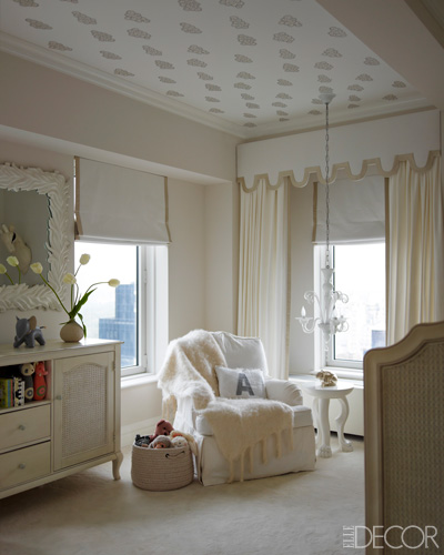
This nursery is in Ivanka Trump’s manhattan apartment, designed by Kelly Behun.
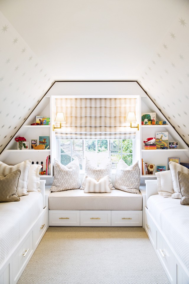
This is a converted attic turned kid’s room designed by LA based design firm Life.Style.
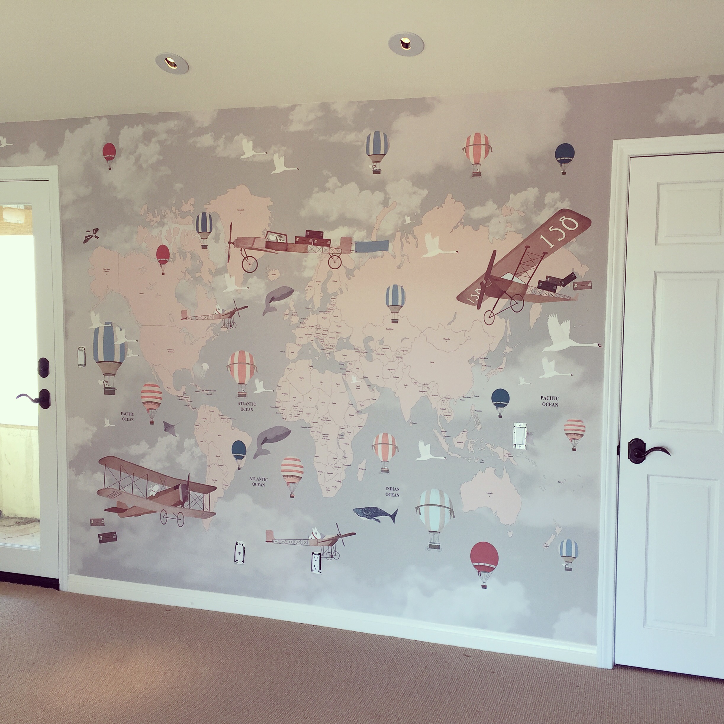
Another wallpaper trend that is on the rise is the use of mural-sized paper. These papers are usually custom made for each individual wall so the story of the paper does not get interrupted. For a current client I am working with, we used the Aviator World Map wallpaper by Little Hands Illustration for the wall behind the crib (which is currently on backorder!):
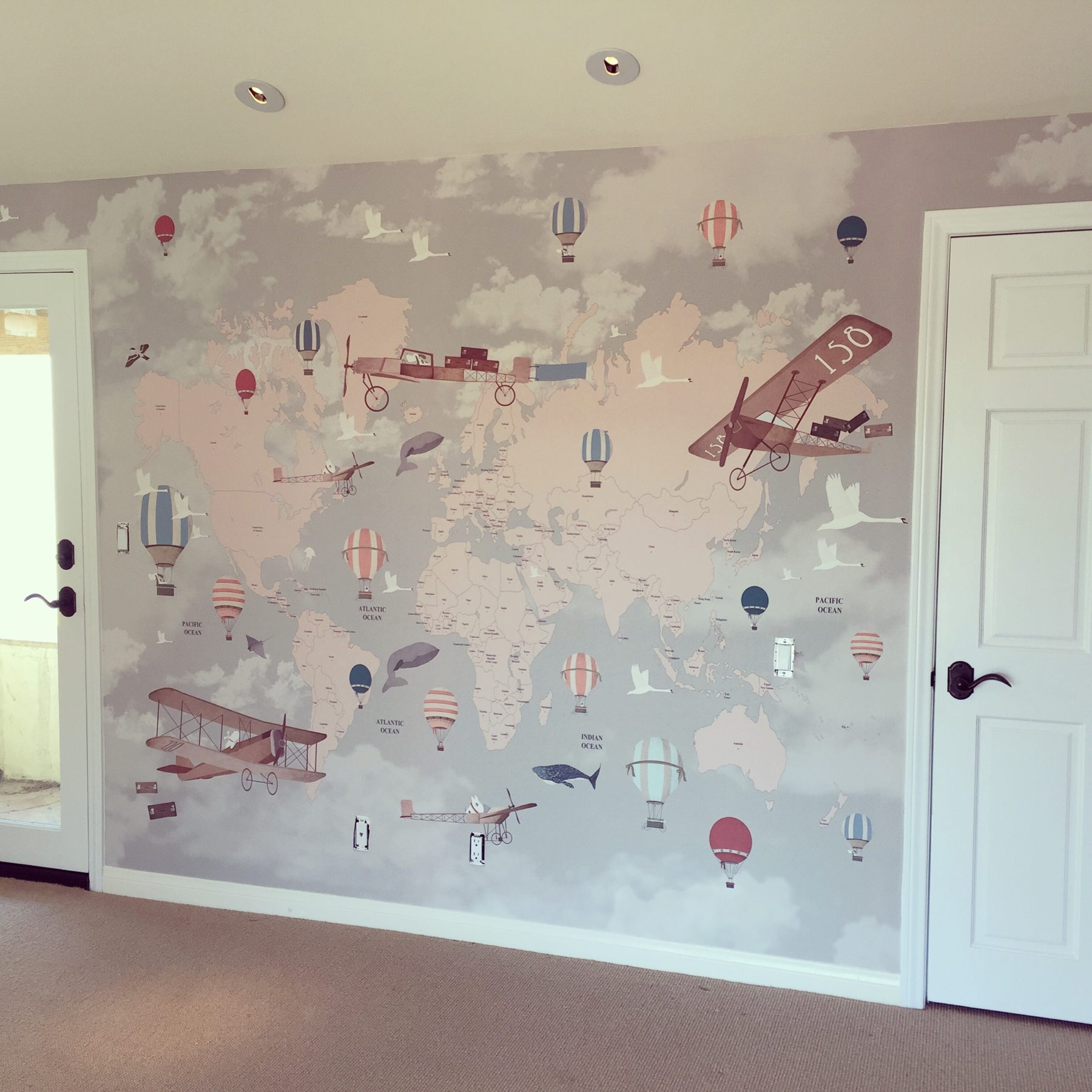
I just love how this mural wall turned out. It is something this boy will continually discover as he grows up here.
Here is another recently completed nursery that also uses mural wallpaper:
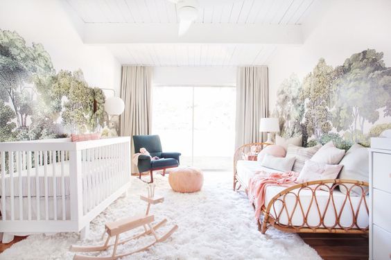
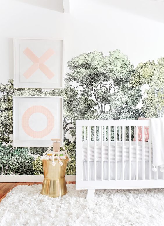
This nursery was designed by Emily Henderson for her daughter. It is so unique and feminine!
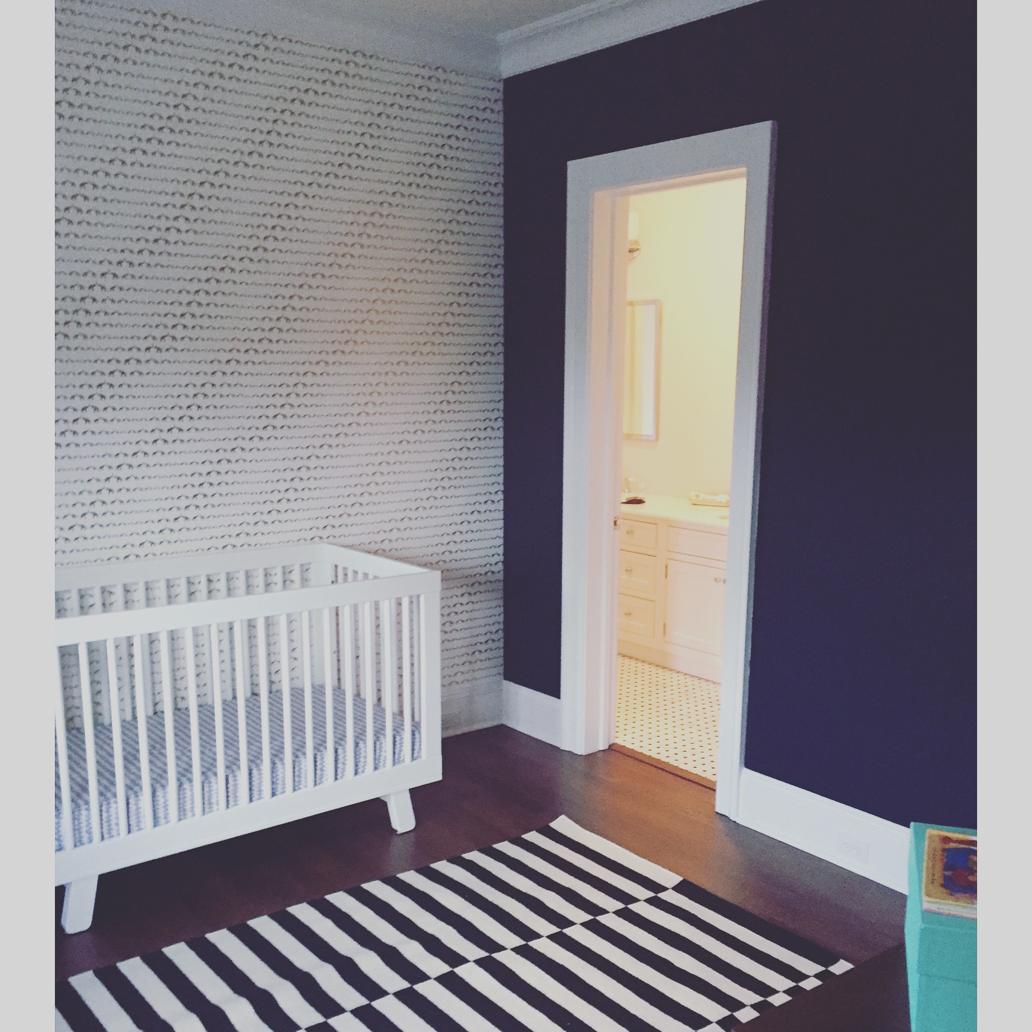
One of my absolute favorite wallpaper vendors is Sissy + Marley. They design really amazing kid’s wallpapers that feel appropriate for a child but are also super sophisticated and modern. I recently installed their Baby Elephant Walk in Gold in a nursery at our Southampton project:
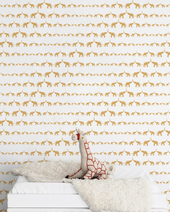
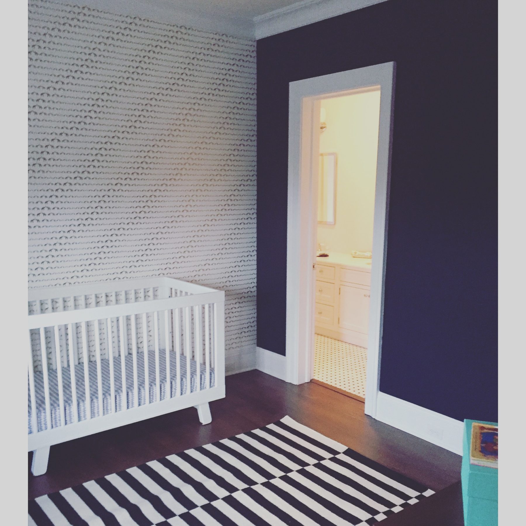
The gold & white paper against the navy walls adds such dynamic to this handsome space.
They have tons of other papers to choose from. One of my personal favorites is called JAM and features illustrations of little cars and trucks (maybe I’m biased because Brady runs around all day screaming CAR!):
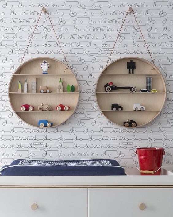
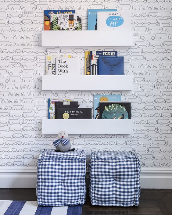
Here are some other nurseries using wallpaper that provide me with inspiration for future projects: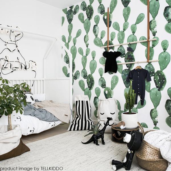
Cactuses (cacti?) are having a moment right now. This wallpaper is called Watercolor Cactus by Anewall.
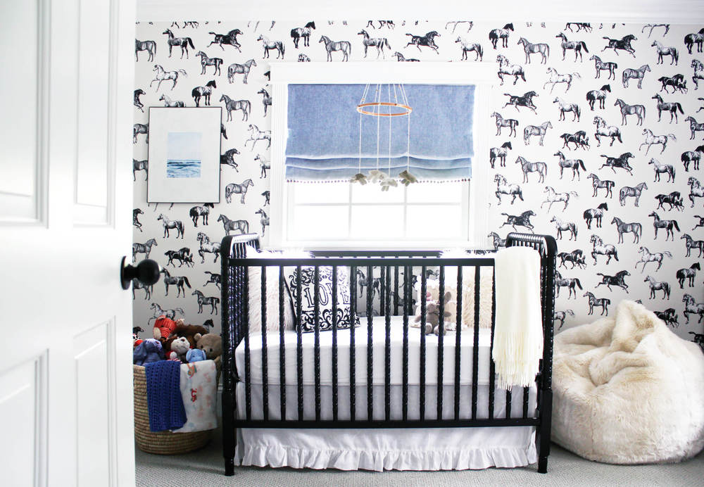
This room by Color me Carla feels like a total throwback. The horse wallpaper is by swedish wallpaper company Sandberg Wallpaper.
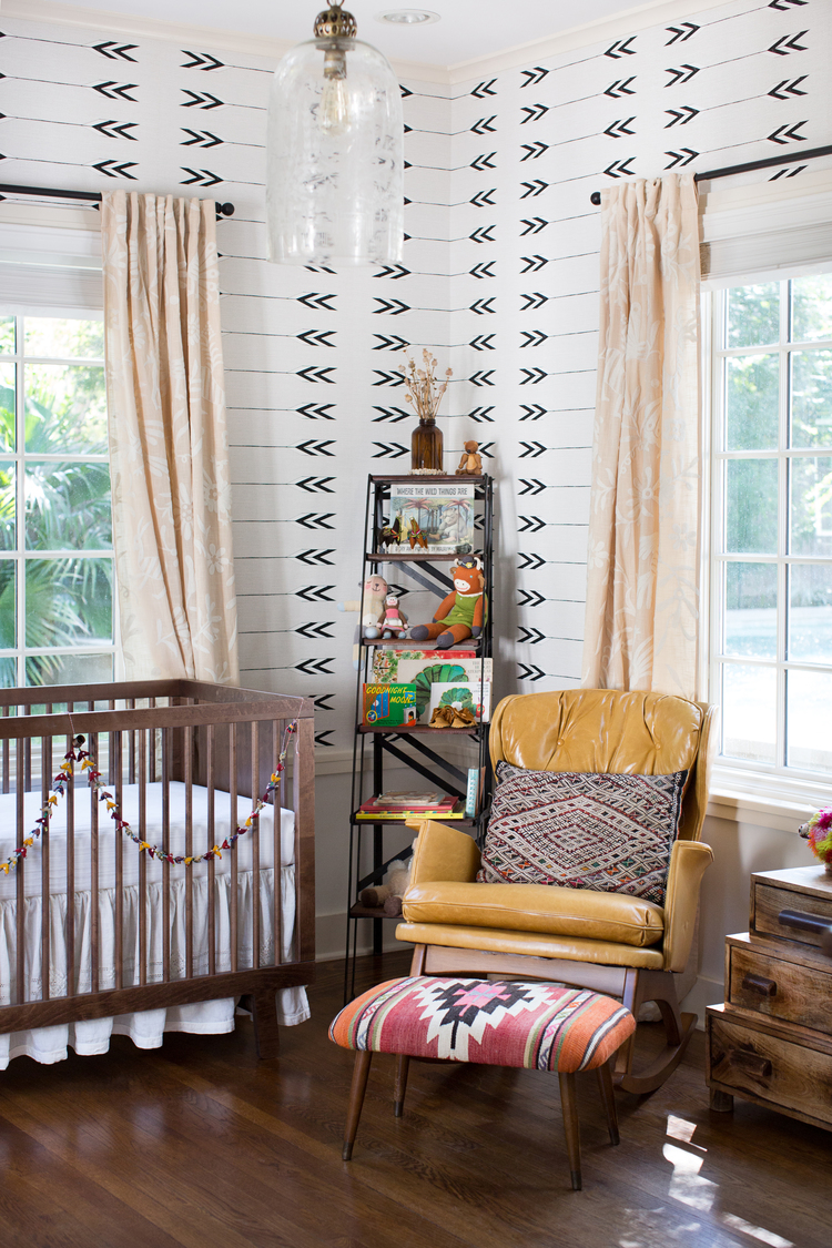
Arrows are another pattern that are hot right now. This nursery by Regan Baker Design has a cool southwest flair.
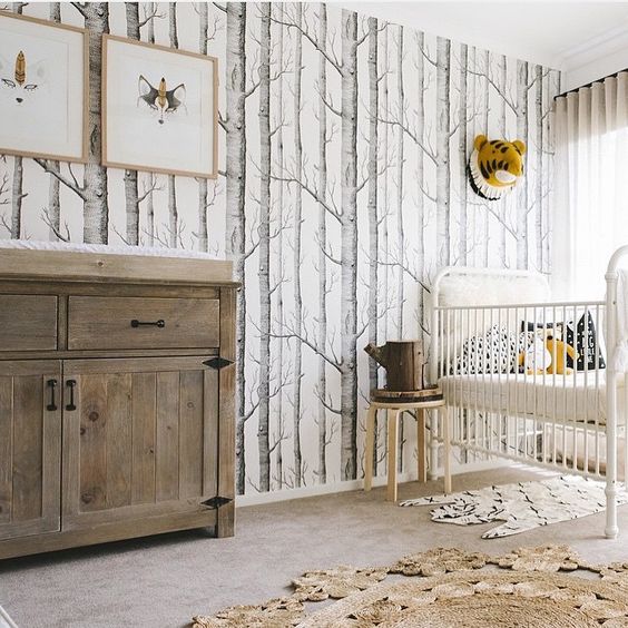
I have coveted this wallpaper by Cole & Son for ages. Love how Sophie Vine used it in her son’s rustic-chic nursery.
Hope I provided you with some inspiration or at least some pretty pictures to look at. That’s it for now! xo, AE
Aug 8, 2016
Welcome to the launch of the ae design blog! This has been on the to-do list for some time and I am hoping to update it often with posts about my current projects and inspiration. For those new to aedesign, my name is Amy Elbaum and I am an interior designer in Los Angeles. I am also a momma to my son Brady and fur-daughter Franny and wife of 5 years to my husband Jeremy. We currently live in Santa Monica but are on the hunt for a bigger home in the area – but that’s another story all of its own…
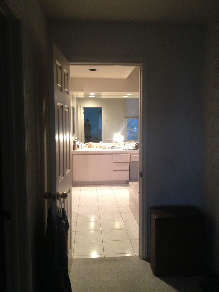
To kick things off, I thought I would share some photos and details of a recent master bathroom renovation project I completed. Let’s start with the before shots….
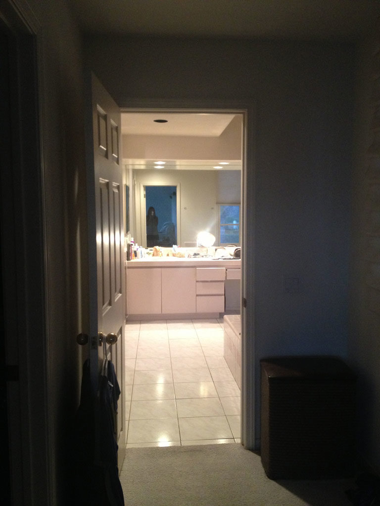
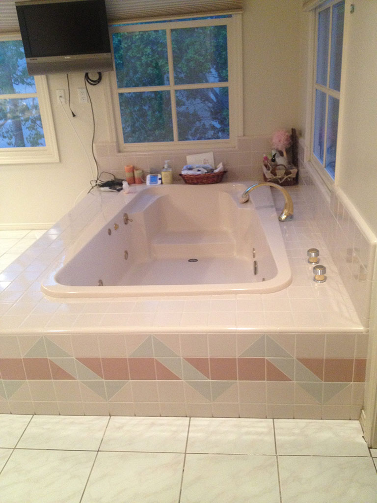
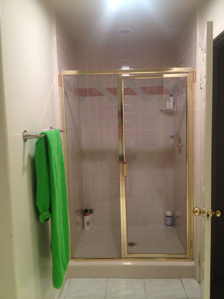
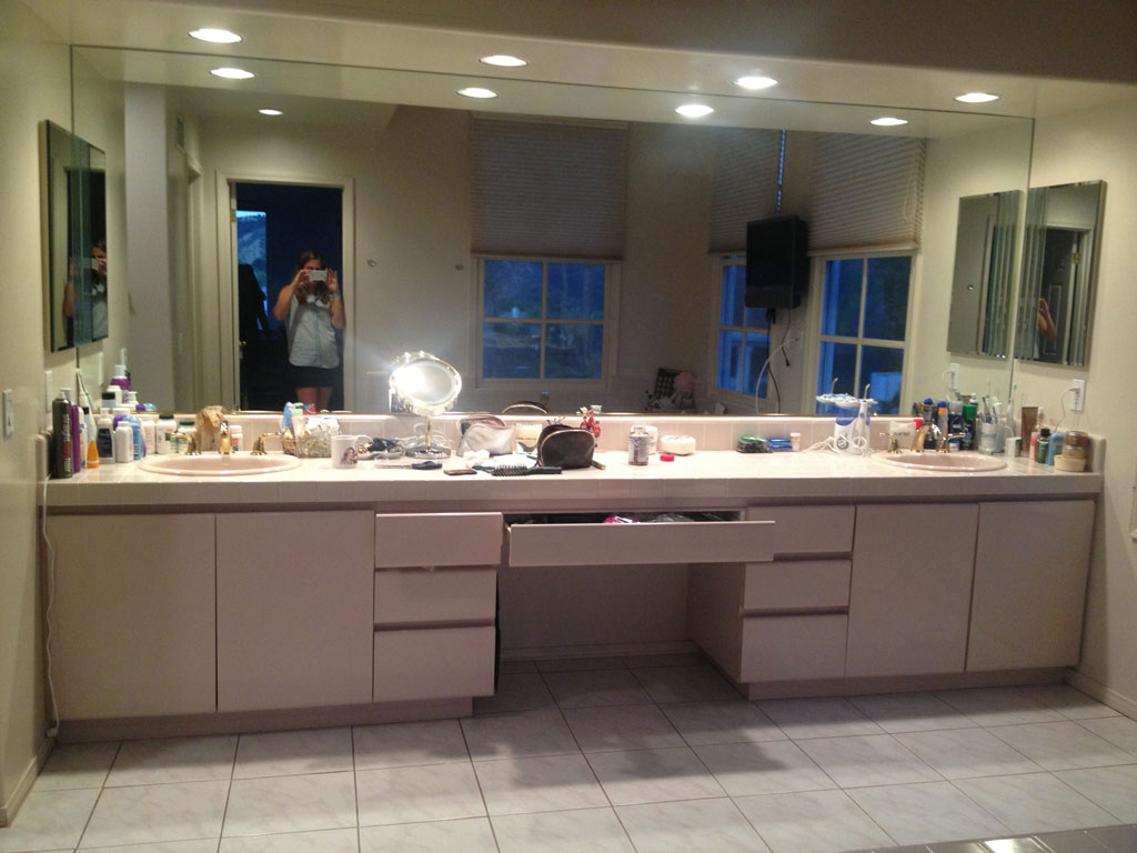
One word…yikes, right?? This house was built in the 80’s and the bathroom had not been touched since mauve was the color of the moment. Everything had to go…every last tile and fixture. We also opened up the entry to the bathroom to brighten up the space and add a wall of shoe storage. This client wanted something very modern, clean, with lots of gray tones. When we began the design process, we were really inspired by this certain type of marble, called Marmara, which has a really unique horizontal stripe:
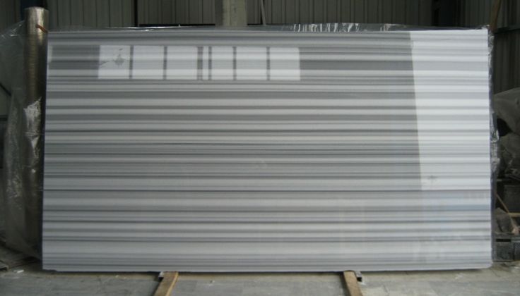
This is what a beautiful slab of Marmara marble looks like.
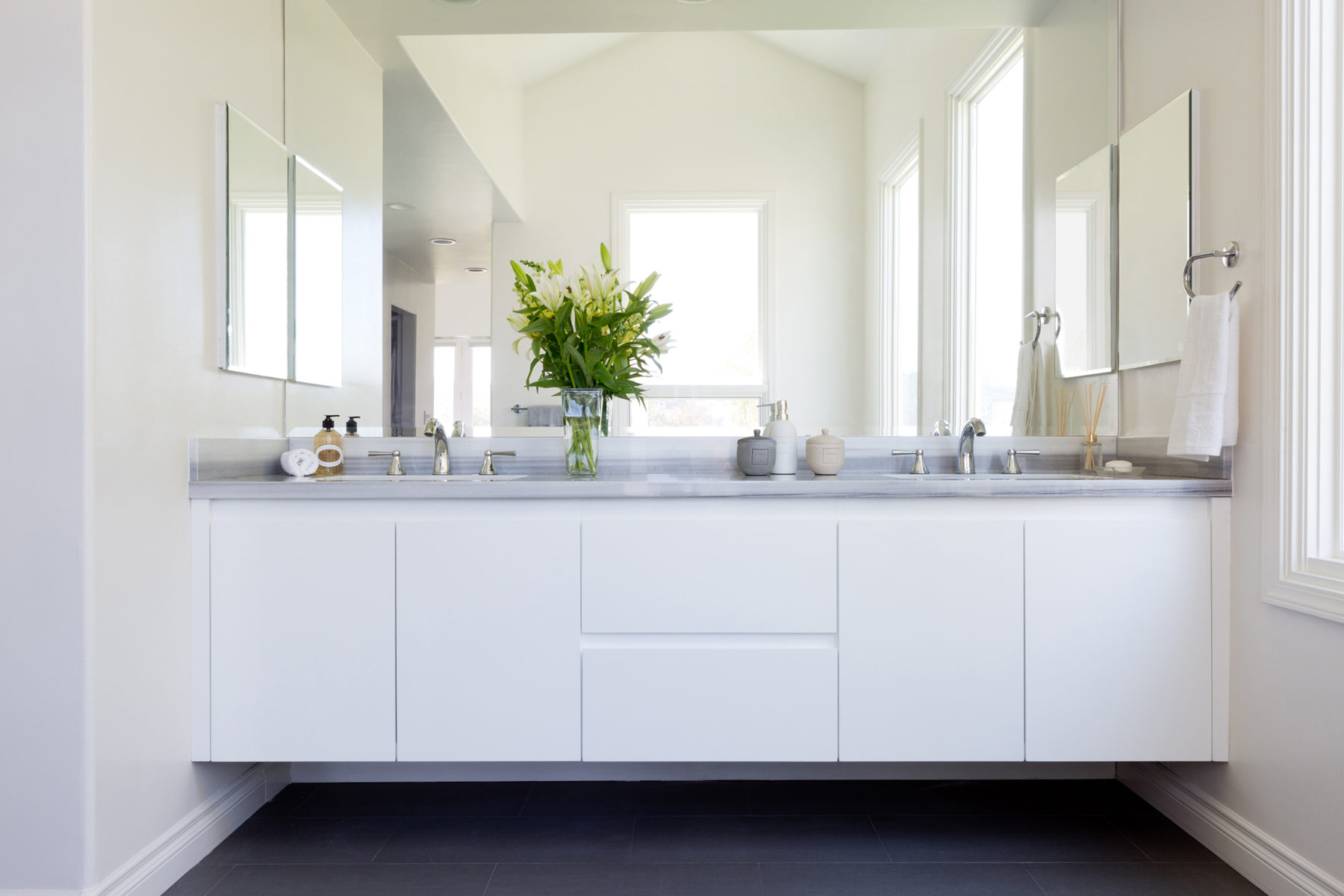
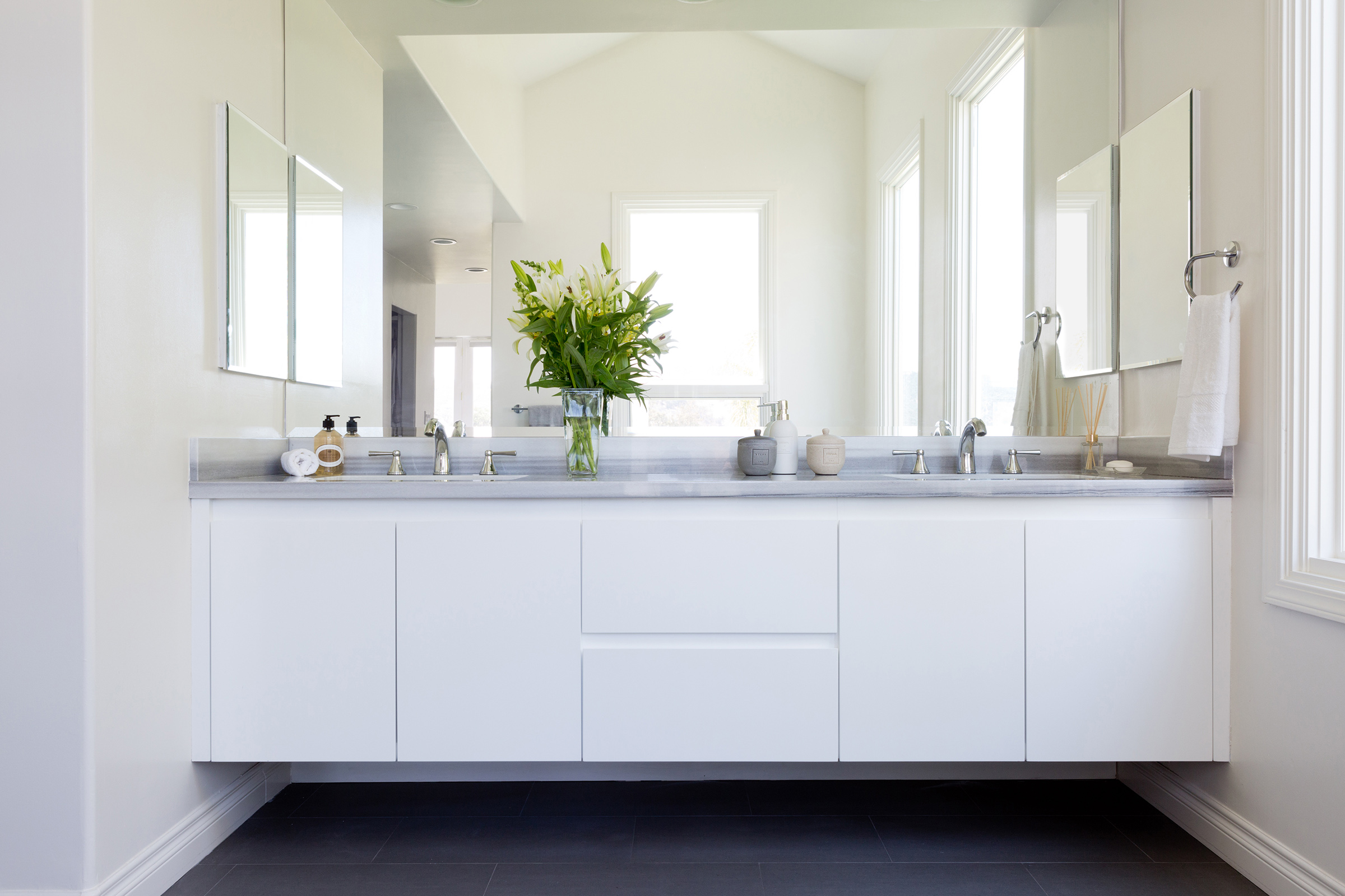
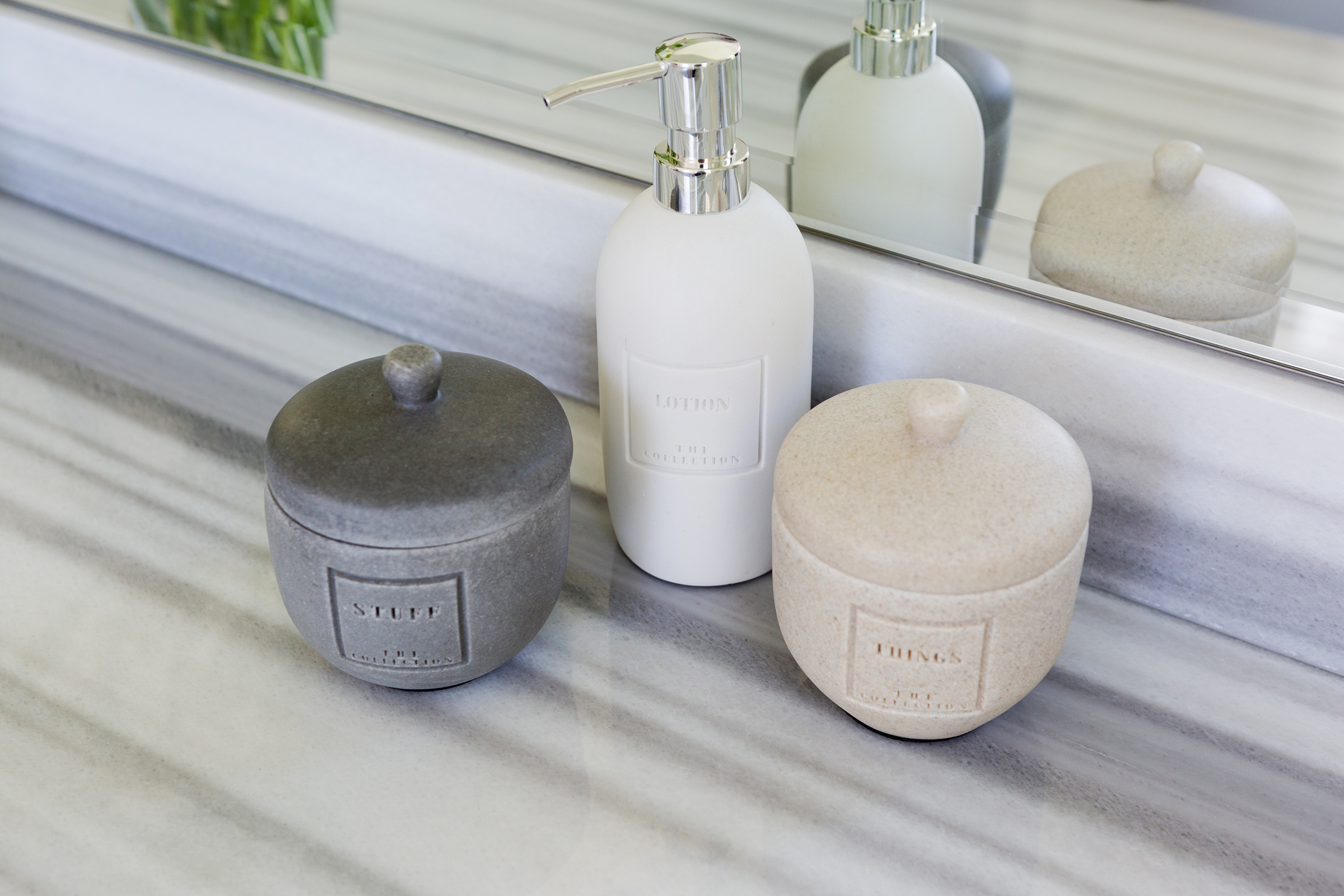
Here is how it looked installed as the top for our floating white lacquer vanity.
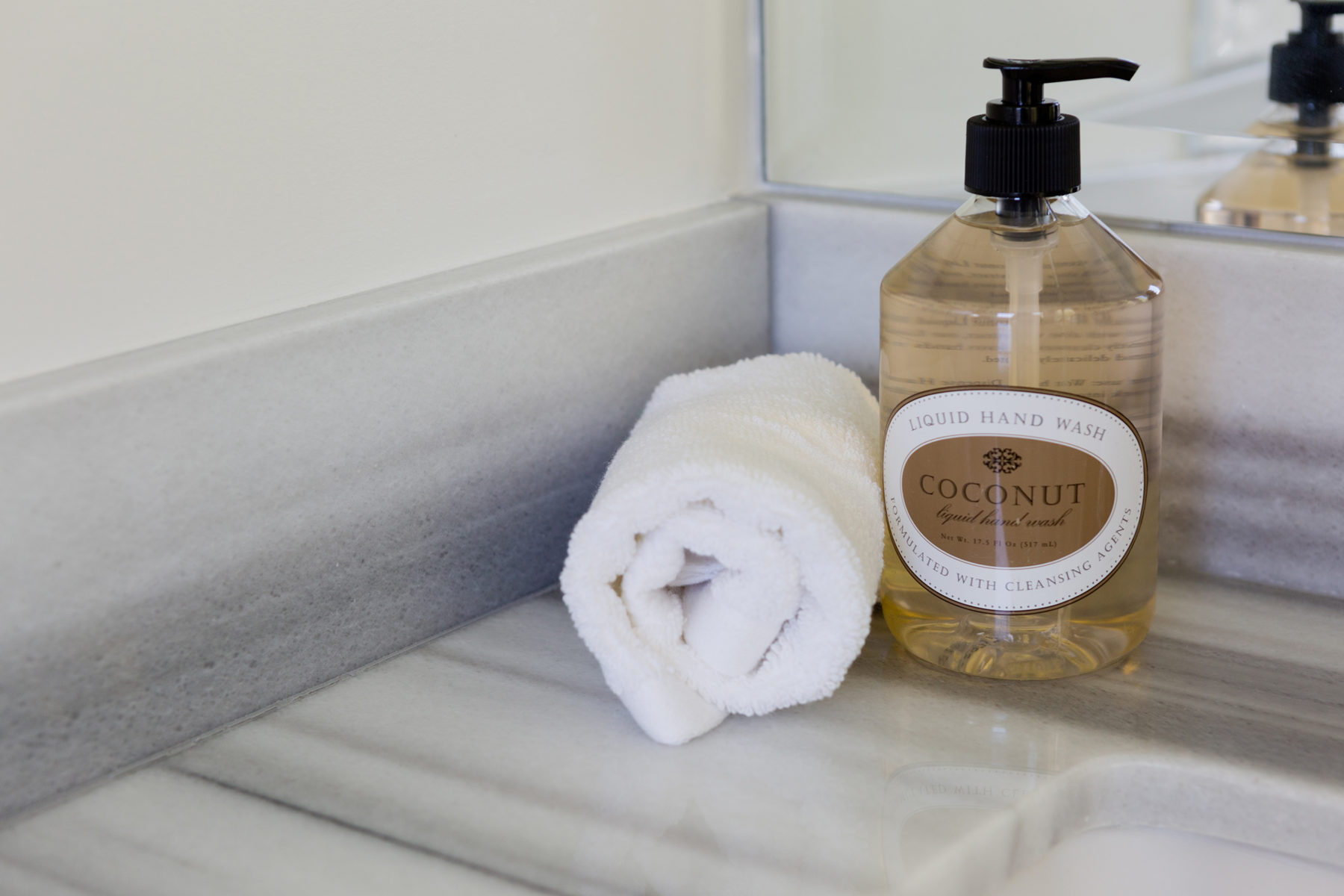
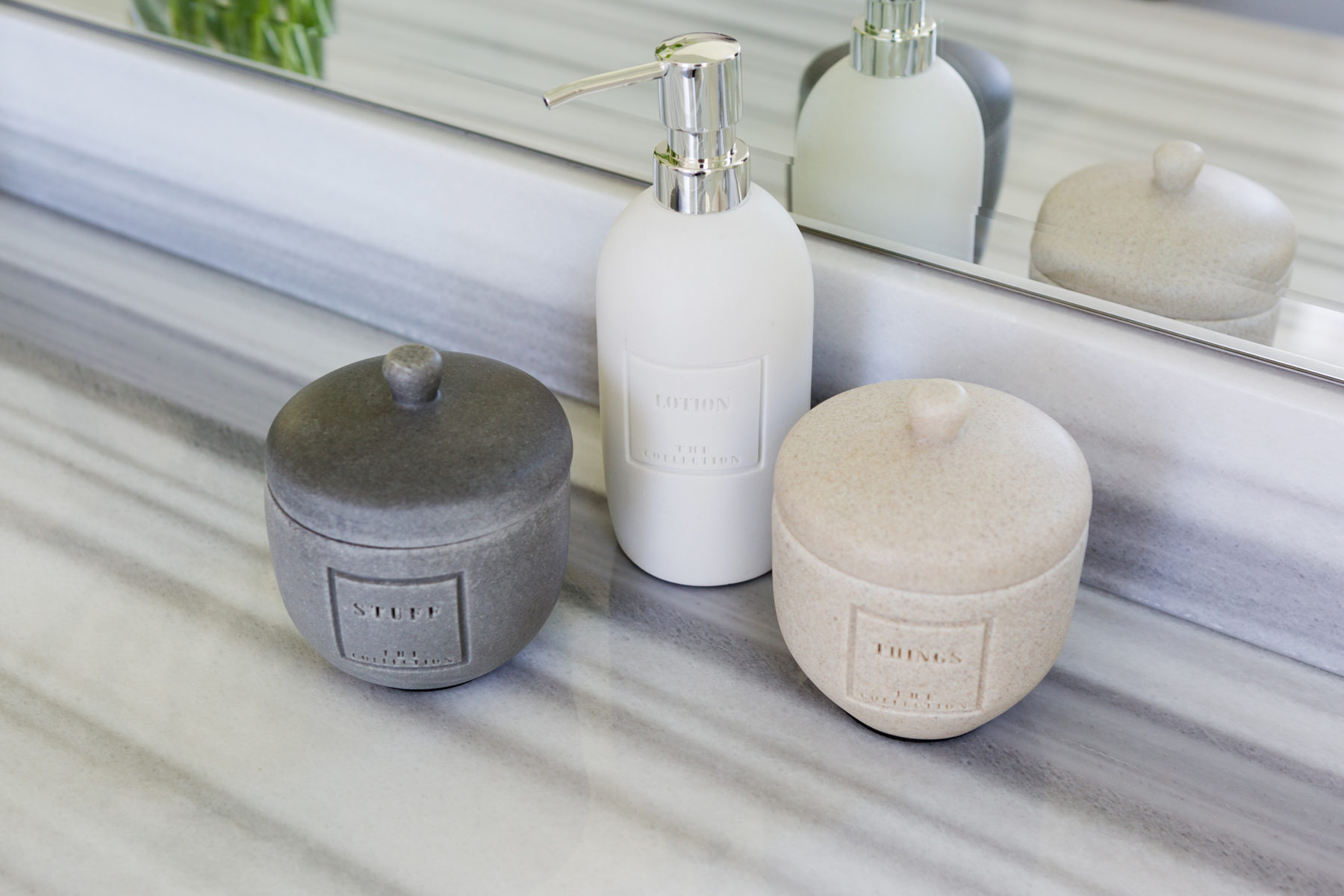
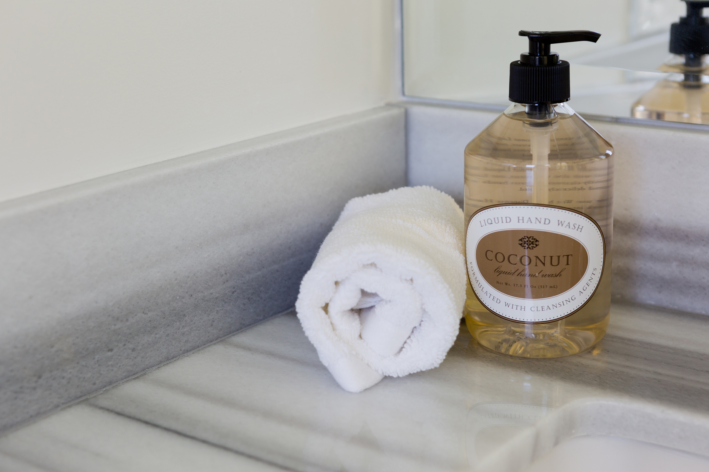
And some detail shots of the vanity top and backsplash.
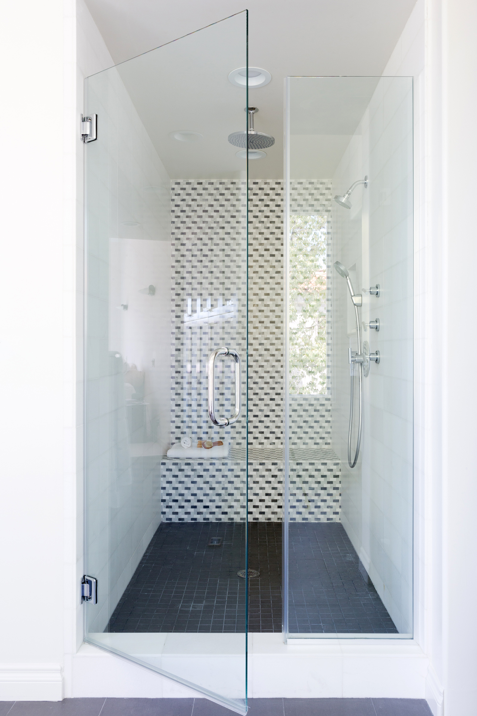
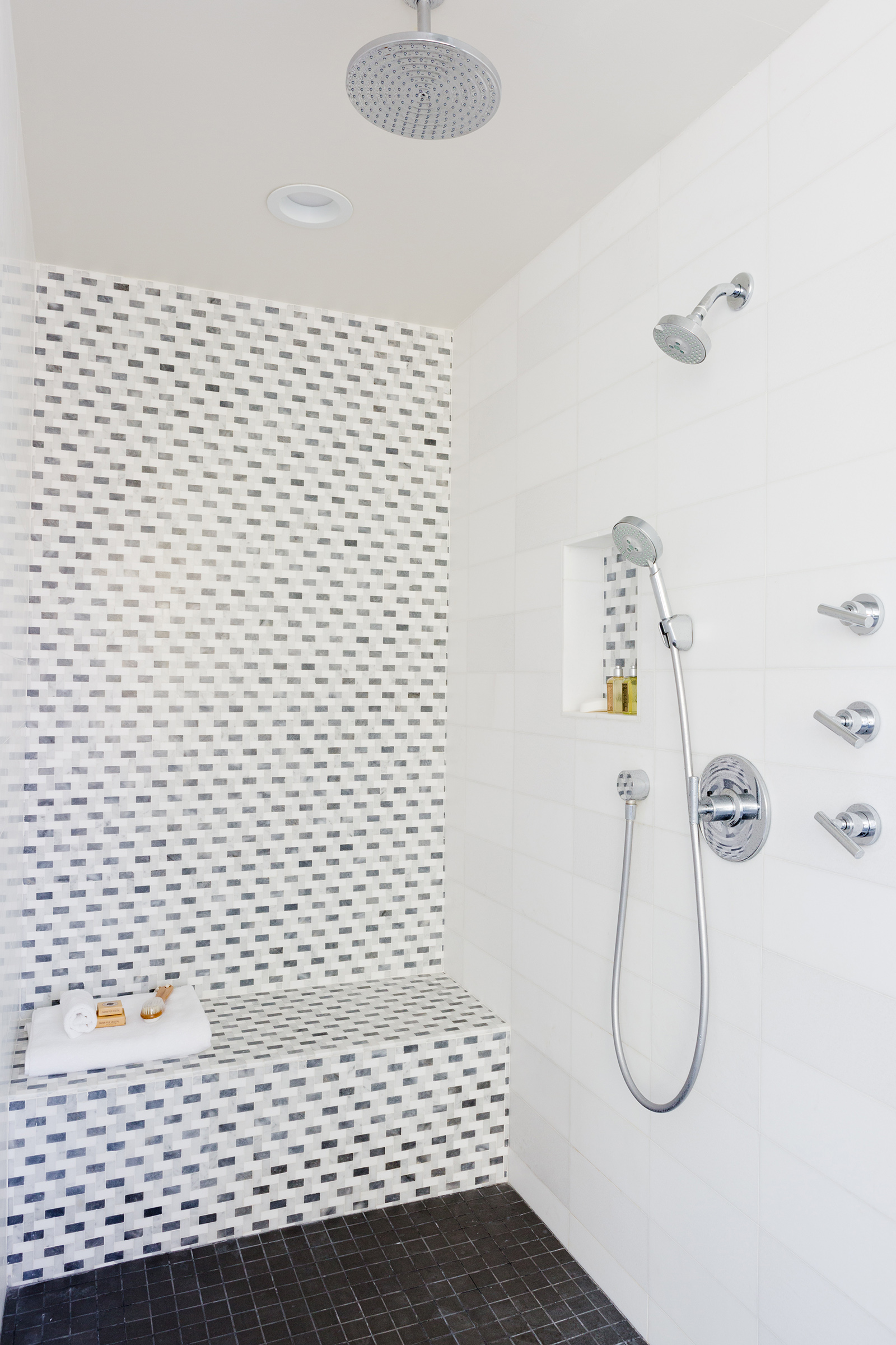
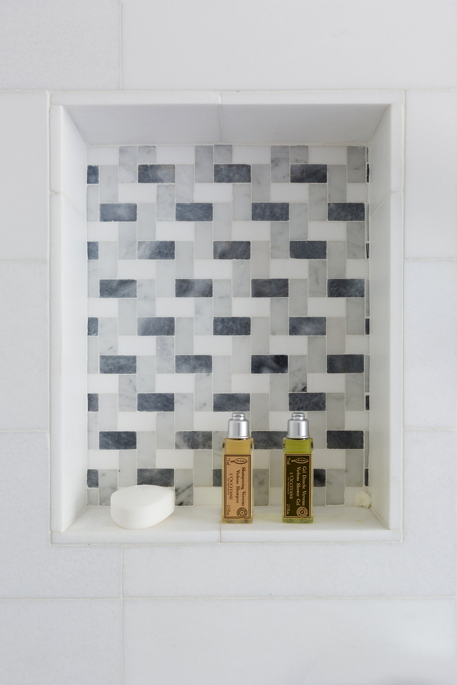
It is a striking stone so once we selected it for the vanity countertop, we chose everything else to compliment it. We used a dark slate tile for the floors to offset the bright white walls and ground the space overall. In the shower, we livened things up with a dynamic feature wall composed of a stone mosaic, which we also used in the shelf nook. We used white thassos marble tiles on the adjoining walls, and a smaller scale of the same slate tile for the floors:
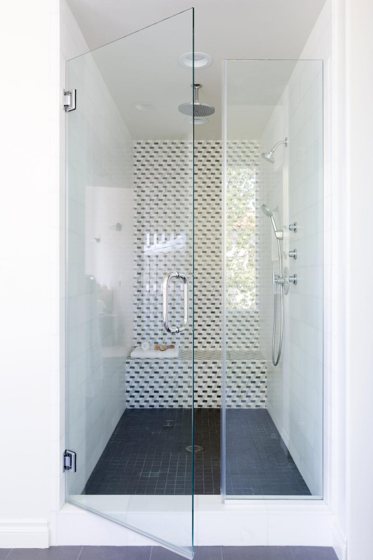
The oversized step-in shower has all the bells & whistles – swinging glass door, overhead recessed lighting, and multiple shower heads.
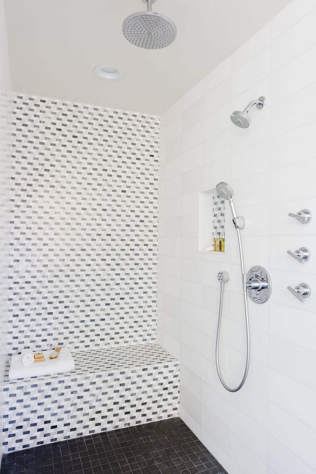
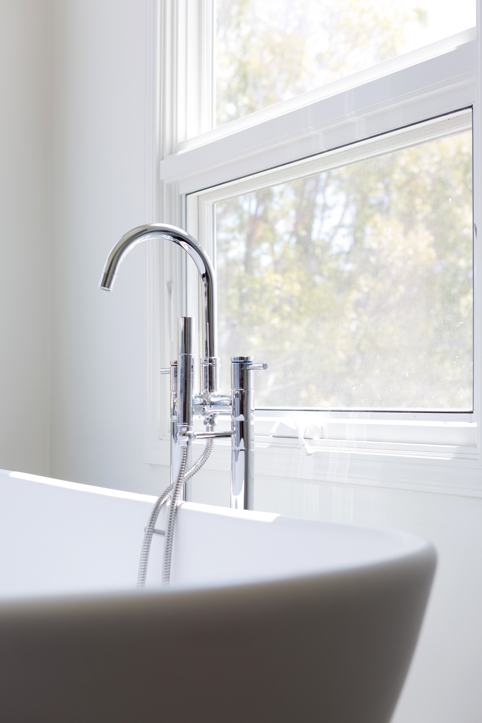
All the fixtures are a polished chrome finish to stick with the modern aesthetic.
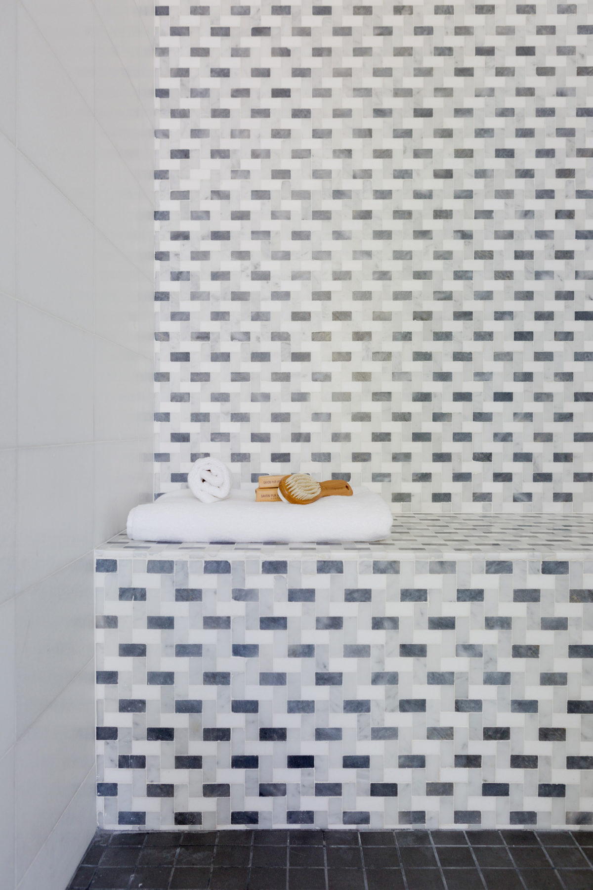
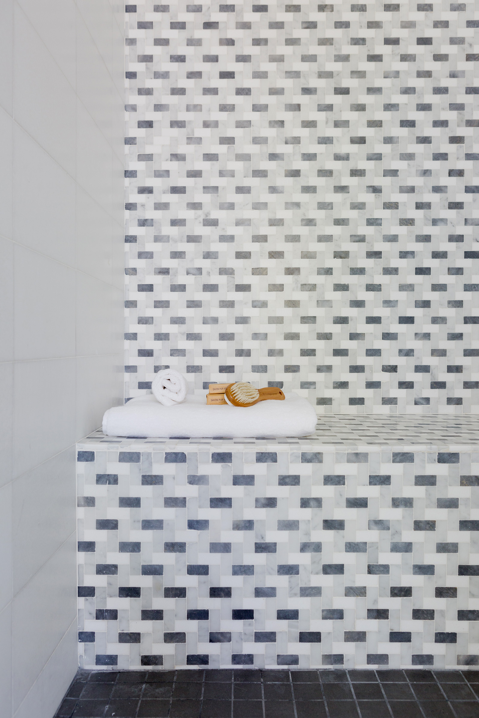
The stone mosaic included a combination of slate, marble & thassos.
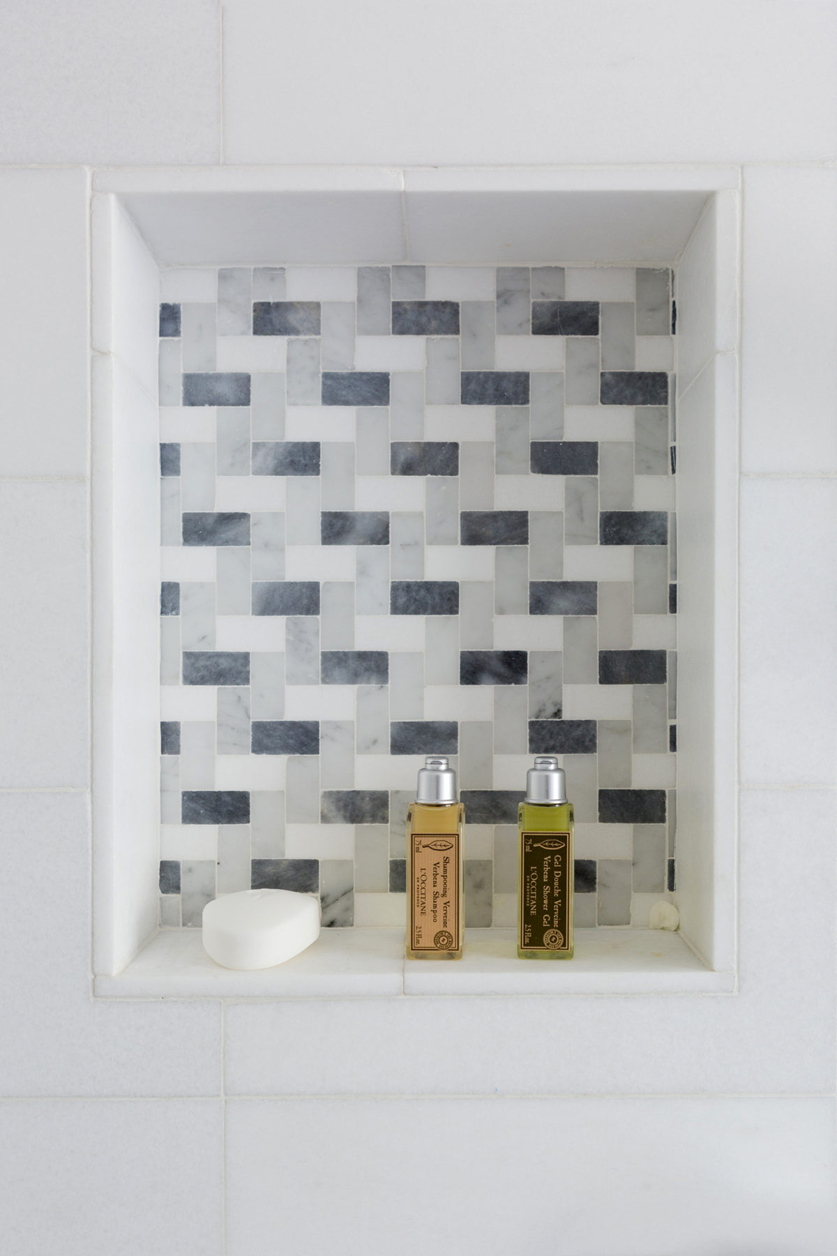
Details are everything! We used the same stone mosaic in the shower nook, framed in white thassos.
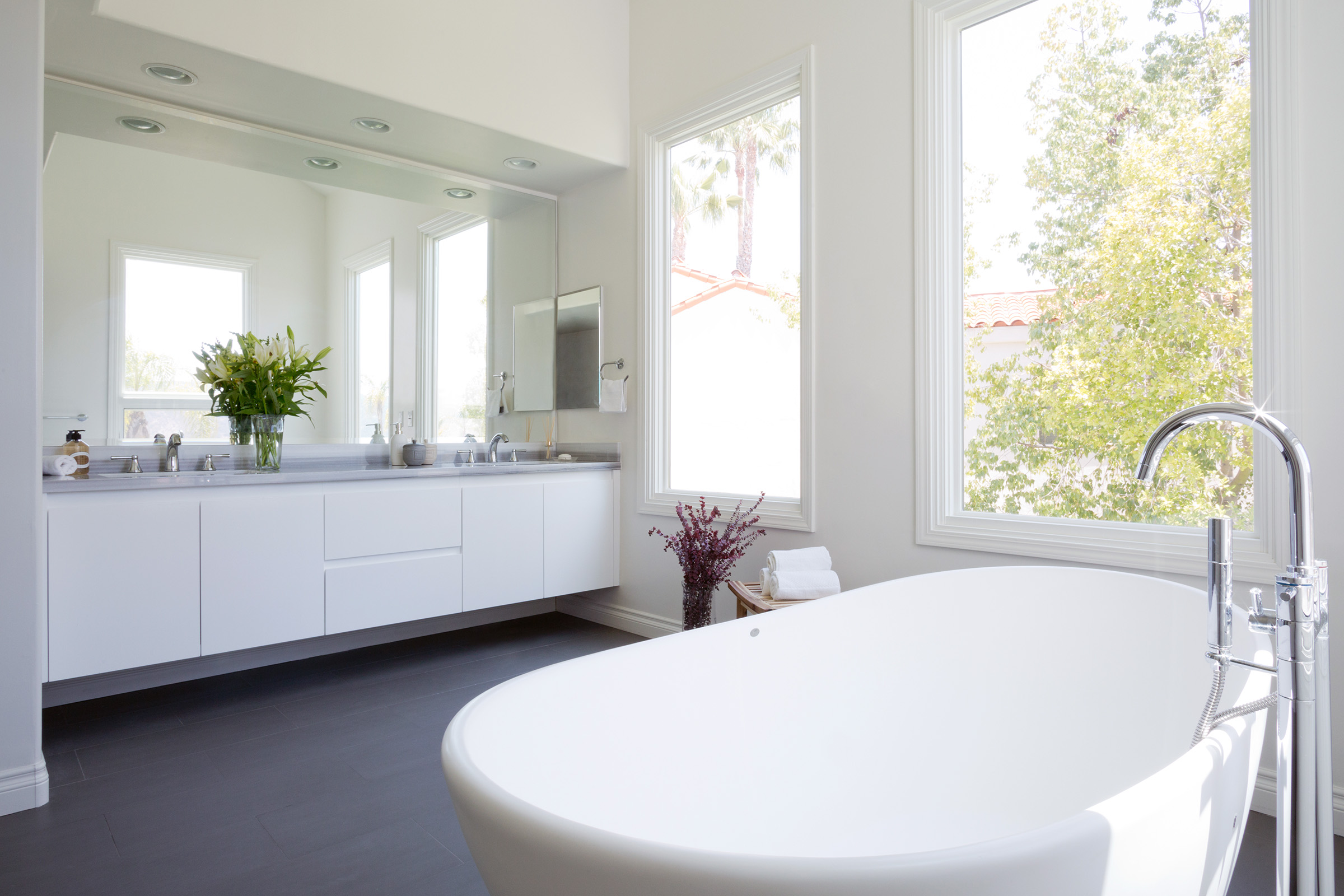
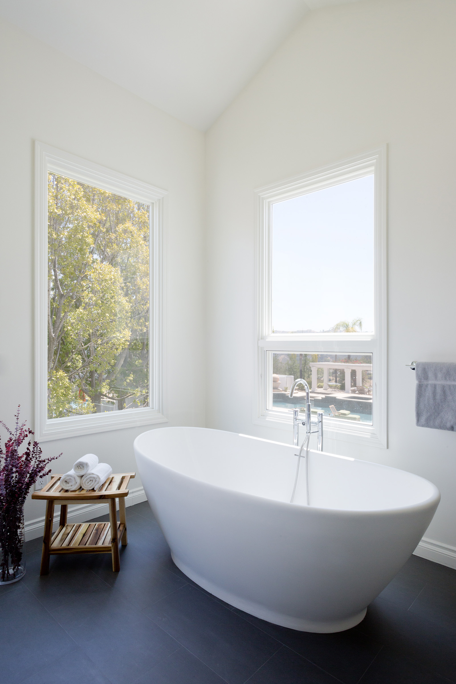
One of my favorite features of this bathroom is the TUB!!! How beautiful are free-standing bathtubs? It is more like a sculpture than anything (although fully functional) and it is the epitome of modern design. This bathroom has incredible views on a very private property so the client wanted to embrace it and leave the windows uncovered:
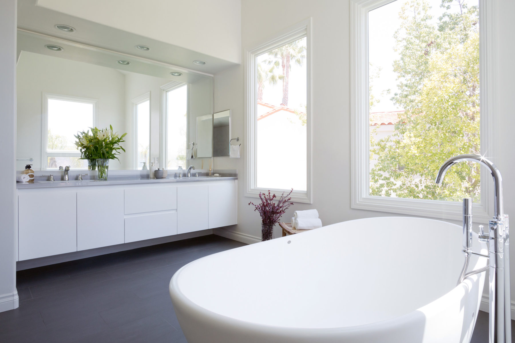
This shot really shows off how large this space is and how the tub is the star of the show.
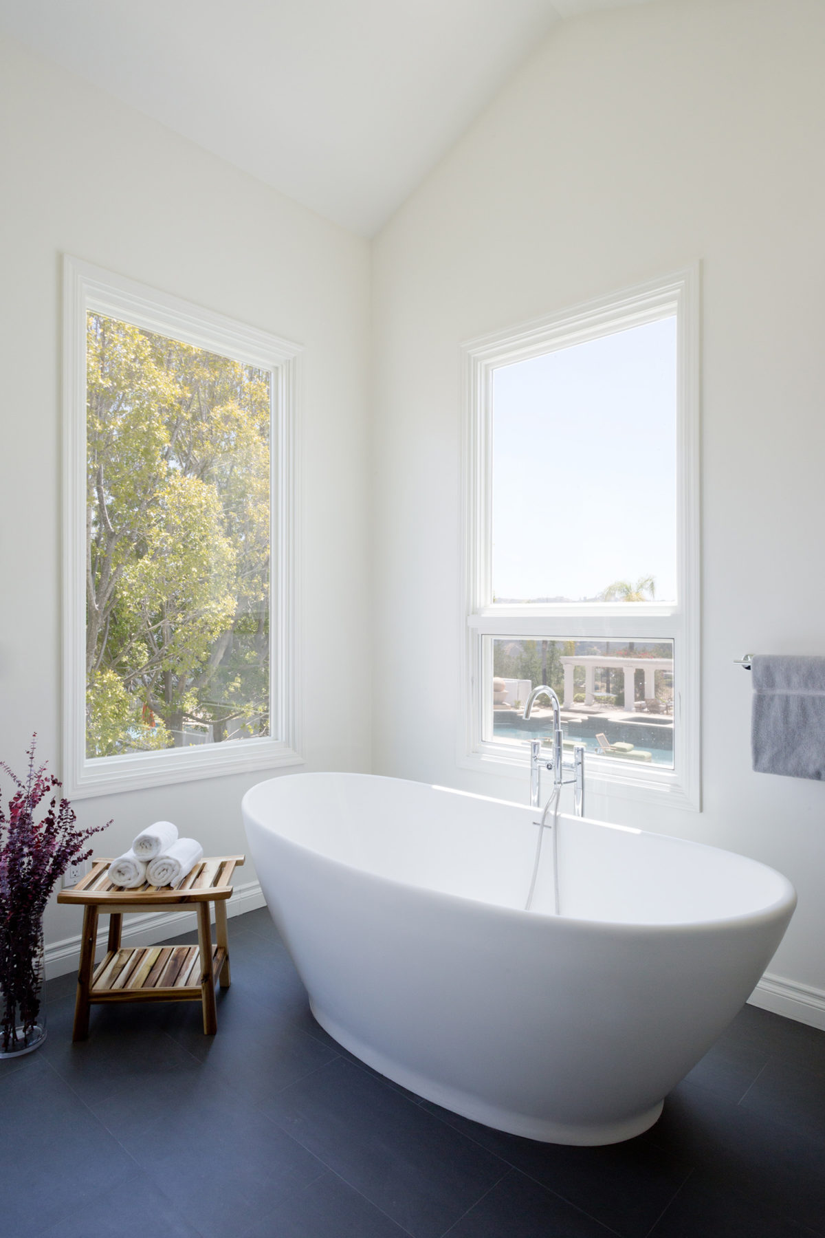
Seriously the views from this tub. Killer!
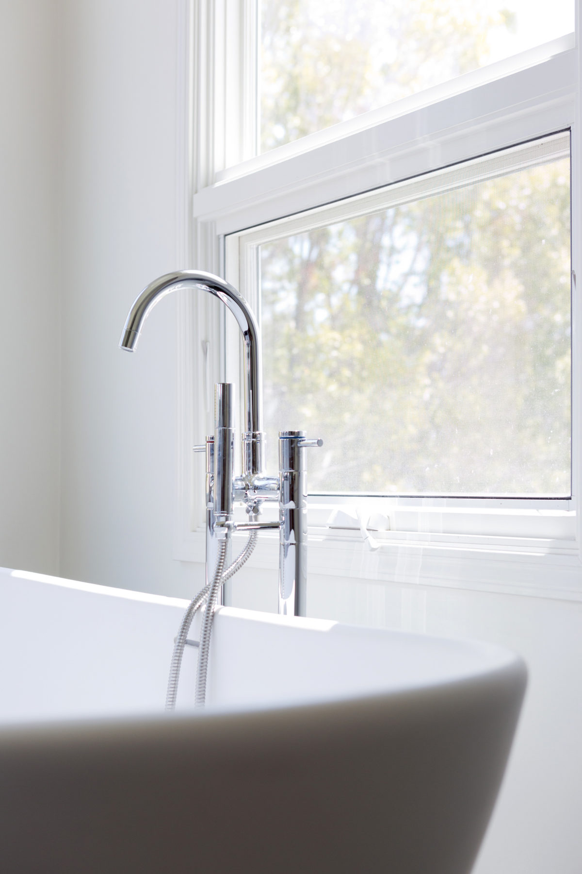
Close up of the polished chrome tub filler.
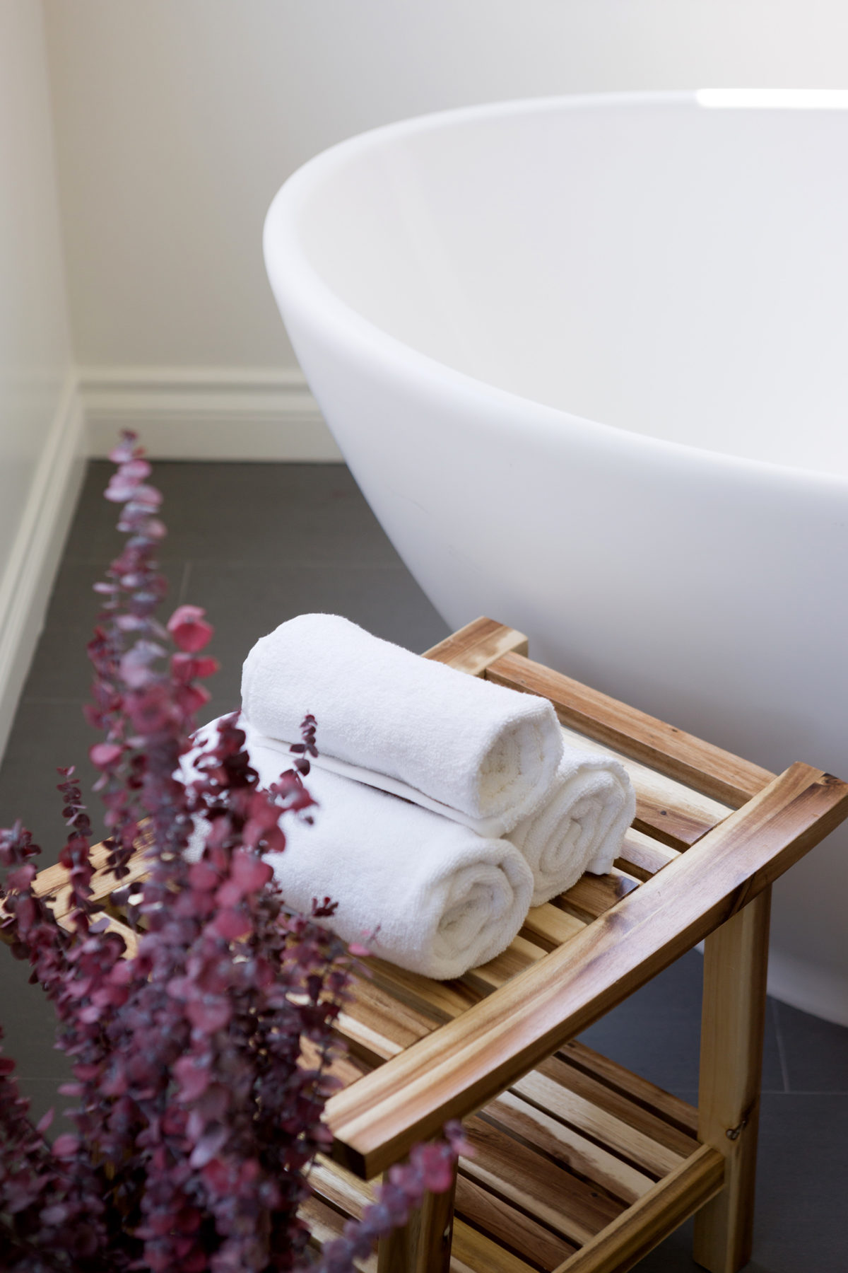
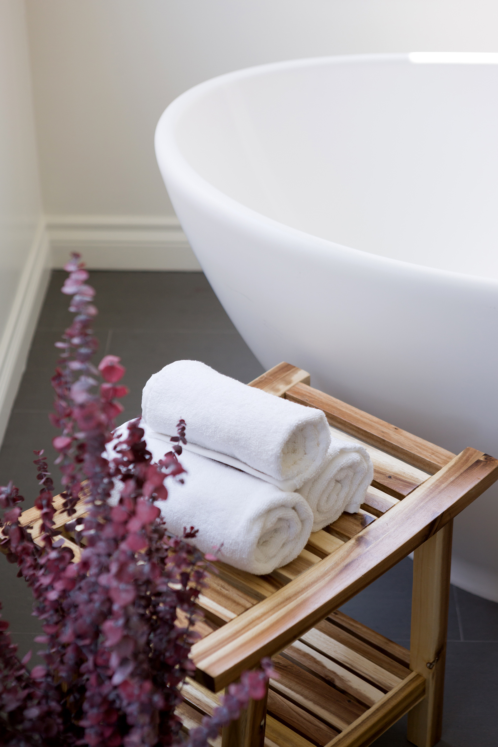
Every free-standing tub needs a side table to hold towels, soap and other necessities. I love this teak stool we used here.
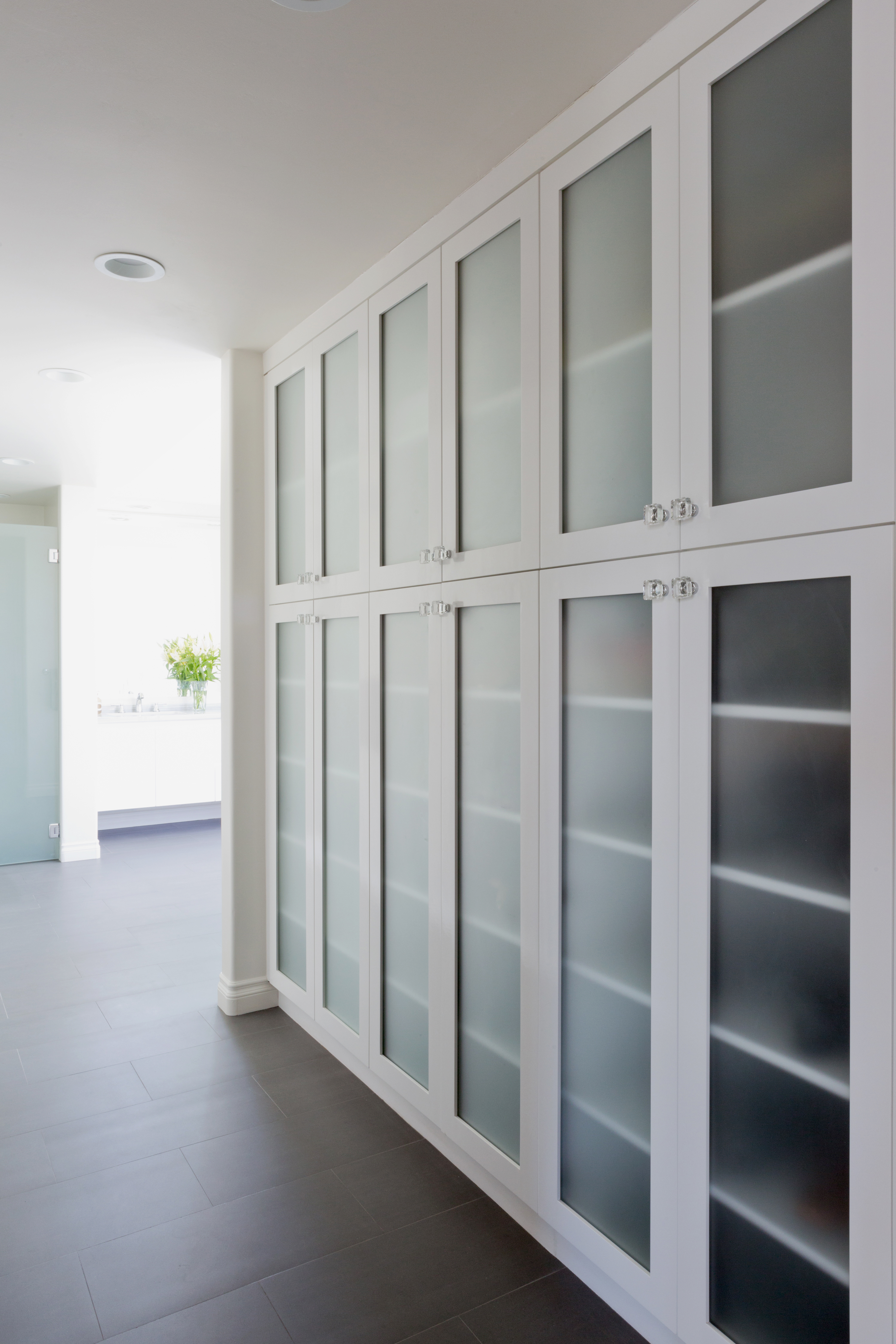
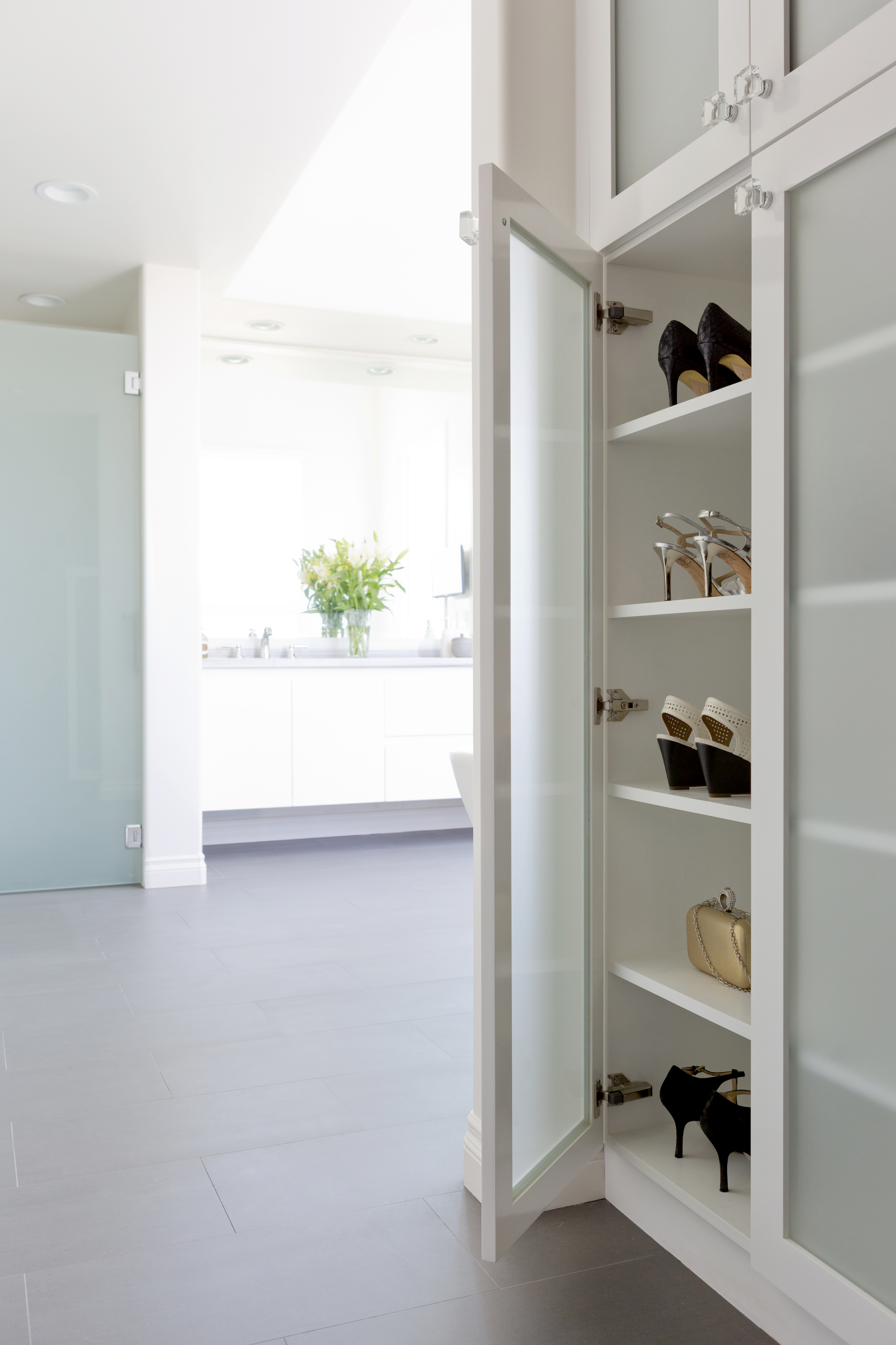
Lastly, this room needed some storage space – for shoes, purses and other bathroom basics. We covered up an existing window in the hallway leading to the bathroom and added a closet with frosted glass doors and feminine lucite knobs. We also created a private room for the toilet that hid some extra storage shelves as well:
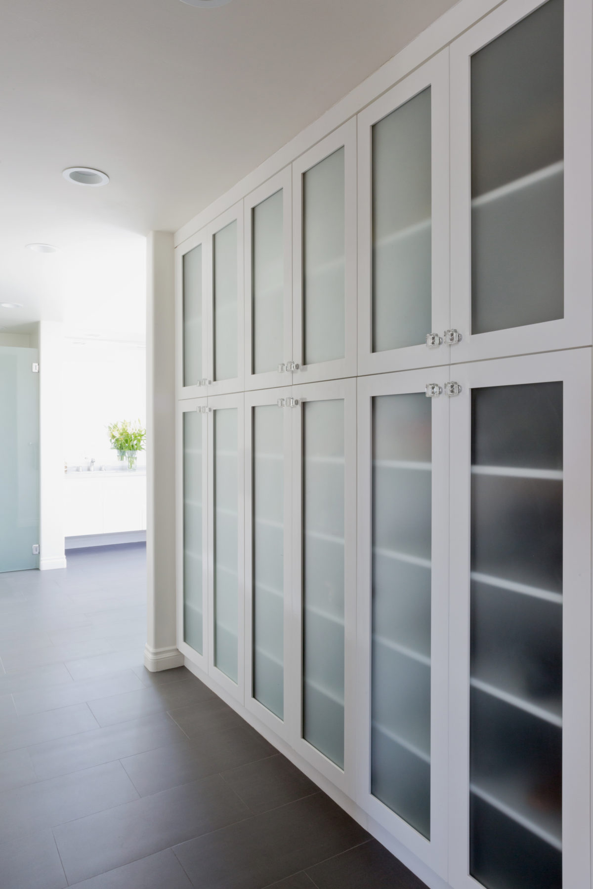
The frosted glass closet doors continue to make the space feel light while providing some privacy as to what is being stored inside.
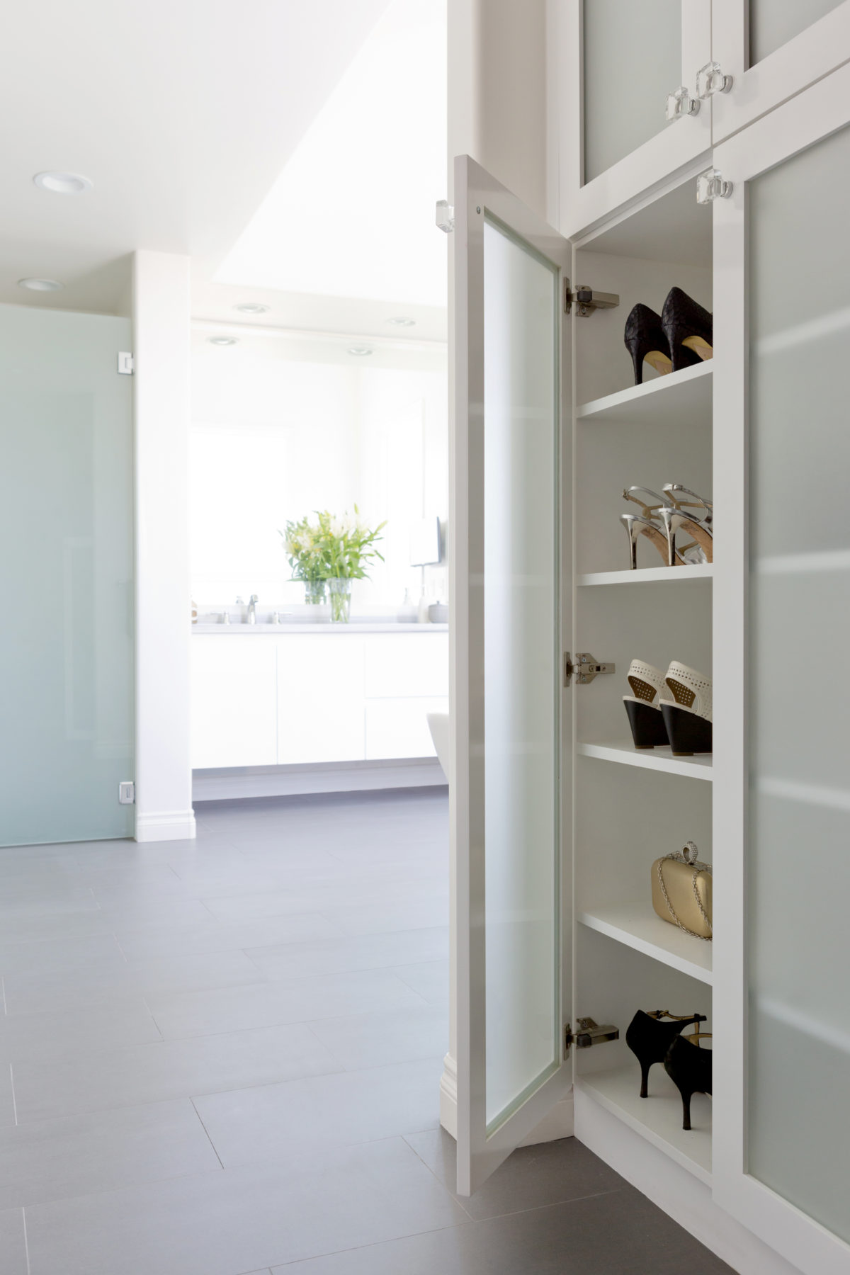
Every girl’s dream. Shoes for days!
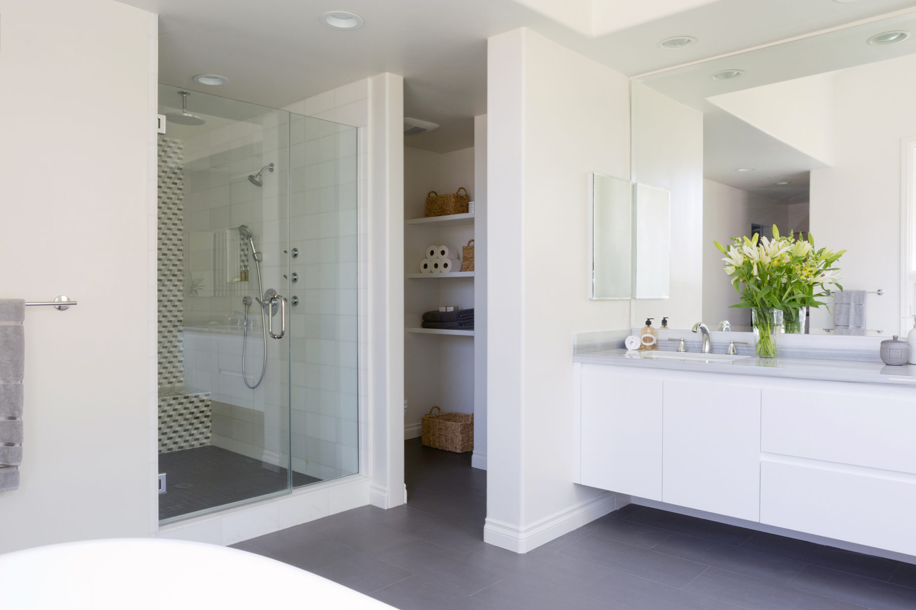
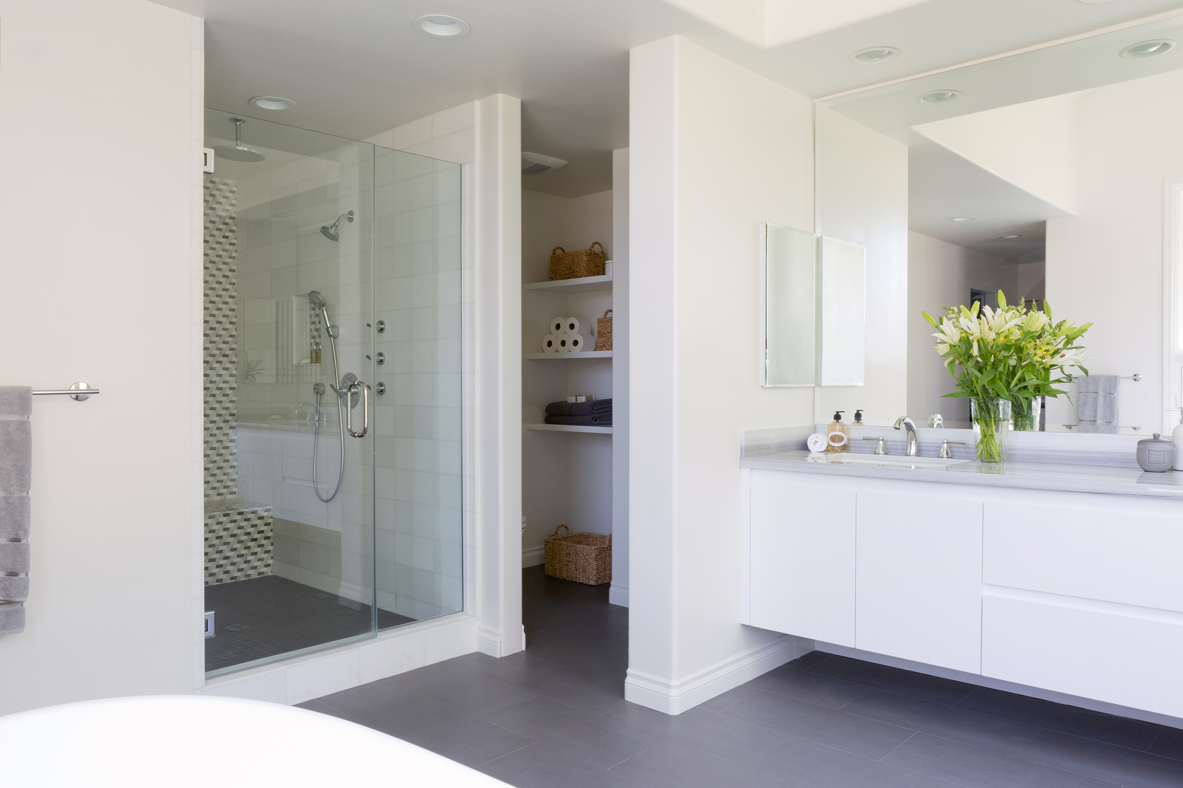
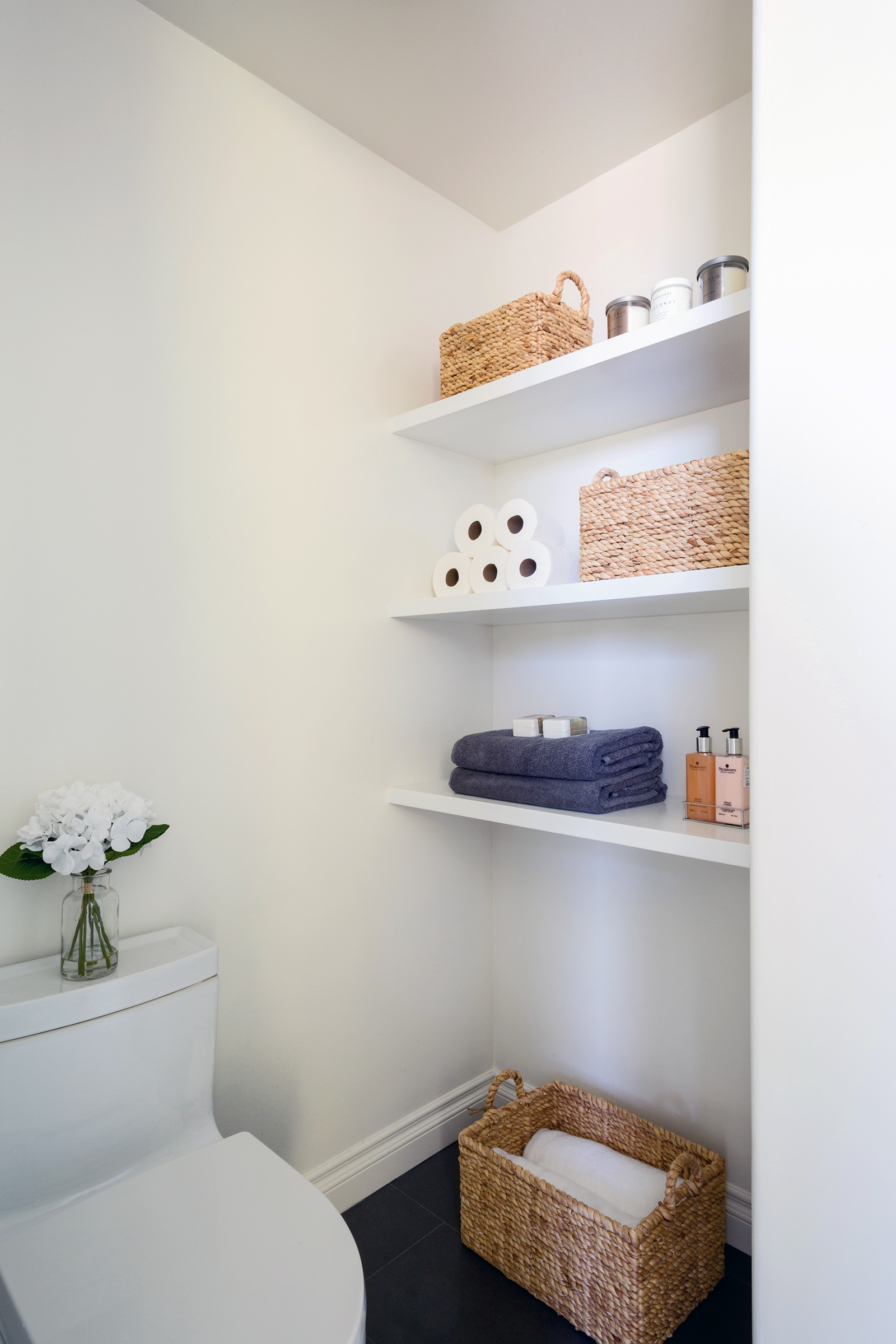
Between the shower & the vanity, we created a small room with another frosted glass door for the toilet and additional storage.
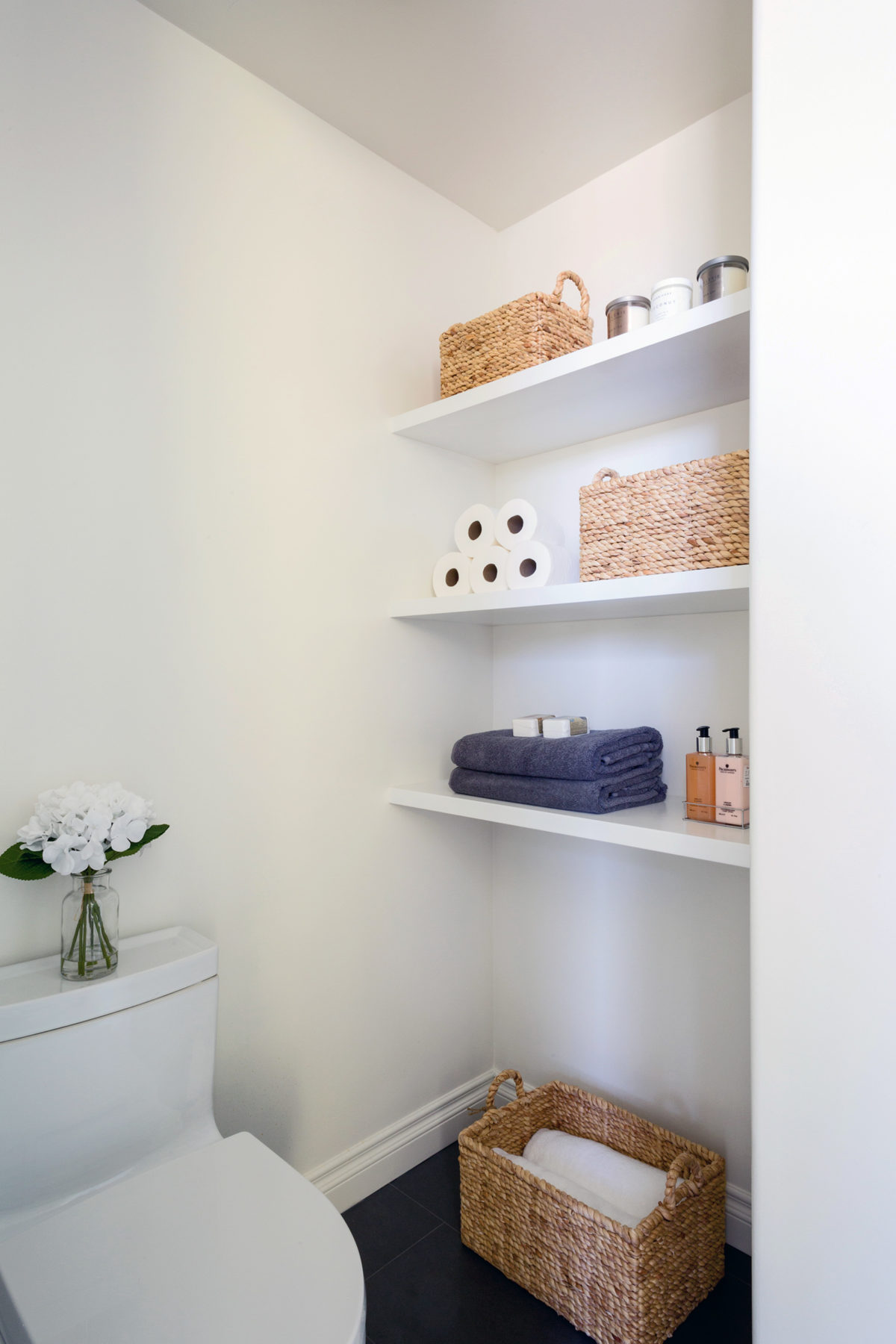
These shelves provide great space for extra toilet paper, towels, soap, etc.
Everyone involved was really pleased on how this room turned out, which is the best case scenario when re-designing someone’s home. We really transformed an extremely outdated space to reflect the client’s more modern taste and were able to keep function in mind.
To check out the rest of my current portfolio, click here.
See you soon! xo, AE (more…)